require(sp)Loading required package: sprequire(ggmap)
data(meuse)
ggplot(meuse, aes(x = x, y = y, color = zinc)) +
geom_point() +
scale_color_viridis_c() +
coord_equal() +
theme_minimal()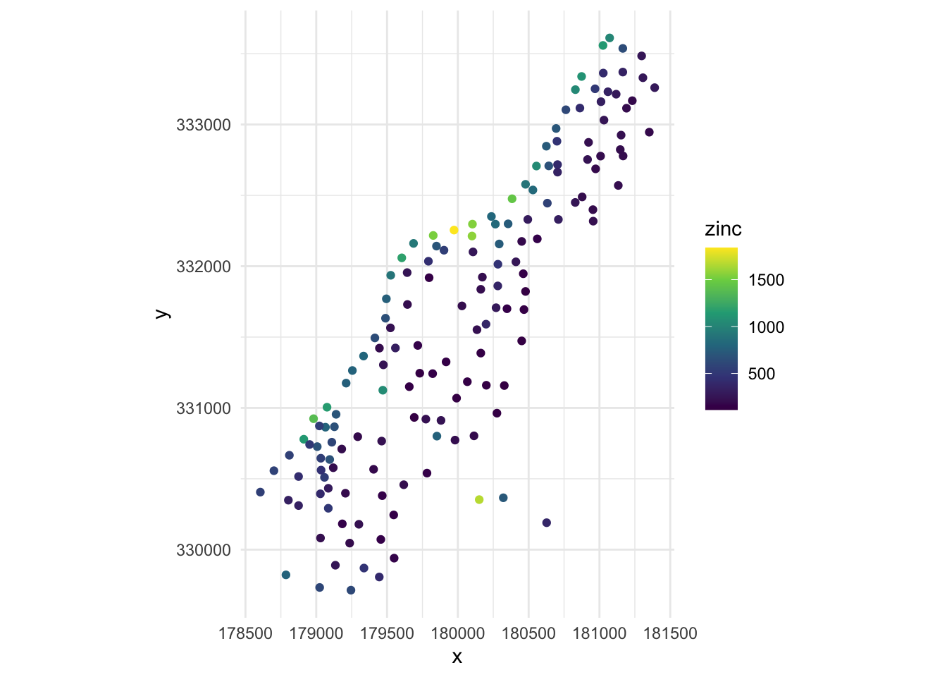
Compared to time series and longitudinal data, spatial data is indexed by space (in 2 or 3 dimensions).
Typically, we have point-referenced or geostatistical data where our outcome is \(Y(s)\) where \(s\in \mathbb{R}^d\) and \(s\) varies continuously. \(s\) may be a point on the globe referenced by its longitude and latitude or a point in another coordinate system. We are typically interested in the relationships between the outcome and explanatory variables and making predictions at locations where we do not have data. We will use that points closer to each other in space are more likely to be similar in value in our endeavors.
Below, we have mapped the value of zinc concentration (coded by color) at 155 spatial locations in a flood plain of the Meuse River in the Netherlands. We might be interested in explaining the variation in zinc concentrations in terms of the distance to the river, flooding frequency, soil type, land use, etc. After building a model to predict the mean zinc concentration, we could use that model to help us understand the current landscape and to make predictions. Remember that to make predictions, we have to observe these characteristics at other spatial locations.
require(sp)Loading required package: sprequire(ggmap)
data(meuse)
ggplot(meuse, aes(x = x, y = y, color = zinc)) +
geom_point() +
scale_color_viridis_c() +
coord_equal() +
theme_minimal()
We may not be able to collect data at that fine granularity of spatial location due to a lack of data or to protect the confidentiality of individuals. Instead, we may have areal or lattice or discrete data such that we have aggregate data that summarizes observations within a spatial boundary such as a county or state (or country or within a square grid). In this circumstance, we think that spatial areas are similar if they are close (share a boundary, centers are close to each other, etc.) We must consider correlation based on factors other than longitude and latitude.
Below, we have mapped the rate of sudden infant death syndrome (SIDS) for countries in North Carolina in 1974. We might be interested in explaining the variation in country SIDS rates in terms of population size, birth rate, and other factors that might explain county-level differences. After building a model to predict the mean SIDS rate, we could use that model to help us understand the current public health landscape, and we can use it to make predictions in the future.
library(sf)
nc <- st_read(system.file("shape/nc.shp", package="sf"))
Reading layer `nc' from data source
`/Library/Frameworks/R.framework/Versions/4.5-arm64/Resources/library/sf/shape/nc.shp'
using driver `ESRI Shapefile'
Simple feature collection with 100 features and 14 fields
Geometry type: MULTIPOLYGON
Dimension: XY
Bounding box: xmin: -84.32385 ymin: 33.88199 xmax: -75.45698 ymax: 36.58965
Geodetic CRS: NAD27st_crs(nc) <- "+proj=longlat +datum=NAD27"
row.names(nc) <- as.character(nc$FIPSNO)
ggplot(nc, aes(fill = SID74)) +
geom_sf() +
scale_fill_gradient(low='white',high='red') +
labs(title = "SIDS (sudden infant death syndrome) in North Carolina") +
theme_classic()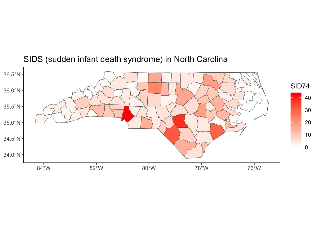
In some disciplines, we may be most interested in the locations themselves and study the point patterns or point processes to try and determine any structure in the locations.
The data below record the locations of 126 pine saplings in a Finnish forest, including their heights and diameters. We might be interested if there are any patterns in the location of the pines. Is it uniform? Is there clustering? Are there optimal distances between pines such that they’ll only grow if they are far enough away from each other (repelling each other)?
require(spatstat)
data(finpines)
plot(unmark(finpines), main="Finnish pines: locations")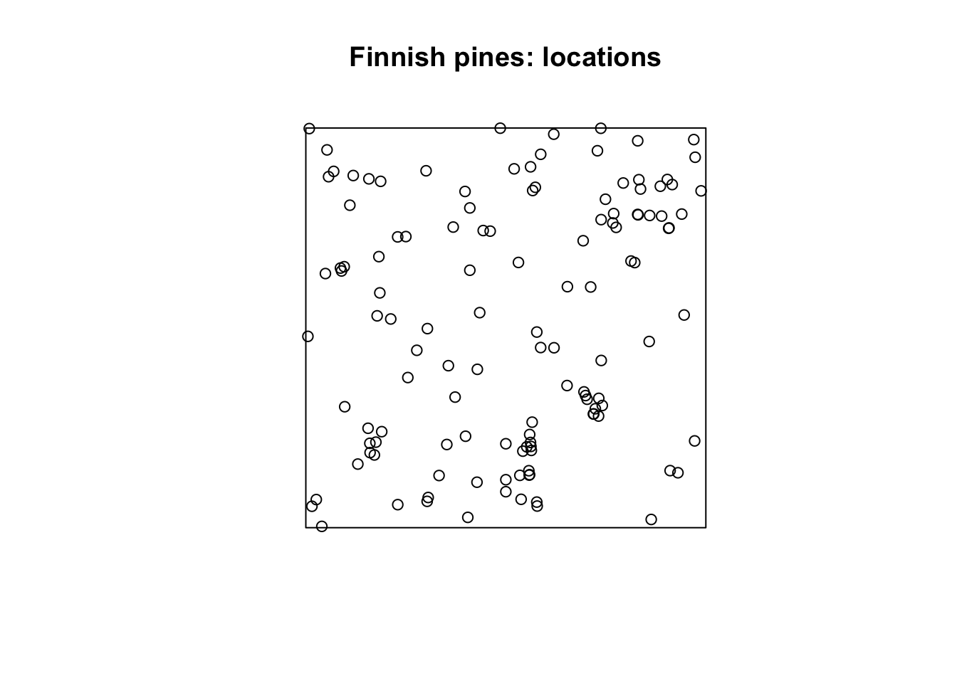
At the heart of every spatial visualization is a set of locations. One way to describe a location is in terms of coordinates and a coordinate reference system (known as CRS).
There are three main components to a CRS: ellipsoid, datum, and a projection.
While you might have learned that the Earth is a sphere, it is actually closer to an ellipsoid with a bulge at the equator. Additionally, the surface is irregular and not smooth. To define a CRS, we first need to choose a mathematical model represent a smooth approximation to the shape of the Earth. The common ellipsoid models are known as WGS84 and GRS80. See the illustration below of one ellipsoid model (shown in black) as compared to Earth’s true irregular surface (shown in red).
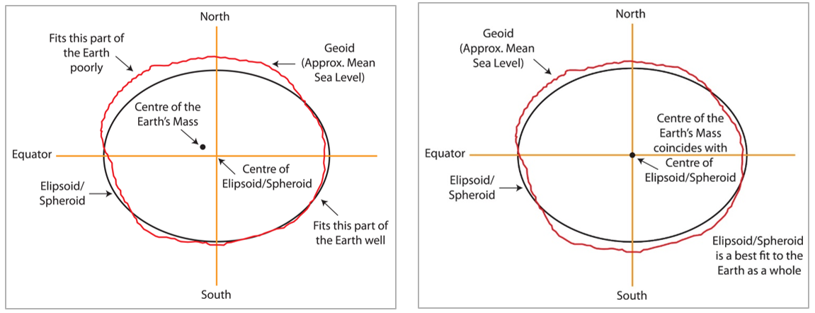
Each ellipsoid model has different ways to position it self relative to Earth depending on the center or origin. Each potential position and reference frame for representing the position of locations on Earth is called a datum.
For example, two different datum for the same ellipsoid model can provide a more accurate fit or approximation of the Earth’s surface depending on the region of interest (South America v. North America). For example, the NAD83 datum is a good fit for the GRS80 ellipsoid in North America, but SIRGAS2000 is a better fit for the GRS80 ellipsoid in South America. The illustration below shows one datum in which the center of the ellipsoid does not coincide with the center of Earth’s mass. With this position of the ellipsoid, we gain a better fit for the southern half of the Earth.
It is useful to know that the Global Positioning System (GPS) uses the WGS84 ellipsoid model and a datum by the same name, which provides an overall best fit of the Earth.
If you have longitude and latitude coordinates for a location, it is important to know what datum and ellipsoid were used to define those positions.
Note: In practice, the horizontal distance between WGS84 and NAD83 coordinates is about 3-4 feet in the US, which may not be significant for most applications.
The 3 most common datum/ellipsoids used in the U.S.:
WGS84 (EPSG: 4326)
+init=epsg:4326 +proj=longlat +ellps=WGS84
+datum=WGS84 +no_defs +towgs84=0,0,0
## CRS used by Google Earth and the U.S. Department of Defense for all their mapping.
## Tends to be used for global reference systems.
## GPS satellites broadcast the predicted WGS84 orbits.
NAD83 (EPSG: 4269)
+init=epsg:4269 +proj=longlat +ellps=GRS80 +datum=NAD83
+no_defs +towgs84=0,0,0
##Most commonly used by U.S. federal agencies.
## Aligned with WGS84 at creation, but has since drifted.
## Although WGS84 and NAD83 are not equivalent, for most applications they are very similar.
NAD27 (EPSG: 4267)
+init=epsg:4267 +proj=longlat +ellps=clrk66 +datum=NAD27
+no_defs
+nadgrids=@conus,@alaska,@ntv2_0.gsb,@ntv1_can.dat
## Has been replaced by NAD83, but is still encountered!
For more resources related to EPSG, go to https://epsg.io/ and https://spatialreference.org/.
Lastly, we must project the 3D ellipse on a 2D surface to make a map with Easting and Northing coordinates. Flattening a round object without distortion is impossible, resulting in trade-offs between area, direction, shape, and distance. For example, distance and direction are trade-offs because both features can not be simultaneously preserved. No “best” projection exists, but some are better suited to different applications.
For a good overview of common projection methods, see https://pubs.usgs.gov/gip/70047422/report.pdf.
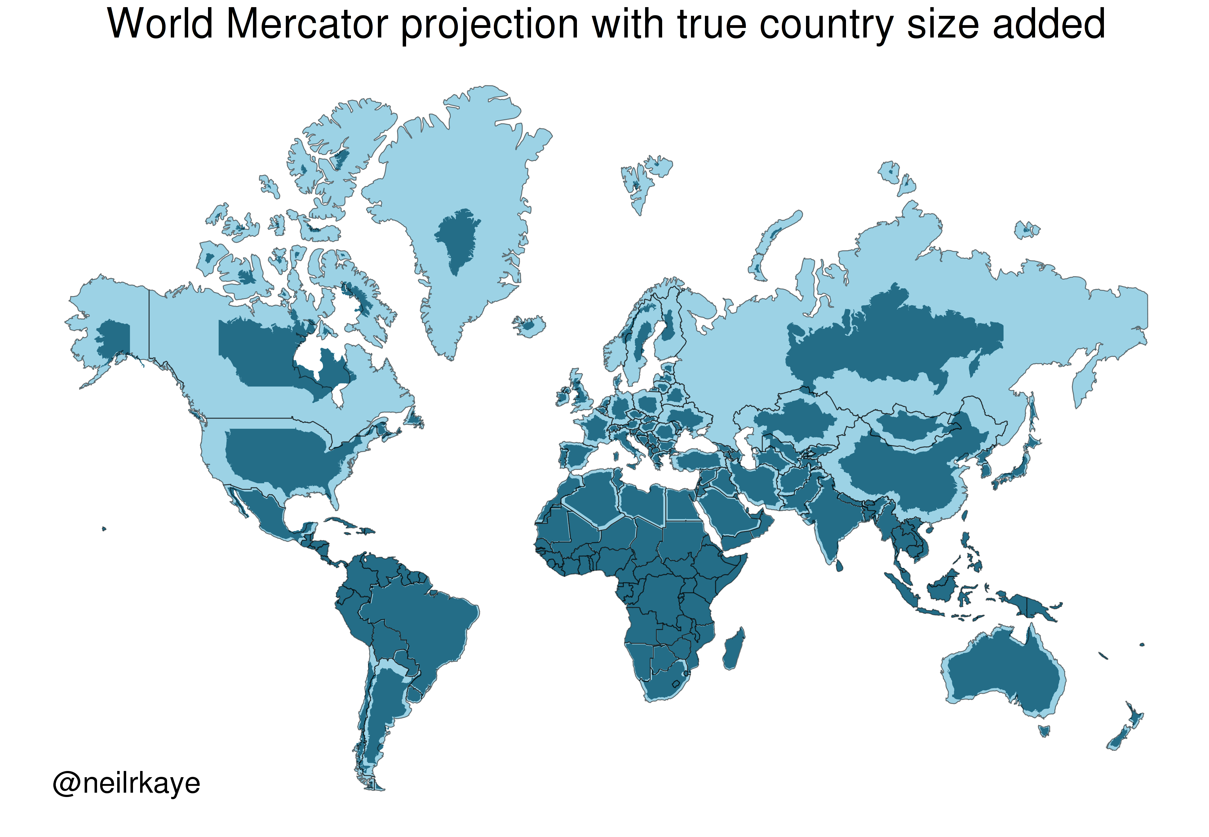
One of the most commonly used projection is the Mercator projection which is a cylindrical map projection from the 1500’s. It became popular for navigation because it represented north as up and south as down everywhere and preserves local directions and shape. However, it inflates the size of regions far from the equator. Thus, Greenland, Antarctica, Canada, and Russia appear large relative to their actual land mass as compared to Central Africa. See the illustration below to compare the area/shape of the countries with the Mercator projection of the world (light blue) with the true areas/shapes (dark blue).
Below you can see four different world projections. Take note of what is lost in terms of angle, area, or distance in these projections.
library(rnaturalearth)
world <- ne_countries(scale = "medium", returnclass = "sf")

# Basic Map w/ labels
ggplot(data = world) +
  geom_sf(color = "black", fill = "#bada55") +
  labs(x = "Longitude", y = "Latitude", title = "World Map - Mercator Projection", subtitle = paste0("(", length(unique(world$name)), " countries)")) +
theme_bw() 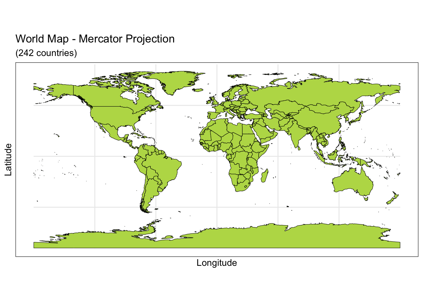
ggplot(data = world) +
    geom_sf(color = "black", fill = "#bada55") +
    coord_sf(crs = "+proj=laea +lat_0=52 +lon_0=10 +x_0=4321000 +y_0=3210000 +ellps=GRS80 +units=m +no_defs")  +
  labs(title = "Lambert Azimuthal Equal-Area Projection", subtitle = "Correctly represents area but not angles") +
  theme_bw()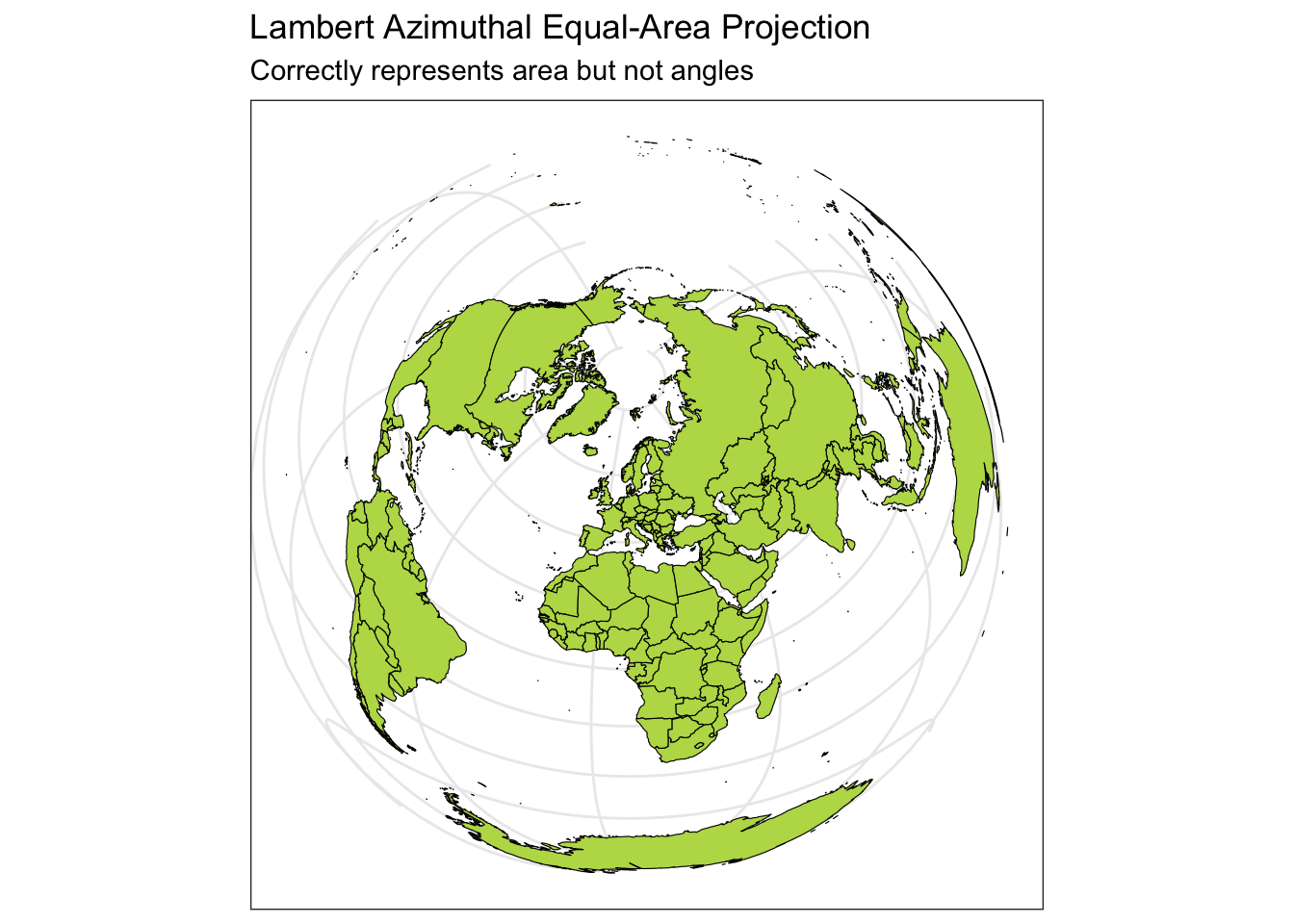
ggplot(data = world) +
    geom_sf(color = "black", fill = "#bada55") +
    coord_sf(crs = "+proj=fouc") +
  labs(title = "Foucaut Projection", subtitle = "Correctly represents area, lots of distortion in high latitudes") +
theme_bw() 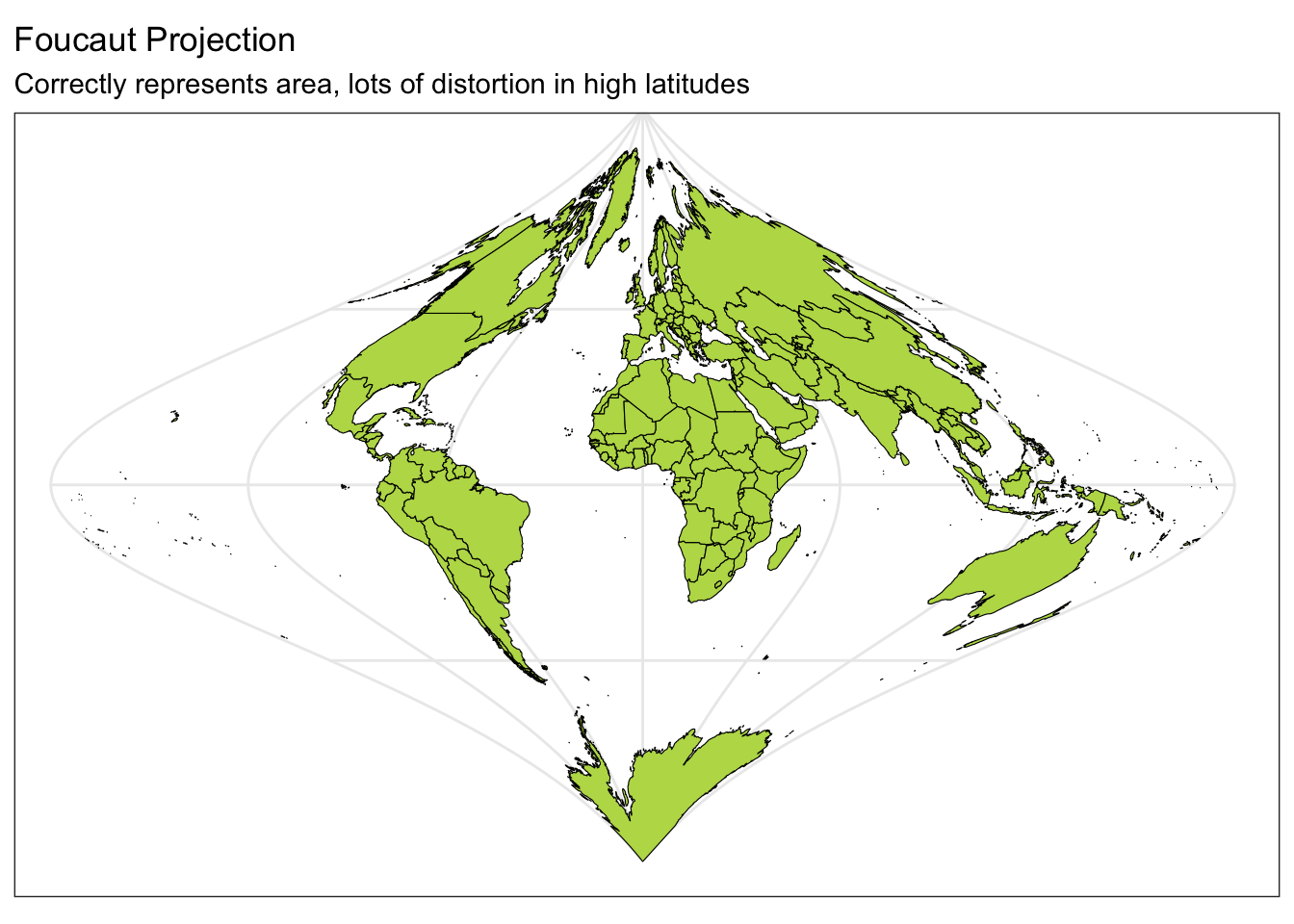
ggplot(data = world) +
    geom_sf(color = "black", fill = "#bada55") +
    coord_sf(crs = "+proj=natearth2") +
    labs(title = "Natural Earth II Projection", subtitle = "Represents globe shape, distorted at high latitudes") +
theme_bw() 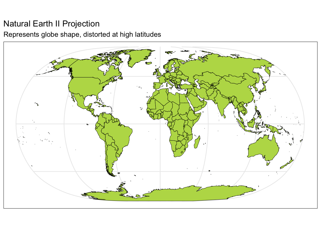
It is important to consider what ellipsoid, datum, and projection your locations have been recorded and mapped using.
Vector data represents the world as a set of spatial geometries that are defined in terms of location coordinates (with a specified CRS) with non-spatial attributes or properties.
The three basic geometries are
For example, city locations can be represented with points, roads and rivers can be represented by lines, and geo-political boundaries and lakes can be represented by polygons.
Hundreds of file formats exist to store spatial vector data. A text file (such as .csv) can store the coordinates in two columns (x,y) in addition to a group id (needed for lines and polygons) plus attributes or properties in additional columns. Note that text files do not store the CRS. However, shapefiles (.shp) developed by ESRI is one of the most widely supported spatial vector file format (that includes the CRS). Additionally, GeoJSON (.geojson) and KML (.kml) are additional popular formats.
Raster data represents the world using a continuous grid of cells where each cell has a single value. These values could be continuous such as elevation or precipitation or categorical such as land cover or soil type.
Typically regular cells are square in shape but they can be rotated and sheared. Rectilinear and curvilinear shapes are also possible, depending on the spatial region of interest and CRS.
Be aware that high resolution raster data involves a large number of small cells. This can slow down the computations and visualizations.
Many raster file formats exist. One of the most popular is GeoTIFF (.tif or .tiff). More complex raster formats include NetCDF (.nc) and HDF (.hdf). To work with raster data in R, you’ll use the raster, terra, and the stars packages. If you are interested in learning more, check out https://r-spatial.github.io/stars/.
The technology available in R is rapidly evolving and improving. In this set of notes, I’ve highlighted some basics for working with spatial data in R, but I list some good resources below.
The following R packages support spatial data classes (data sets that are indexed with geometries):
sf: generic support for working with spatial datageojsonsf: read in geojson filesThe following R packages contain cultural and physical boundaries, and raster maps:
maps: polygon maps of the worldUSAboundaries: contemporary US state, county, and Congressional district boundaries, as well as zip code tabulation area centroidsrnaturalearth: hold and facilitate interaction with Natural Earth map dataThe following R packages support geostatistical/point-referenced data analysis:
gstat: classical geostatisticsgeoR: model-based geostatisticsRandomFields: stochastic processesakima: interpolationThe following R packages support regional/areal data analysis:
spdep: spatial dependencespgwr: geographically weighted regressionThe following R packages support point patterns/processes data analysis:
spatstat: parametric modeling, diagnosticssplancs: non-parametric, space-timeFor each file format, we need use a different function to read in the data. See the examples below for reading in GeoJSON, csv, and shapefiles.
# Read in GeoJSON file
hex_spatial <- geojsonsf::geojson_sf("data/us_states_hexgrid.geojson")

# Read in CSV File
pop_growth <- readr::read_csv('data/apportionment.csv') %>% janitor::clean_names()
Rows: 684 Columns: 10
── Column specification ────────────────────────────────────────────────────────
Delimiter: ","
chr (2): Name, Geography Type
dbl (5): Year, Percent Change in Resident Population, Resident Population De...
num (3): Resident Population, Resident Population Density, Average Apportion...
ℹ Use `spec()` to retrieve the full column specification for this data.
ℹ Specify the column types or set `show_col_types = FALSE` to quiet this message.# Read in Shapefiles
mn_cities <- sf::read_sf('data/shp_loc_pop_centers') #shp file/folderWarning in CPL_read_ogr(dsn, layer, query, as.character(options), quiet, :
automatically selected the first layer in a data source containing more than
one.mn_water <- sf::read_sf('data/shp_water_lakes_rivers') #shp file/folderWhen data is read it, an R data object is created of a default class. Notice the classes of the R objects we read in. Also, notice that an object may have multiple classes, which indicate the type of structure it has and how functions may interact with the object.
class(hex_spatial)[1] "sf" "data.frame"class(pop_growth)[1] "spec_tbl_df" "tbl_df" "tbl" "data.frame" class(mn_cities)[1] "sf" "tbl_df" "tbl" "data.frame"class(mn_water)[1] "sf" "tbl_df" "tbl" "data.frame"You also may encounter classes such as SpatialPoints, SpatialLines, and SpatialPolygons, or Spatial*DataFrame from the sp package. The community is moving away from using older sp classes to sf classes. It is useful for you to know that the older versions exist but stick with the sf classes.
sfc objects are modern, general versions of the spatial geometries from the sp package with a bbox, CRS, and many geometries available.sf objects are data.frame-like objects with a geometry column of class sfcWe can convert objects between these data classes with the following functions:
fortify(x): sp object x to data.frame
st_as_sf(x ): sp object x to sf
st_as_sf(x, coords = c("long", "lat")): data.frame x to sf as points
To convert a data.frame with columns of long, lat, and group containing polygon geometry information, you can use:
st_as_sf(x, coords = c("long", "lat")) %>%
group_by(group) %>%
  summarise(geometry = st_combine(geometry)) %>%
st_cast("POLYGON")In general, if you have geometries (points, polygons, lines, etc.) that you want to plot, you can use geom_sf() with ggplot(). See https://ggplot2.tidyverse.org/reference/ggsf.html for more details.
If you have x and y coordinates (longitude and latitude over a small region), we can use our typical plotting tools in ggplot2 package using the x and y coordinates as the x and y values in geom_point(). Then you can color the points according to a covariate or outcome variable.
If you have longitude and latitude over the globe or a larger region, you must project those coordinates onto a 2D surface. You can do this using the sf package and st_transform() after specifying the CRS (documentation: https://www.rdocumentation.org/packages/sf/versions/0.8-0/topics/st_transform). Then we can use geom_sf().
We’ll walk through create a map of MN with different layers of information (city point locations, county polygon boundaries, rivers as lines and polygons, and a raster elevation map). To add all of this information on one map, we need to ensure that the CRS is the same for all spatial datasets.
#check CRS
st_crs(mn_cities)
Coordinate Reference System:
User input: NAD83 / UTM zone 15N
wkt:
PROJCRS["NAD83 / UTM zone 15N",
BASEGEOGCRS["NAD83",
DATUM["North American Datum 1983",
ELLIPSOID["GRS 1980",6378137,298.257222101,
LENGTHUNIT["metre",1]]],
PRIMEM["Greenwich",0,
ANGLEUNIT["degree",0.0174532925199433]],
ID["EPSG",4269]],
CONVERSION["UTM zone 15N",
METHOD["Transverse Mercator",
ID["EPSG",9807]],
PARAMETER["Latitude of natural origin",0,
ANGLEUNIT["Degree",0.0174532925199433],
ID["EPSG",8801]],
PARAMETER["Longitude of natural origin",-93,
ANGLEUNIT["Degree",0.0174532925199433],
ID["EPSG",8802]],
PARAMETER["Scale factor at natural origin",0.9996,
SCALEUNIT["unity",1],
ID["EPSG",8805]],
PARAMETER["False easting",500000,
LENGTHUNIT["metre",1],
ID["EPSG",8806]],
PARAMETER["False northing",0,
LENGTHUNIT["metre",1],
ID["EPSG",8807]]],
CS[Cartesian,2],
AXIS["(E)",east,
ORDER[1],
LENGTHUNIT["metre",1]],
AXIS["(N)",north,
ORDER[2],
LENGTHUNIT["metre",1]],
ID["EPSG",26915]]#check CRS
st_crs(mn_water)Coordinate Reference System:
User input: NAD83 / UTM zone 15N
wkt:
PROJCRS["NAD83 / UTM zone 15N",
BASEGEOGCRS["NAD83",
DATUM["North American Datum 1983",
ELLIPSOID["GRS 1980",6378137,298.257222101,
LENGTHUNIT["metre",1]]],
PRIMEM["Greenwich",0,
ANGLEUNIT["degree",0.0174532925199433]],
ID["EPSG",4269]],
CONVERSION["UTM zone 15N",
METHOD["Transverse Mercator",
ID["EPSG",9807]],
PARAMETER["Latitude of natural origin",0,
ANGLEUNIT["Degree",0.0174532925199433],
ID["EPSG",8801]],
PARAMETER["Longitude of natural origin",-93,
ANGLEUNIT["Degree",0.0174532925199433],
ID["EPSG",8802]],
PARAMETER["Scale factor at natural origin",0.9996,
SCALEUNIT["unity",1],
ID["EPSG",8805]],
PARAMETER["False easting",500000,
LENGTHUNIT["metre",1],
ID["EPSG",8806]],
PARAMETER["False northing",0,
LENGTHUNIT["metre",1],
ID["EPSG",8807]]],
CS[Cartesian,2],
AXIS["(E)",east,
ORDER[1],
LENGTHUNIT["metre",1]],
AXIS["(N)",north,
ORDER[2],
LENGTHUNIT["metre",1]],
ID["EPSG",26915]]#transform CRS of water to the same of the cities
mn_water <- mn_water %>%
st_transform(crs = st_crs(mn_cities))# install.packages("remotes")
# remotes::install_github("ropensci/USAboundaries")
# remotes::install_github("ropensci/USAboundariesData")
# Load country boundaries data as sf object
mn_counties <- USAboundaries::us_counties(resolution = "high", states = "Minnesota")The USAboundariesData package needs to be updated. Please try installing the package using the following command:
install.packages("USAboundariesData", repos = "https://ropensci.r-universe.dev", type = "source")# Remove duplicate column names
names_counties <- names(mn_counties)
names(mn_counties)[names_counties == 'state_name'] <- c("state_name1", "state_name2")
# Check CRS
st_crs(mn_counties)Coordinate Reference System:
User input: EPSG:4326
wkt:
GEOGCRS["WGS 84",
DATUM["World Geodetic System 1984",
ELLIPSOID["WGS 84",6378137,298.257223563,
LENGTHUNIT["metre",1]]],
PRIMEM["Greenwich",0,
ANGLEUNIT["degree",0.0174532925199433]],
CS[ellipsoidal,2],
AXIS["geodetic latitude (Lat)",north,
ORDER[1],
ANGLEUNIT["degree",0.0174532925199433]],
AXIS["geodetic longitude (Lon)",east,
ORDER[2],
ANGLEUNIT["degree",0.0174532925199433]],
USAGE[
SCOPE["Horizontal component of 3D system."],
AREA["World."],
BBOX[-90,-180,90,180]],
ID["EPSG",4326]]# Transform the CRS of county data to the more local CRS of the cities
mn_counties <- mn_counties %>%
st_transform(crs = st_crs(mn_cities))
st_crs(mn_counties)Coordinate Reference System:
User input: NAD83 / UTM zone 15N
wkt:
PROJCRS["NAD83 / UTM zone 15N",
BASEGEOGCRS["NAD83",
DATUM["North American Datum 1983",
ELLIPSOID["GRS 1980",6378137,298.257222101,
LENGTHUNIT["metre",1]]],
PRIMEM["Greenwich",0,
ANGLEUNIT["degree",0.0174532925199433]],
ID["EPSG",4269]],
CONVERSION["UTM zone 15N",
METHOD["Transverse Mercator",
ID["EPSG",9807]],
PARAMETER["Latitude of natural origin",0,
ANGLEUNIT["Degree",0.0174532925199433],
ID["EPSG",8801]],
PARAMETER["Longitude of natural origin",-93,
ANGLEUNIT["Degree",0.0174532925199433],
ID["EPSG",8802]],
PARAMETER["Scale factor at natural origin",0.9996,
SCALEUNIT["unity",1],
ID["EPSG",8805]],
PARAMETER["False easting",500000,
LENGTHUNIT["metre",1],
ID["EPSG",8806]],
PARAMETER["False northing",0,
LENGTHUNIT["metre",1],
ID["EPSG",8807]]],
CS[Cartesian,2],
AXIS["(E)",east,
ORDER[1],
LENGTHUNIT["metre",1]],
AXIS["(N)",north,
ORDER[2],
LENGTHUNIT["metre",1]],
ID["EPSG",26915]]ggplot() + # plot frame
geom_sf(data = mn_cities, size = 0.5) + # city point layer
ggthemes::theme_map()
ggplot() + # plot frame
  geom_sf(data = mn_counties, fill = NA) + # county boundary layer
  geom_sf(data = mn_cities, size = 0.5) + # city point layer
  ggthemes::theme_map()
ggplot() +
  geom_sf(data = mn_counties, fill = 'wheat', color = "tan") +
  geom_sf(data = mn_cities %>% filter(Population >= 10000), mapping = aes(color = Population,size = Population), alpha = 0.8)+ #cities layer
  scale_color_viridis_c() + #continuous (gradient) color scale
  labs(title = "Minnesota Cities with Population >= 10,000") +
  ggthemes::theme_map() + theme(legend.position = "bottom")  #move legend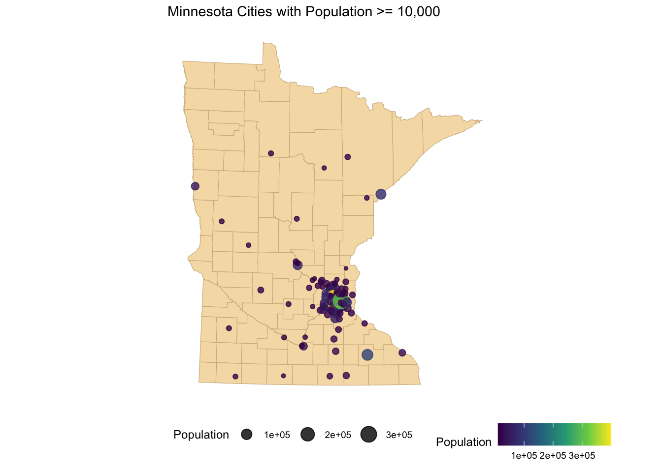
If you have areal data, you’ll need shapefiles with boundaries for those polygons. City, state, or federal governments often provide these. We can read them into R with st_read() in the sf package. Once we have that stored object, we can view shapefile metadata using the st_geometry_type(), st_crs(), and st_bbox(). These tell you about the type of geometry stored about the shapes, the CRS, and the bounding box that determines the study area of interest.
#read in shapefile information
shapefile <- st_read(shapefile)
If we have data that are points that we will aggregate to a polygon level, then we could use code such as the one below to join together the summaries at an average longitude and latitude coordinate with the shapefiles by whether the longitude and latitude intersect with the polygon.
#join the shapefile and our data summaries with a common polygon I.D. variable
fulldat <- left_join(shapefile, dat)
hex_growth <- hex_spatial %>%
mutate(name = str_replace(google_name,' \\(United States\\)',''),
abbr = iso3166_2) %>%
left_join(pop_growth, by = 'name')If we have data that are points that we will aggregate to a polygon level, then we could use code such as the one below to join together the summaries at an average longitude and latitude coordinate with the shapefiles by whether the longitude and latitude intersect with the polygon.
# make our data frame a spatial data frame
dat <- st_as_sf(originaldatsum, coords = c('Longitude','Latitude'))
#copy the coordinate reference info from the shapefile onto our new data frame
st_crs(dat) <- st_crs(shapefile)

#join the shapefile and our data summaries
fulldat <- st_join(shapefile, dat, join = st_intersects)
If you are working with U.S. counties, states, or global countries, the shapefiles are already available in the map package. You’ll need to use the I.D. variable to join this data with your polygon-level data.
Once we have an sf object with attributes (variables) and geometry (polygons), we can use geom_sf(aes(fill = attribute)) to plot and color the polygons in the ggplot2 context with respect to an outcome variable.
hex_growth%>%  # start with sf object
  filter(year == 2020) %>% #filter to focus on data from 2020
  ggplot() +
  geom_sf(aes(fill = percent_change_in_resident_population)) + # plot the sf geometry (polygons) and fill color according to percent change in population
  geom_sf_text( aes(label = abbr), color = 'white') + # add text labels to the sf geometry regions using abbr for the text
  labs(fill = 'Population Change (%)') + # Change legend label
  ggthemes::theme_map() + theme(legend.position = 'bottom', legend.justification = 'right') # remove the background theme and move the legend to the bottom right
Warning in st_point_on_surface.sfc(sf::st_zm(x)): st_point_on_surface may not
give correct results for longitude/latitude data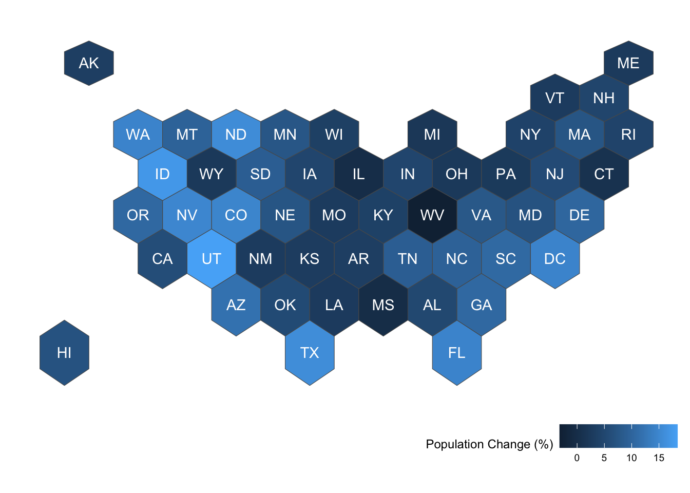
# install.packages('devtools')
# devtools::install_github("UrbanInstitute/urbnmapr")
library(urbnmapr) # projection with Alaska and Hawaii close to lower 48 states
get_urbn_map(map = "counties", sf = TRUE) %>%
    left_join(countydata) %>%
    ggplot() + geom_sf(aes(fill = horate), color = 'white',linewidth = 0.01) +
    labs(fill = 'Homeownership Rate') +
    scale_fill_gradient(high='white',low = 'darkblue',limits=c(0.25,0.85)) +
    theme_void()
Joining with `by = join_by(county_fips)`
old-style crs object detected; please recreate object with a recent
sf::st_crs()Warning in CPL_crs_from_input(x): GDAL Message 1: CRS EPSG:2163 is deprecated.
Its non-deprecated replacement EPSG:9311 will be used instead. To use the
original CRS, set the OSR_USE_NON_DEPRECATED configuration option to NO.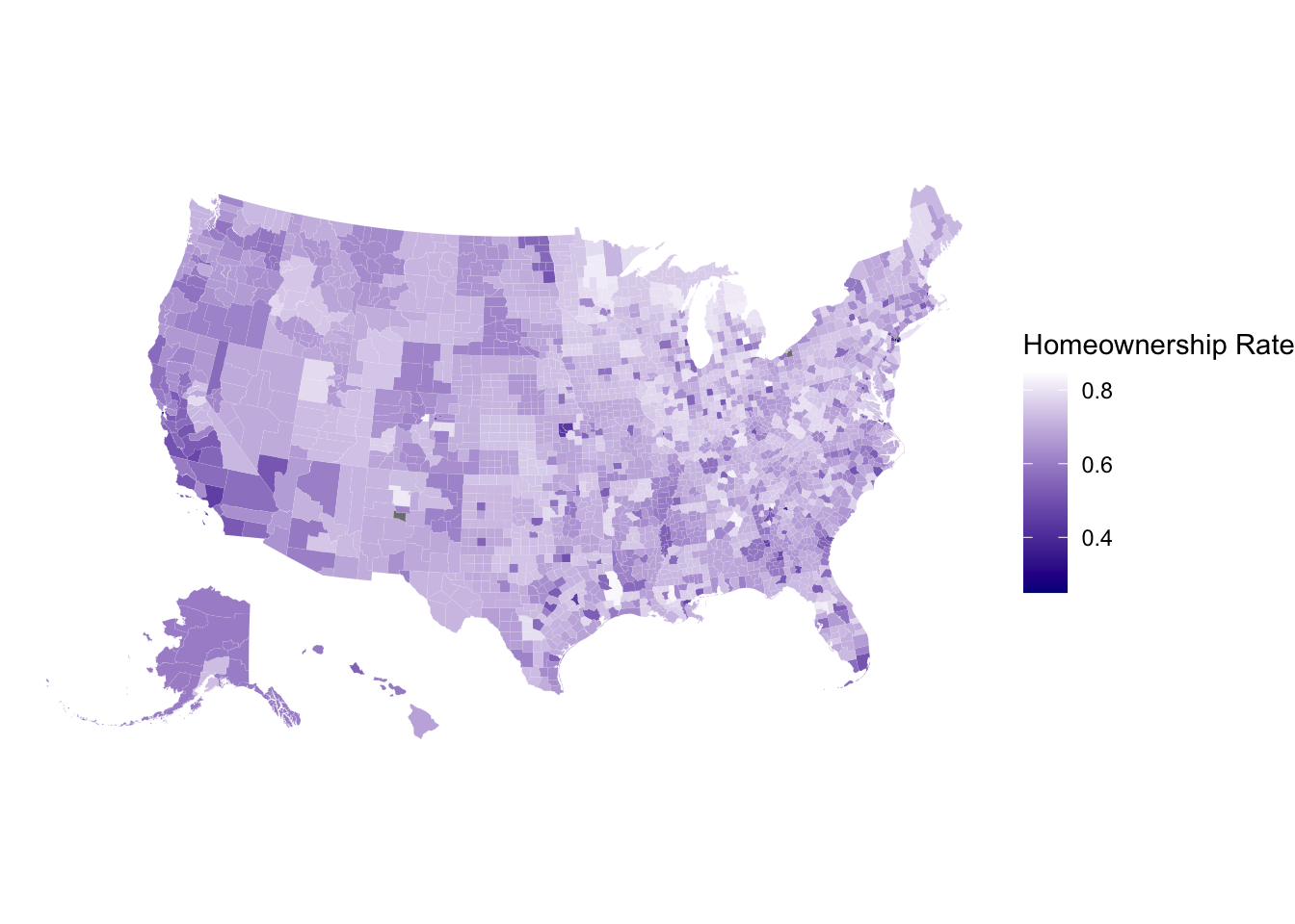
# Subset to M.N.
get_urbn_map(map = "counties", sf = TRUE) %>%
    left_join(countydata) %>%
    filter(stringr::str_detect(state_abbv,'MN')) %>%
    ggplot() + geom_sf(aes(fill = horate), color = 'white',linewidth = 0.05) +
    labs(fill = 'Homeownership Rate') +
    coord_sf(crs=26915) +
  scale_fill_gradient(high='white',low = 'darkblue',limits=c(0.25,0.85)) +
  theme_void()
Joining with `by = join_by(county_fips)`
old-style crs object detected; please recreate object with a recent
sf::st_crs()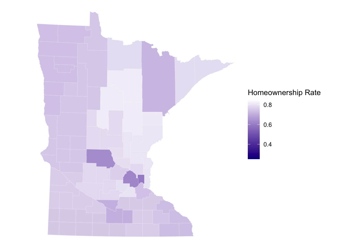
To include raster images in the visualization, we need to obtain/load raster data. Below shows code to get the elevation raster image for MN.
Then we need to convert the raster to a data.frame to plot using geom_raster as an additional layer to ggplot().
elevation <- elevatr::get_elev_raster(mn_counties, z = 5, clip = 'bbox')Mosaicing & ProjectingClipping DEM to bboxNote: Elevation units are in meters.raster::crs(elevation) <- sf::st_crs(mn_counties)
# Convert to Data Frame for plotting
elev_df <- elevation %>% terra::as.data.frame(xy = TRUE)
names(elev_df) <-c('x','y','value')
ggplot() +
geom_raster(data = elev_df, aes(x = x,y = y,fill = value)) + # adding the elevation as first (bottom) layer
geom_sf(data = mn_counties, fill = NA, color = "black") +
geom_sf(data = mn_cities %>% filter(Population >= 10000), mapping = aes(color = Population,size = Population), alpha = 0.8)+ #cities layer
scale_color_viridis_c() + #continuous (gradient) color scale
scale_fill_gradient(low = 'darkgreen',high = 'white', guide = FALSE) +
labs(title = "Minnesota Cities with Population >= 10,000") +
ggthemes::theme_map() + theme(legend.position = "bottom") #move legendWarning: The `guide` argument in `scale_*()` cannot be `FALSE`. This was deprecated in
ggplot2 3.3.4.
ℹ Please use "none" instead.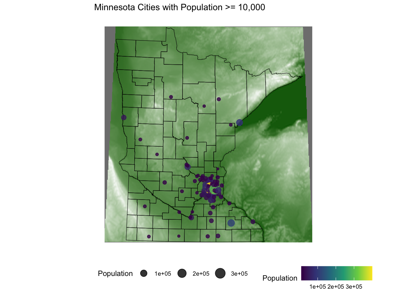
To demonstrate multiple layers on one visualization, let’s zoom into the Twin Cities and add waterways and rivers.
Seven_countyarea <- st_bbox(mn_counties %>% filter(name %in% c("Anoka", "Hennepin", "Ramsey", "Dakota", "Carver", "Washington", "Scott")))


elevation <- elevatr::get_elev_raster(mn_counties %>% st_crop(Seven_countyarea), z = 9, clip = 'bbox')
Warning: attribute variables are assumed to be spatially constant throughout
all geometriesMosaicing & ProjectingClipping DEM to bboxNote: Elevation units are in meters.raster::crs(elevation) <- sf::st_crs(mn_counties)
#Convert to Data Frame for plotting
elev_df <- elevation %>% terra::as.data.frame(xy = TRUE)
names(elev_df) <-c('x','y','value')
ggplot() +
geom_raster(data = elev_df, aes(x = x,y = y,fill = value)) +
geom_sf(data = mn_counties, fill = NA, color = "black") + # county boundary layer
geom_sf(data = mn_water, fill = 'lightsteelblue1',color = 'lightsteelblue1') + # added a river/lake layer
geom_sf(data = mn_cities %>% filter(Population >= 10000), mapping = aes(color = Population,size = Population)) + #cities layer
coord_sf(xlim = Seven_countyarea[c(1,3)],ylim = Seven_countyarea[c(2,4)]) + # crop map to coordinates of seven county area
scale_color_viridis_c(option = 'magma') + #continuous (gradient) color scale
scale_fill_gradient(low = 'darkgreen',high = 'white') + #continuous (gradient) fill scale
labs(title = "Twin Cities with Population >= 10,000") +
ggthemes::theme_map() + theme(legend.position = "none") #remove legend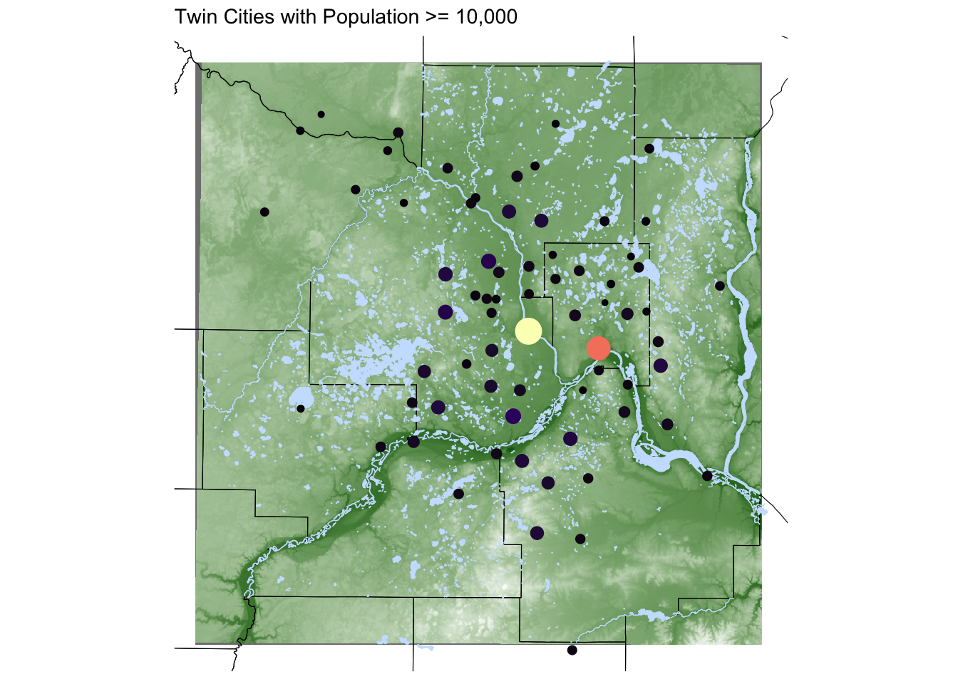
A point pattern/process data set gives the locations of objects/events occurring in a study region. These points could represent trees, animal nests, earthquake epicenters, crimes, cases of influenza, galaxies, etc. We assume that a point’s occurrence or non-occurrence at a location is random.
The observed points may have extra information called marks attached to them. These marks represent an attribute or characteristic of the point. These could be categorical or continuous.
The underlying probability model we assume determines the number of events in a small area will be a Poisson model with parameter \(\lambda(s)\), the intensity in a fixed area. This intensity may be constant (uniform) across locations or vary from location to location (inhomogeneous).
For a homogeneous Poisson process, we model the number of points in any region \(A\), \(N(A)\), to be Poisson with
\[E(N(A)) = \lambda\cdot\text{Area}(A)\]
such that \(\lambda\) is constant across space. Given \(N(A) = n\), the \(N\) events form an iid sample from the uniform distribution on \(A\). Under this model, for any two disjoint regions \(A\) and \(B\), the random variables \(N(A)\) and \(N(B)\) are independent.
If we observe \(n\) events in a region \(A\), the estimator \(\hat{\lambda} = n/\text{Area(A)}\) is unbiased if the model is correct.
This homogeneous Poisson model is known as complete spatial randomness (CSR). If points deviate from it, we might be able to detect this with a hypothesis test. We’ll return to this when we discuss distances to neighbors.
To simulate data from a CSR process in a square [0,1]x[0,1], we could
n <- rpois(1, lambda = 50)x <- runif(n,0,1)
y <- runif(n,0,1)
plot(x,y)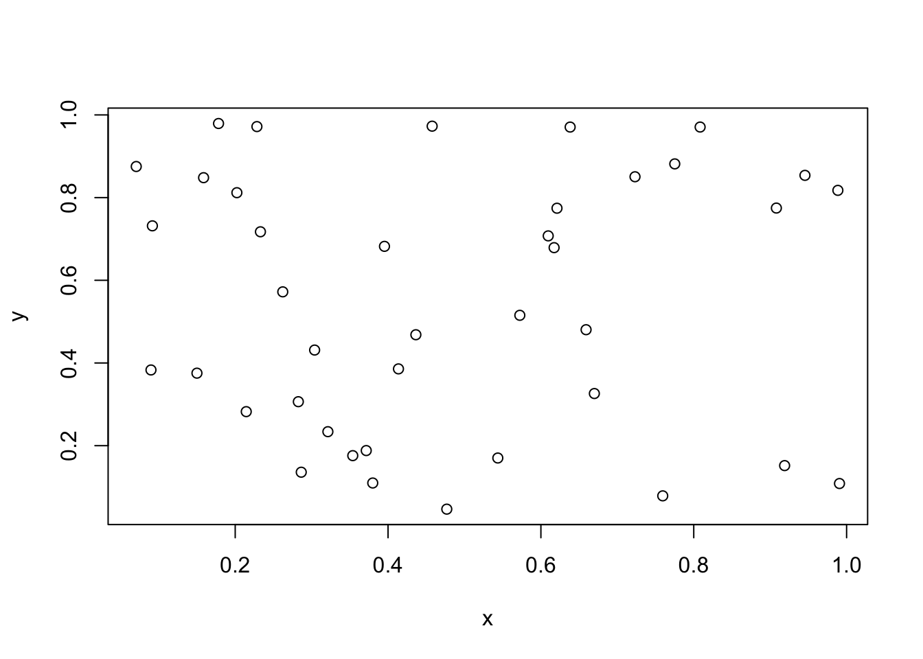
rpoispp.sim1 <- rpoispp(lambda = 50)
plot(sim1)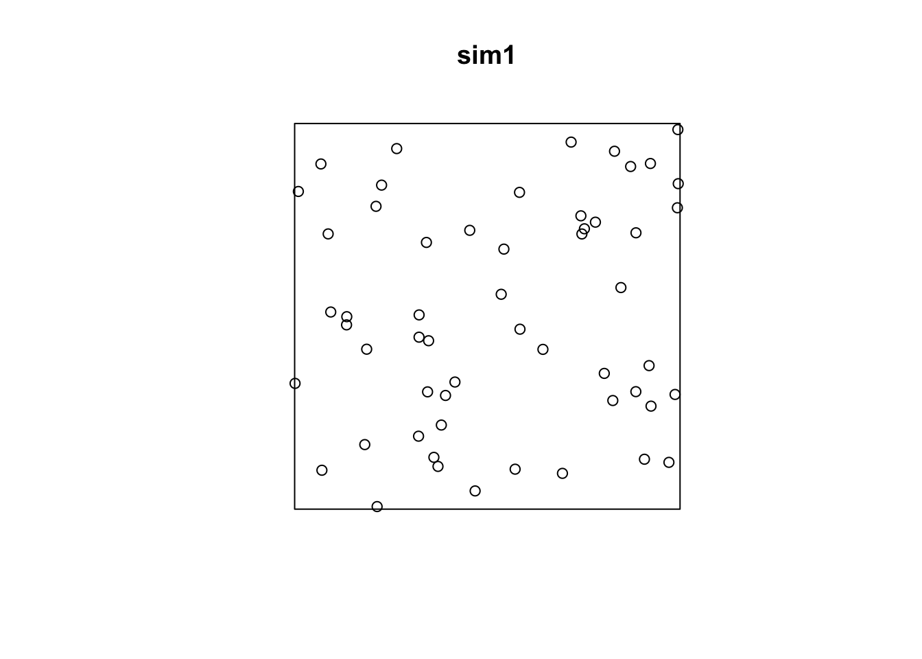
If the intensity is not constant across space (inhomogeneous Poisson process), then we define intensity as
\[\lambda(s) = \lim_{|ds|\rightarrow 0} \frac{E(N(ds))}{|ds|}\]
where \(ds\) is a small area element and \(N(A)\) has a Poisson distribution with mean
\[\mu(A) = \int_A \lambda(s)ds\]
When working with point process data, we generally want to estimate and/or model \(\lambda(s)\) in a region \(A\) and determine if \(\lambda(s) = \lambda\) for \(s\in A\).
One way to estimate the intensity \(\lambda(s)\) requires dividing the study area into sub-regions (also known as quadrats). Then, the estimated density is computed for each quadrat by dividing the number of points in each quadrat by the quadrat’s area. Quadrats can take on many shapes, such as hexagons and triangles or the typically square quadrats.
If the points have uniform/constant intensity (CSR), the quadrat counts should be Poisson random numbers with constant mean. Using a \(\chi^2\) goodness-of-fit test statistic, we can test \(H_0:\) CSR,
plot(quadratcount(bei, nx=4, ny=4))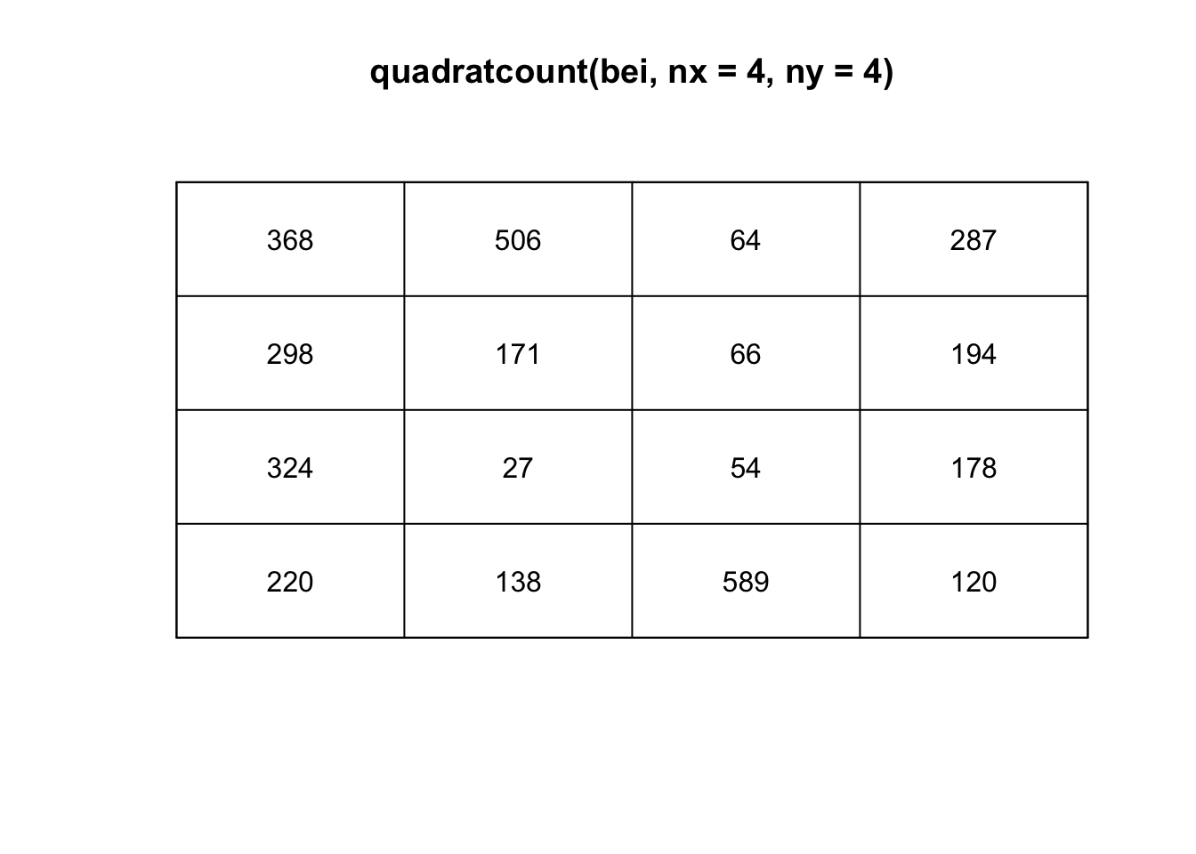
(T <- quadrat.test(bei, nx=4, ny=4))
    Chi-squared test of CSR using quadrat counts

data:  bei
X2 = 1754.6, df = 15, p-value < 2.2e-16
alternative hypothesis: two.sided

Quadrats: 4 by 4 grid of tilesplot(bei)
plot(T, add=TRUE)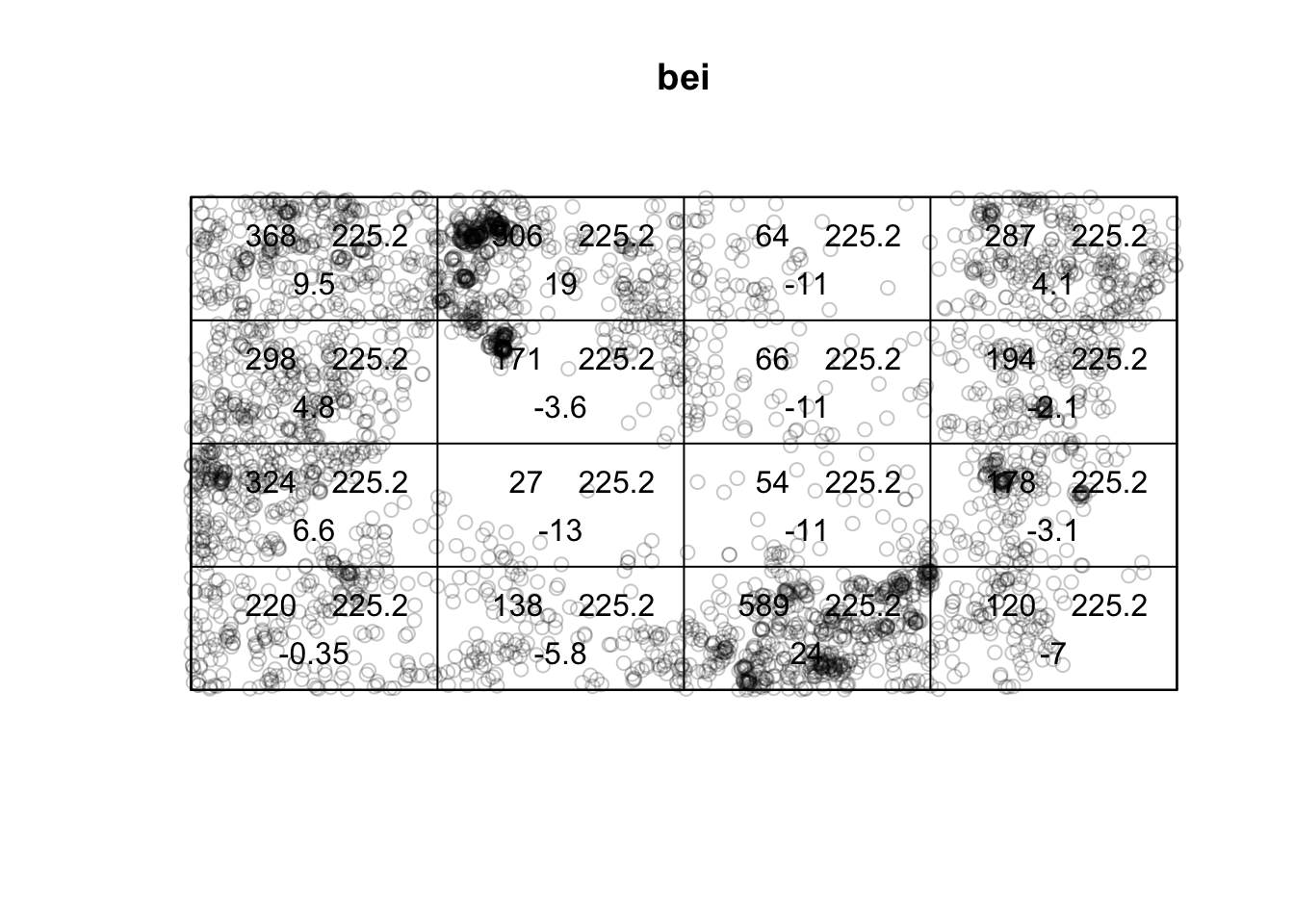
The choice of quadrat numbers and shape can influence the estimated density and must be chosen carefully. If the quadrats are too small, you risk having many quadrats with no points, which may prove uninformative (and can cause issues if you are trying to run a \(\chi^2\) test). If very large quadrat sizes are used, you risk missing subtle changes in spatial density.
You should wonder why if the density is not uniform across the space. Is there a covariate (characteristic of the space that could be collected at every point in space) that could help explain the difference in the intensity? For example, perhaps the elevation of an area could be impacting the intensity of trees that thrive in the area. Or there could be a west/east or north/south pattern such that the longitude or latitude impacts the intensity.
If there is a covariate, we can convert the covariate across the continuous spatial field into discretized areas. We can then plot the relationship between the estimated point density within the quadrat and the covariate regions to assess any dependence between variables. If there is a clear relationship, the covariate levels can define new sub-regions within which the density can be computed. This is the idea of normalizing data by some underlying covariate.
The quadrat analysis approach has its advantages in that it is easy to compute and interpret; however, it does suffer from the modifiable areal unit problem (MAUP) as the relationship observed can change depending on the size and shape of the quadrats chosen. Another density-based approach that will be explored next (less susceptible to the MAUP) is the kernel density estimation process.
The kernel density approach is an extension of the quadrat method. Like the quadrat density, the kernel approach computes a localized density for subsets of the study area. Still, unlike its quadrat density counterpart, the sub-regions overlap, providing a moving sub-region window. A kernel defines this moving window. The kernel density approach generates a grid of density values whose cell size is smaller than the kernel window’s. Each cell is assigned the density value computed for the kernel window centered on that cell.
A kernel not only defines the shape and size of the window, but it can also weight the points following a well-defined kernel function. The simplest function is a basic kernel where each point in the window is assigned equal weight (uniform kernel). Some popular kernel functions assign weights to points inversely proportional to their distances to the kernel window center. A few such kernel functions follow a Gaussian or cubic distribution function. These functions tend to produce a smoother density map.
\[\hat{\lambda}_{\mathbf{H}}(\mathbf{s}) = \frac{1}{n}\sum^n_{i=1}K_{\mathbf{H}}(\mathbf{s} - \mathbf{s}_i)\]
where \(\mathbf{s}_1,...,\mathbf{s}_n\) are the locations of the observed points (typically specified by longitude and latitude),
\[K_{\mathbf{H}}(\mathbf{x}) = |\mathbf{H}|^{-1/2}K(\mathbf{H}^{-1/2}\mathbf{x})\]
\(\mathbf{H}\) is the bandwidth matrix, and \(K\) is the kernel function, typically assumed multivariate Gaussian. Still, it could be another symmetric function that decays to zero as it moves away from the center.
To incorporate covariates into kernel density estimation, we can estimate a normalized density as a function of a covariate; we notate this as \(\rho(Z(s))\) where \(Z(s)\) is a continuous spatial covariate. There are three ways to estimate this: ratio, re-weight, or transform. We will not delve into the differences between these methods but note that there is more than one way to estimate \(\rho\). This is a non-parametric way to estimate the intensity.
Below is a point pattern giving the locations of 3605 trees in a tropical rain forest.
library(spatstat)
plot(bei)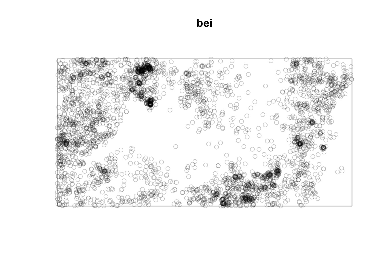
Below are two pixel images of covariates, the elevation and slope (gradient) of the elevation in the study region.
plot(bei.extra$elev)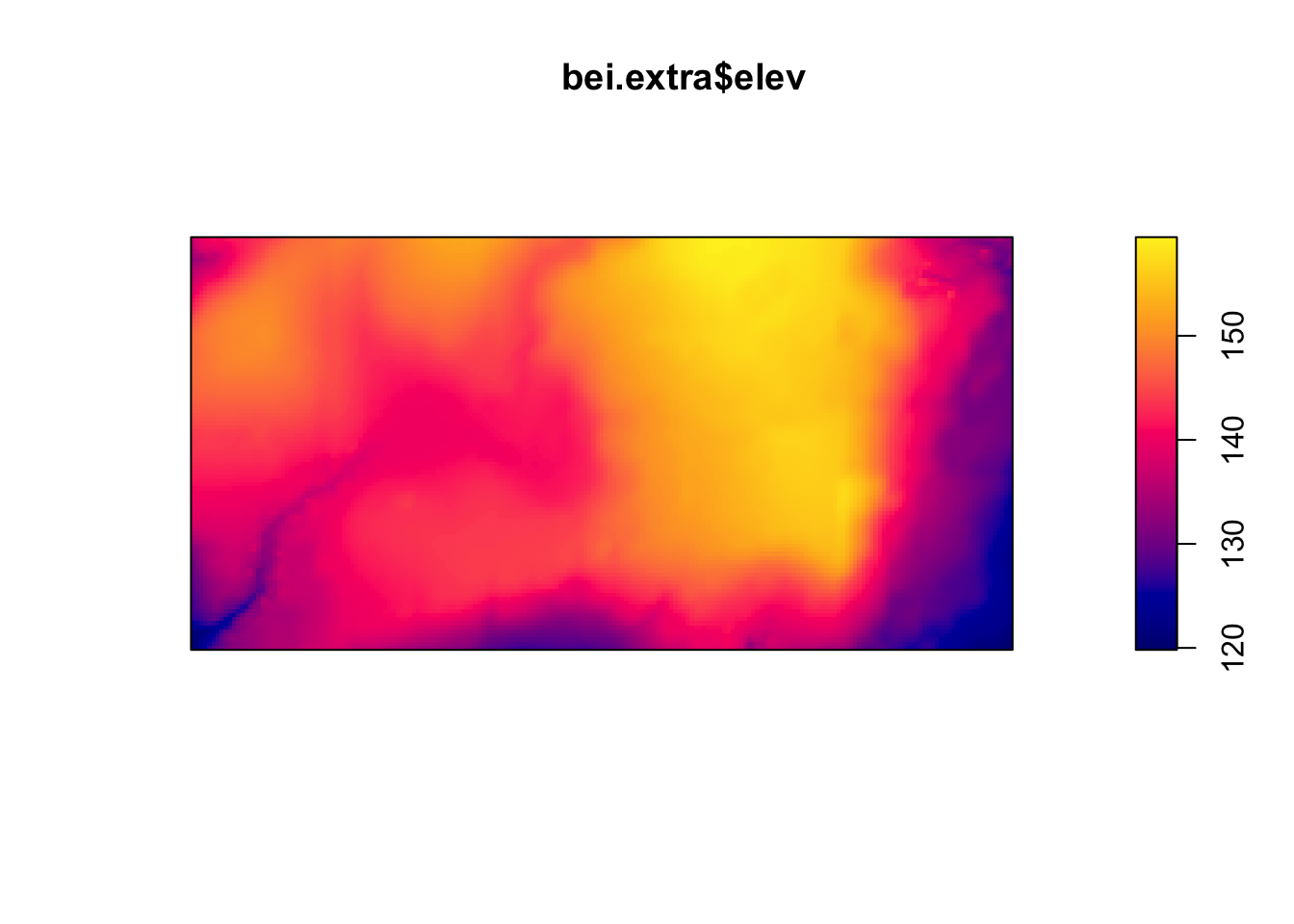
plot(bei.extra$grad)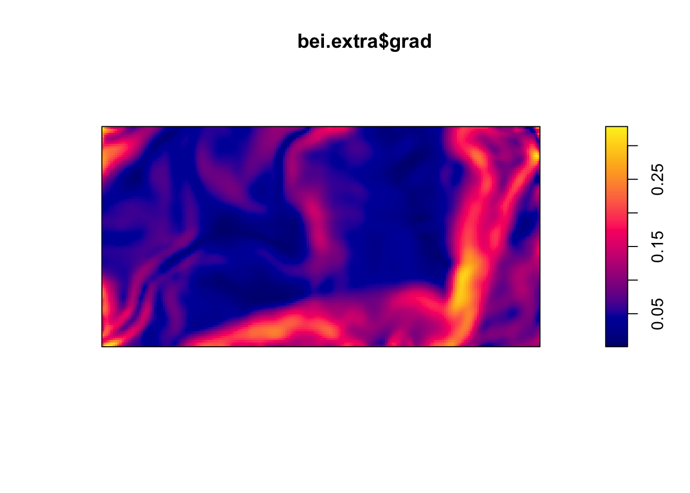
Let’s plot the points on top of the covariates to see if we can see any relationships.
plot(bei.extra$elev, main = "")
plot(bei, add = TRUE, cex = 0.3, pch = 16, cols = "white")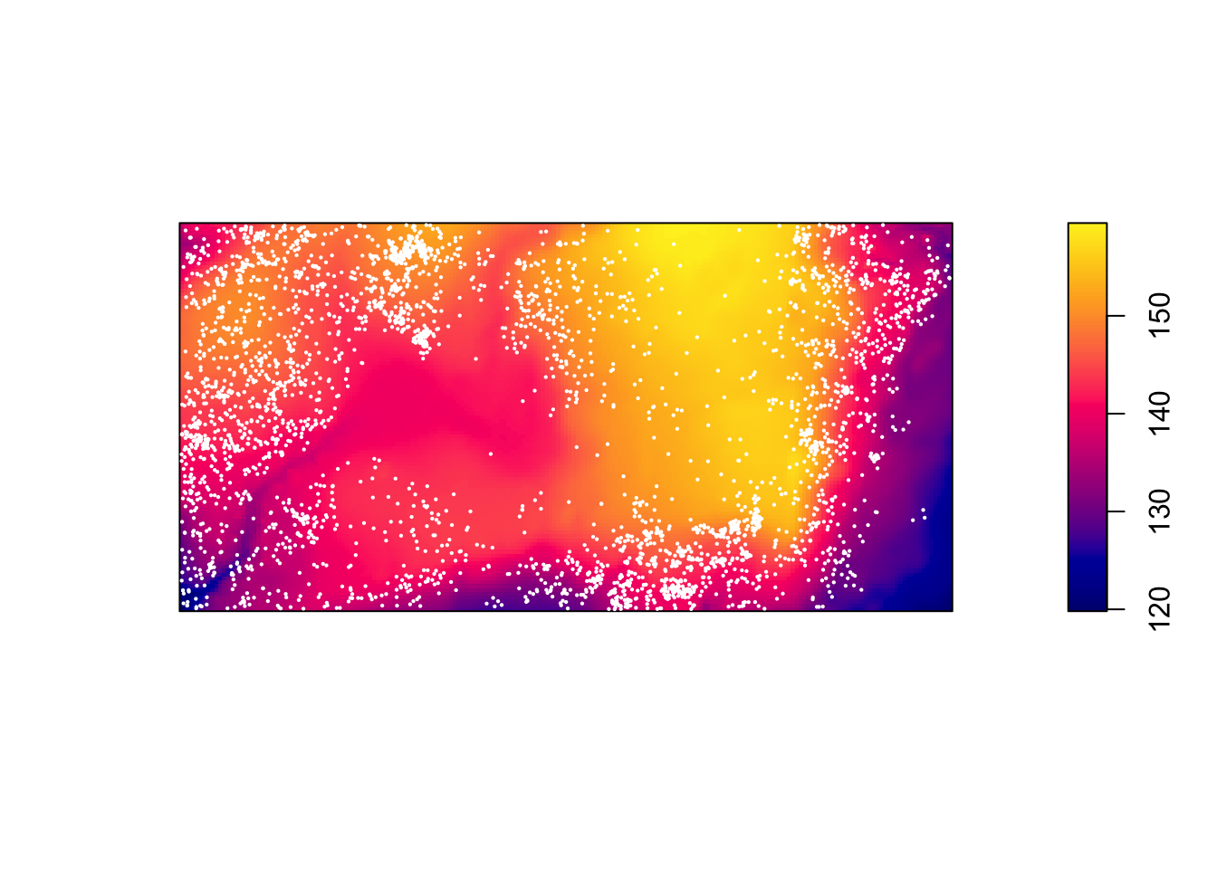
plot(bei.extra$grad, main = "")
plot(bei, add = TRUE, cex = 0.3, pch = 16, cols = "white")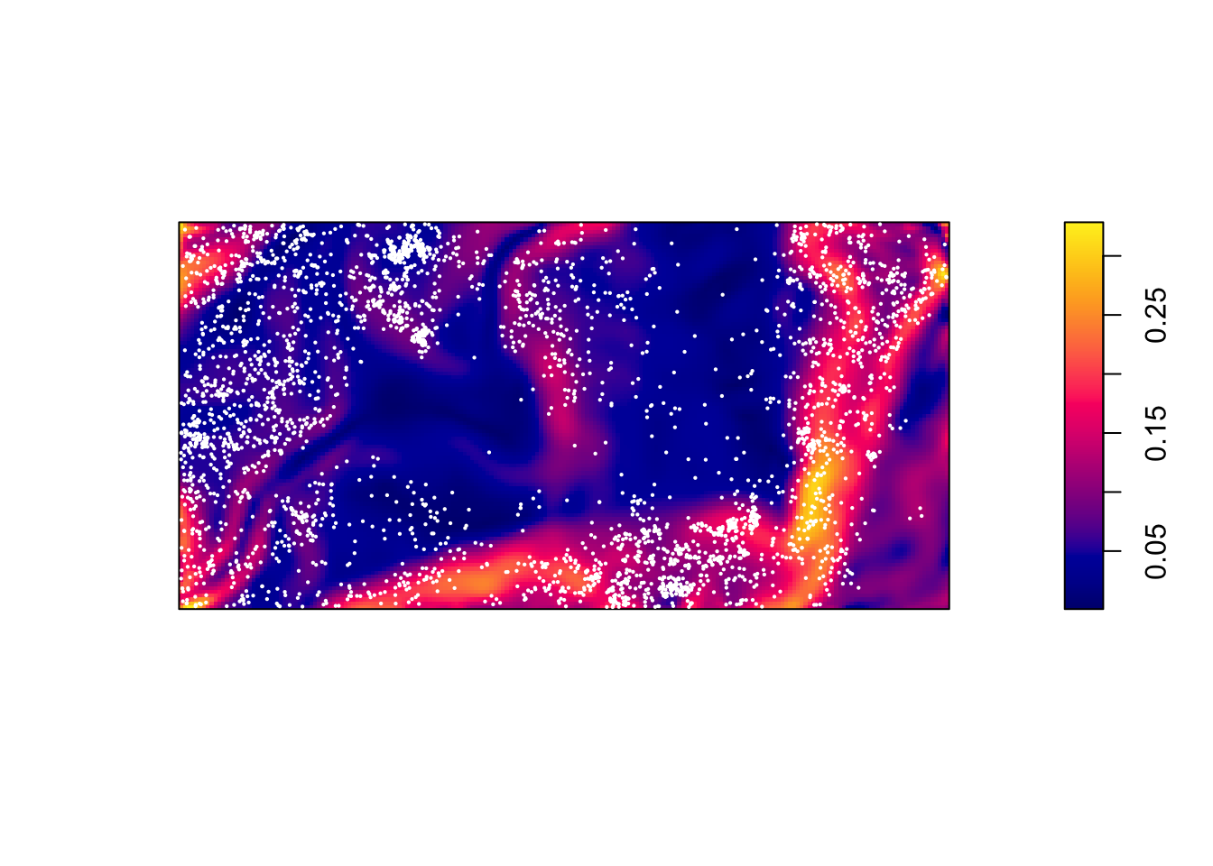
We could convert the image above of the elevation to a tesselation, count the number of points in each region using quadratcount, and plot the quadrat counts.
elev <- bei.extra$elev
Z <- cut(elev, 4, labels=c("Low", "Med-Low", "Med-High", "High"))
textureplot(Z, main = "")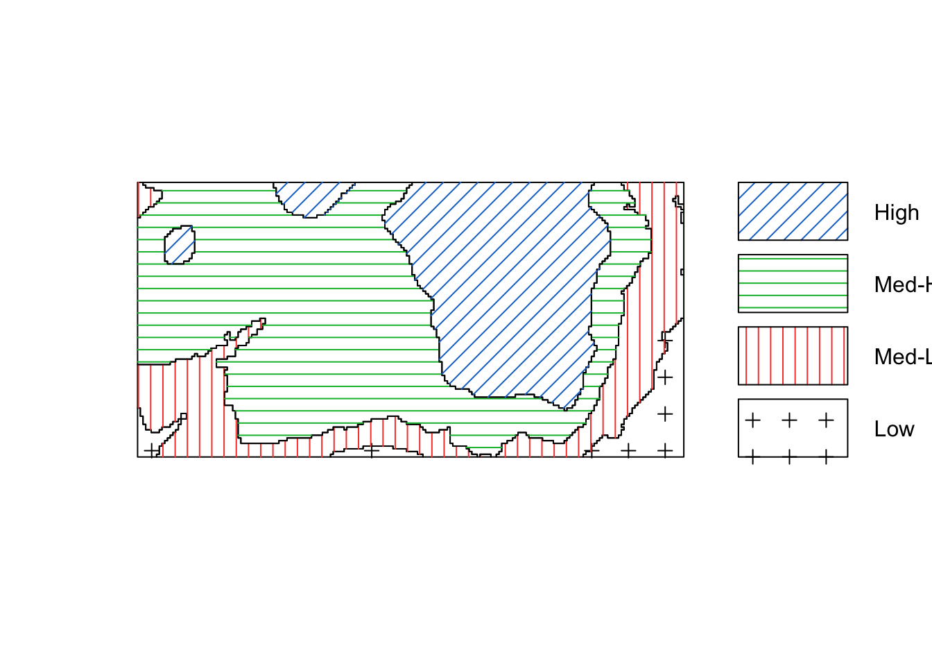
Y <- tess(image = Z)
qc <- quadratcount(bei, tess = Y)
plot(qc)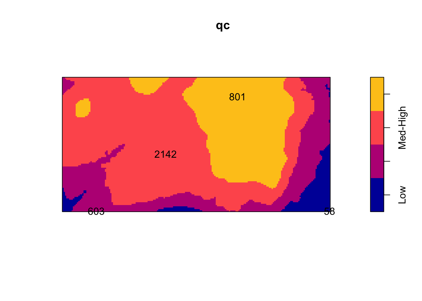
intensity(qc)tile
Low Med-Low Med-High High
0.002259007 0.006372523 0.008562862 0.005843516 Using a non-parametric kernel density estimation, we can estimate the intensity as a function of the elevation.
rh <- rhohat(bei, elev)
plot(rh)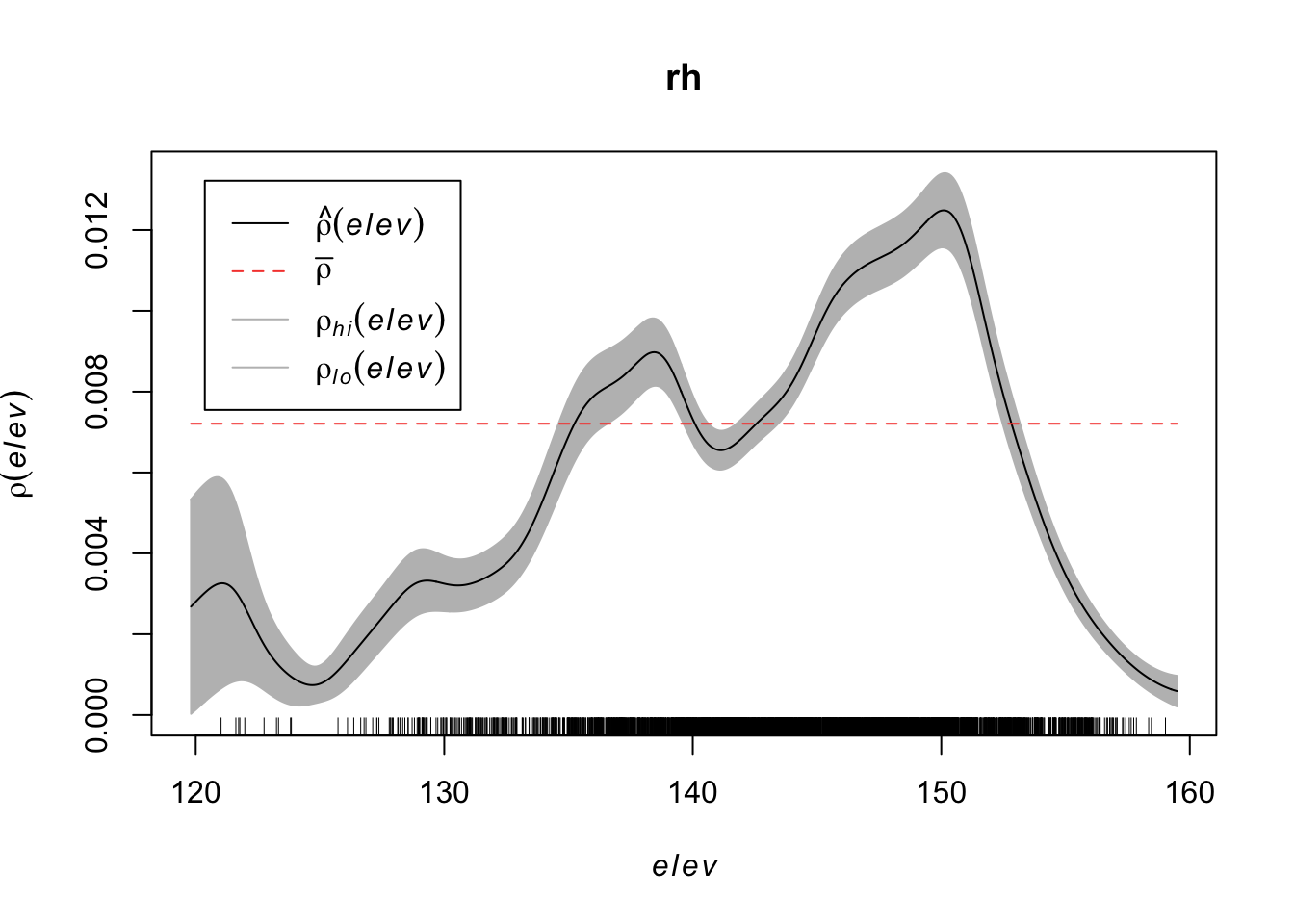
Then predict the intensity based on this function.
prh <- predict(rh)
plot(prh, main = "")
plot(bei, add = TRUE, cols = "white", cex = .2, pch = 16)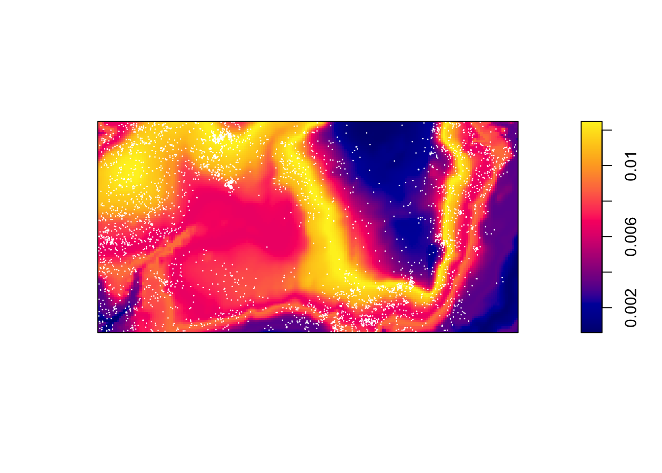
Contrast this to a simple kernel density estimate without a covariate:
dbei <- density(bei)
plot(dbei, main = "")
plot(bei, add = TRUE, cols = "white", cex = .2, pch = 16)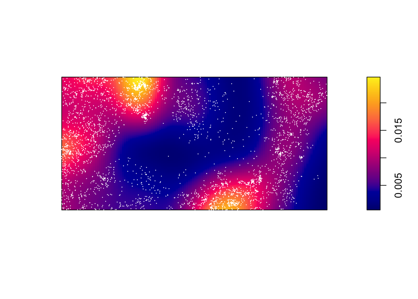
par(mfrow=c(1,2))
plot(prh, main = "With Covariate")
plot(dbei, main = "Without Covariate")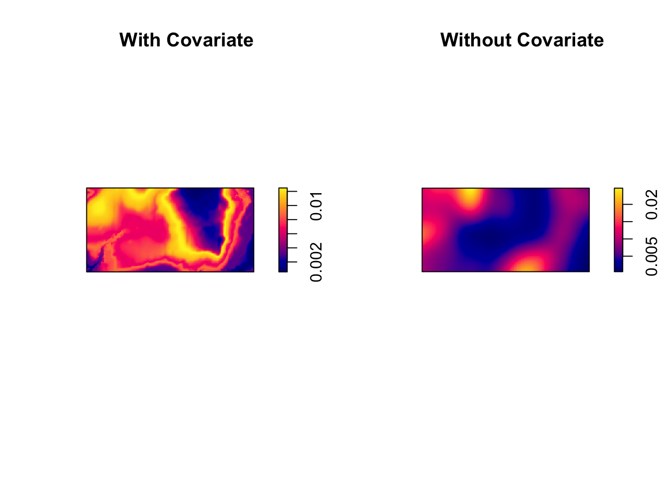
Beyond kernel density estimates, we may want to model this intensity with a parametric model. We’ll use a log-link function between the linear model and our intensity.
We assume \(log(\lambda(s)) = \beta_0\) for a uniform Poisson process.
ppm(bei ~ 1)Stationary Poisson process
Fitted to point pattern dataset 'bei'
Intensity: 0.007208
Estimate S.E. CI95.lo CI95.hi Ztest Zval
log(lambda) -4.932564 0.01665742 -4.965212 -4.899916 *** -296.1182We may think that the x coordinate linearly impacts the intensity, \(log(\lambda(s)) = \beta_0 + \beta_1 x\).
ppm(bei ~ x)Nonstationary Poisson process
Fitted to point pattern dataset 'bei'
Log intensity: ~x
Fitted trend coefficients:
(Intercept) x
-4.5577338857 -0.0008031298
Estimate S.E. CI95.lo CI95.hi Ztest
(Intercept) -4.5577338857 3.040310e-02 -4.6173228598 -4.498144912 ***
x -0.0008031298 5.863308e-05 -0.0009180485 -0.000688211 ***
Zval
(Intercept) -149.91019
x -13.69755We may think that the x and y coordinates linearly impact the intensity, \(log(\lambda(s)) = \beta_0 + \beta_1 x + \beta_2 y\).
ppm(bei ~ x + y)Nonstationary Poisson process
Fitted to point pattern dataset 'bei'
Log intensity: ~x + y
Fitted trend coefficients:
(Intercept) x y
-4.7245290274 -0.0008031288 0.0006496090
Estimate S.E. CI95.lo CI95.hi Ztest
(Intercept) -4.7245290274 4.305915e-02 -4.8089234185 -4.6401346364 ***
x -0.0008031288 5.863311e-05 -0.0009180476 -0.0006882100 ***
y 0.0006496090 1.157132e-04 0.0004228153 0.0008764027 ***
Zval
(Intercept) -109.721827
x -13.697530
y 5.613957We could use a variety of models based solely on the x and y coordinates of their location:
(mod <- ppm(bei ~ polynom(x,y,2))) #quadratic relationshipNonstationary Poisson process
Fitted to point pattern dataset 'bei'
Log intensity: ~x + y + I(x^2) + I(x * y) + I(y^2)
Fitted trend coefficients:
(Intercept) x y I(x^2) I(x * y)
-4.275762e+00 -1.609187e-03 -4.895166e-03 1.625968e-06 -2.836387e-06
I(y^2)
1.331331e-05
Estimate S.E. CI95.lo CI95.hi Ztest
(Intercept) -4.275762e+00 7.811138e-02 -4.428857e+00 -4.122666e+00 ***
x -1.609187e-03 2.440907e-04 -2.087596e-03 -1.130778e-03 ***
y -4.895166e-03 4.838993e-04 -5.843591e-03 -3.946741e-03 ***
I(x^2) 1.625968e-06 2.197200e-07 1.195325e-06 2.056611e-06 ***
I(x * y) -2.836387e-06 3.511163e-07 -3.524562e-06 -2.148212e-06 ***
I(y^2) 1.331331e-05 8.487506e-07 1.164979e-05 1.497683e-05 ***
Zval
(Intercept) -54.739290
x -6.592577
y -10.116084
I(x^2) 7.400185
I(x * y) -8.078197
I(y^2) 15.685769(mod1 <- ppm(bei ~ I( x > 50))) #thresholdNonstationary Poisson process
Fitted to point pattern dataset 'bei'
Log intensity: ~I(x > 50)
Fitted trend coefficients:
(Intercept) I(x > 50)TRUE
-4.3790111 -0.5960561
Estimate S.E. CI95.lo CI95.hi Ztest Zval
(Intercept) -4.3790111 0.05471757 -4.4862556 -4.2717666 *** -80.02935
I(x > 50)TRUE -0.5960561 0.05744408 -0.7086444 -0.4834677 *** -10.37628require(splines)Loading required package: splines(mod2 <- ppm(bei ~ bs(x) + bs(y))) #B-splineNonstationary Poisson process
Fitted to point pattern dataset 'bei'
Log intensity: ~bs(x) + bs(y)
Fitted trend coefficients:
(Intercept) bs(x)1 bs(x)2 bs(x)3 bs(y)1 bs(y)2
-3.49662617 -2.04025568 -0.23163941 -1.36342361 -1.79118390 -0.57815937
bs(y)3
-0.05630791
Estimate S.E. CI95.lo CI95.hi Ztest Zval
(Intercept) -3.49662617 0.07468060 -3.6429974 -3.35025488 *** -46.8210784
bs(x)1 -2.04025568 0.17102665 -2.3754617 -1.70504961 *** -11.9294608
bs(x)2 -0.23163941 0.12980360 -0.4860498 0.02277098 -1.7845376
bs(x)3 -1.36342361 0.10227353 -1.5638760 -1.16297118 *** -13.3311487
bs(y)1 -1.79118390 0.18113345 -2.1461989 -1.43616886 *** -9.8887526
bs(y)2 -0.57815937 0.11815893 -0.8097466 -0.34657213 *** -4.8930655
bs(y)3 -0.05630791 0.08835629 -0.2294831 0.11686724 -0.6372824plot(predict(mod))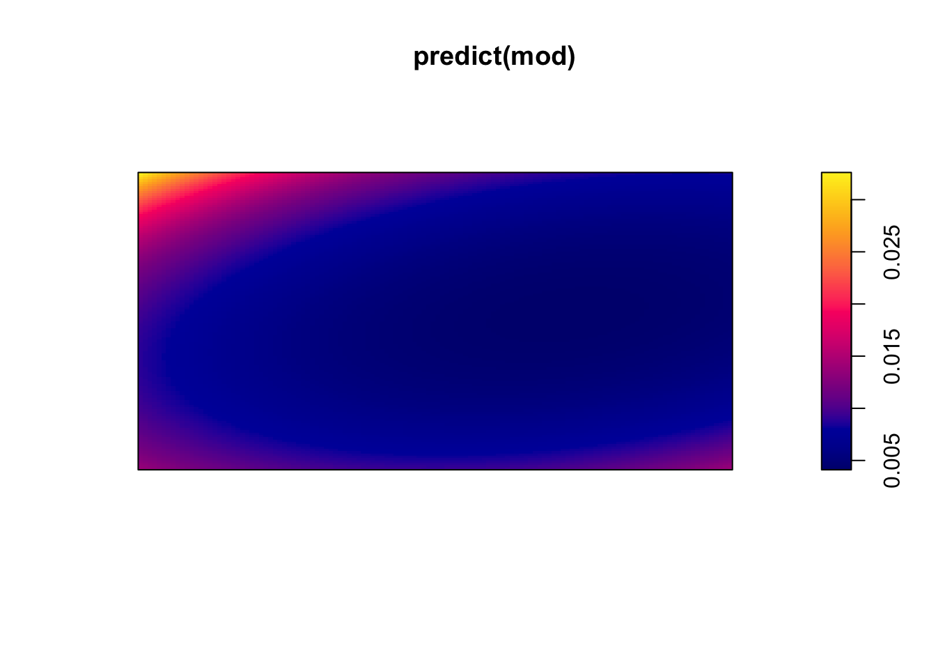
plot(predict(mod1))
plot(predict(mod2))
We can compare models using a likelihood ratio test.
hom <- ppm(bei ~ 1)

anova(hom, mod, test = 'Chi')
Analysis of Deviance Table
Model 1: ~1 Poisson
Model 2: ~x + y + I(x^2) + I(x * y) + I(y^2) Poisson
Npar Df Deviance Pr(>Chi)
1 1
2 6 5 604.15 < 2.2e-16 ***
---
Signif. codes: 0 '***' 0.001 '**' 0.01 '*' 0.05 '.' 0.1 ' ' 1Also, considering the residuals, we should see if there is a pattern where our model has errors in predicting the intensity.
diagnose.ppm(mod, which="smooth")
Model diagnostics (raw residuals)
Diagnostics available:
    smoothed residual field
range of smoothed field =  [-0.004988, 0.006086]
As we saw with the kernel density estimation, the elevation plays a role in the intensity of trees. Let’s add that to our model,
\[\log(\lambda(s)) = \beta_0 + \beta_1 Elevation(s)\]
(mod2 <- ppm(bei ~ elev))Nonstationary Poisson process
Fitted to point pattern dataset 'bei'
Log intensity: ~elev
Fitted trend coefficients:
(Intercept) elev
-5.63919077 0.00488995
Estimate S.E. CI95.lo CI95.hi Ztest Zval
(Intercept) -5.63919077 0.304565582 -6.2361283457 -5.042253203 *** -18.515522
elev 0.00488995 0.002102236 0.0007696438 0.009010256 * 2.326071diagnose.ppm(mod2, which="smooth")
Model diagnostics (raw residuals)
Diagnostics available:
    smoothed residual field
range of smoothed field = [-0.004413, 0.007798]plot(effectfun(mod2))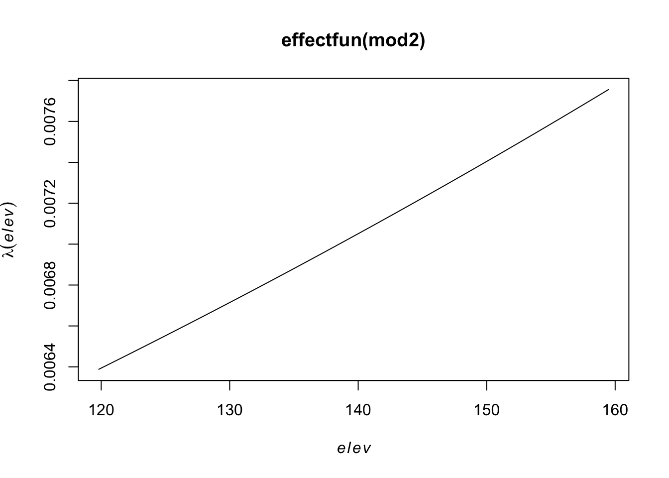
But the relationship may not be linear, so let’s try a quadratic relationship with elevation,
\[\log(\lambda(s)) = \beta_0 + \beta_1 Elevation(s)+ \beta_2 Elevation^2(s)\]
(mod2 <- ppm(bei ~ polynom(elev,2)))Nonstationary Poisson process
Fitted to point pattern dataset 'bei'
Log intensity: ~elev + I(elev^2)
Fitted trend coefficients:
(Intercept) elev I(elev^2)
-1.379706e+02 1.847007e+00 -6.396003e-03
Estimate S.E. CI95.lo CI95.hi Ztest
(Intercept) -1.379706e+02 6.7047209548 -1.511116e+02 -124.8295945 ***
elev 1.847007e+00 0.0927883205 1.665145e+00 2.0288686 ***
I(elev^2) -6.396003e-03 0.0003207726 -7.024705e-03 -0.0057673 ***
Zval
(Intercept) -20.57813
elev 19.90560
I(elev^2) -19.93937diagnose.ppm(mod2, which="smooth")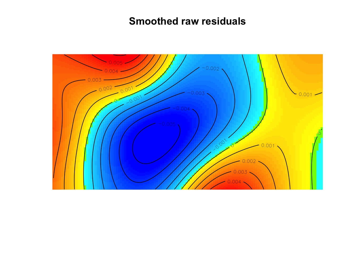
Model diagnostics (raw residuals)
Diagnostics available:
    smoothed residual field
range of smoothed field = [-0.005641, 0.006091]plot(effectfun(mod2))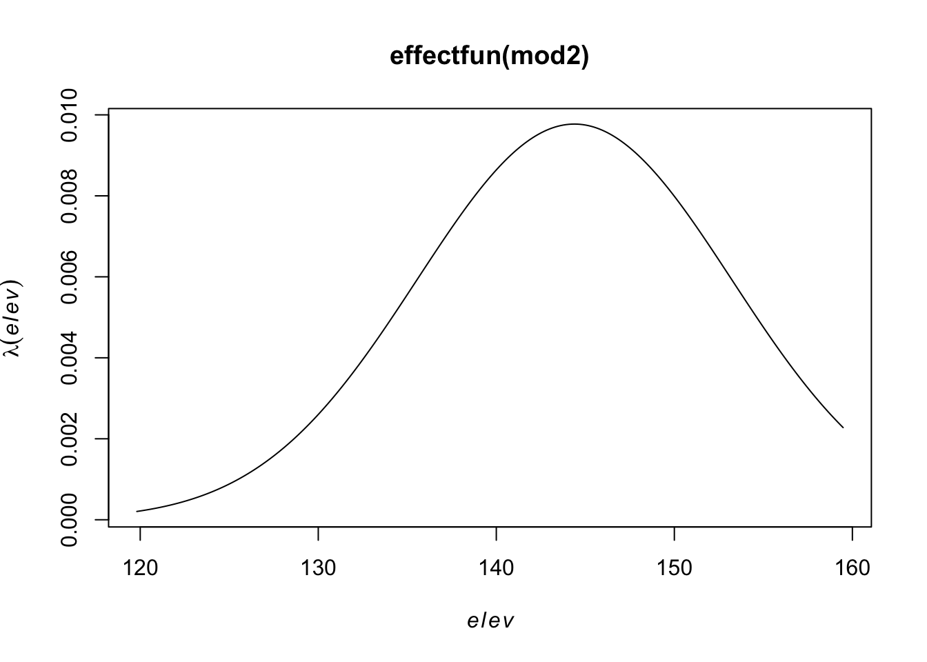
Classical tests about the interaction effects between points are based on derived distances.
pairdist)pairdist(bei)[1:10,1:10] #distance matrix for each pair of points [,1] [,2] [,3] [,4] [,5] [,6]
[1,] 0.0000 1025.97671 1008.73600 1012.76608 969.054054 964.316302
[2,] 1025.9767 0.00000 19.03786 13.26084 56.922755 61.762205
[3,] 1008.7360 19.03786 0.00000 10.01249 40.429692 45.845065
[4,] 1012.7661 13.26084 10.01249 0.00000 43.729281 48.509381
[5,] 969.0541 56.92275 40.42969 43.72928 0.000000 5.920304
[6,] 964.3163 61.76221 45.84507 48.50938 5.920304 0.000000
[7,] 973.0970 54.02814 40.31724 40.88239 11.601724 11.412712
[8,] 959.1238 71.28324 59.21976 58.54955 26.109385 21.202123
[9,] 961.3980 73.63457 63.88153 61.61980 35.327751 31.005806
[10,] 928.8108 158.87769 154.57400 149.57837 128.720472 123.704850
[,7] [,8] [,9] [,10]
[1,] 973.09701 959.12378 961.39801 928.81077
[2,] 54.02814 71.28324 73.63457 158.87769
[3,] 40.31724 59.21976 63.88153 154.57400
[4,] 40.88239 58.54955 61.61980 149.57837
[5,] 11.60172 26.10939 35.32775 128.72047
[6,] 11.41271 21.20212 31.00581 123.70485
[7,] 0.00000 19.34580 26.45695 120.34168
[8,] 19.34580 0.00000 10.50952 102.61822
[9,] 26.45695 10.50952 0.00000 93.90575
[10,] 120.34168 102.61822 93.90575 0.00000nndist)mean(nndist(bei)) #average first nearest neighbor distance[1] 4.329677mean(nndist(bei,k=2)) #average second nearest neighbor distance[1] 6.473149ANN <- apply(nndist(bei, k=1:100), 2, mean) #Mean for 1,...,100 nearest neighbors
plot(ANN ~ I(1:100), type="b", main=NULL, las=1)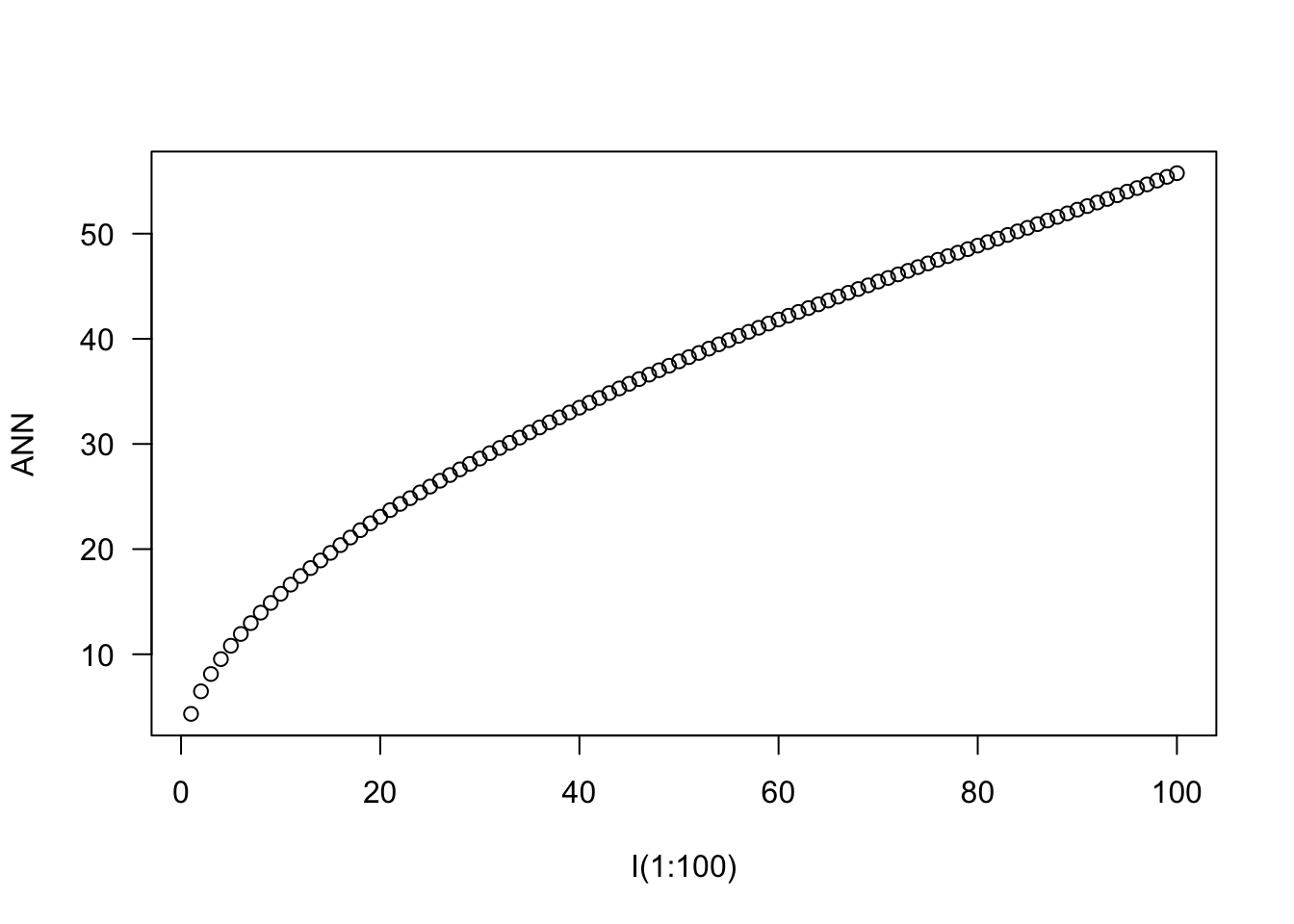
distmap)plot(distmap(bei)) #map of the distances to the nearest observed point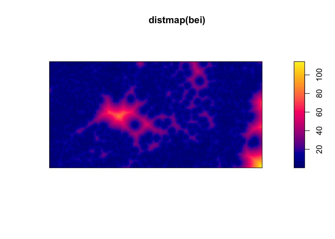
Consider the empty-space distance.
Consider the CDF,
\[F_u(r) = P(d(u) \leq r)\] \[= P(\text{ at least one point within radius }r\text{ of }u)\] \[= 1 - P(\text{ no points within radius }r\text{ of }u)\]
For a homogeneous Poisson process on \(R^2\),
\[F(r) = 1 - e^{-\lambda \pi r^2}\]
Consider the process defined on \(R^2\) and we only observe it on \(A\). The observed distances are biased relative to the “true” distances, which results in “edge effects”.
If you define a set of locations \(u_1,...,u_m\) for estimating \(F(r)\) under an assumption of statitionary, the estimator
\[\hat{F}(r) = \frac{1}{m} \sum^m_{j=1}I(d(u_j)\leq r)\]
is biased due to the edge effects.
Compare the \(\hat{F}(r)\) to the \(F(r)\) under a homogenous Poisson process.
plot(Fest(bei)) #km is kaplan meier correction, bord is the border correction (reduced sample)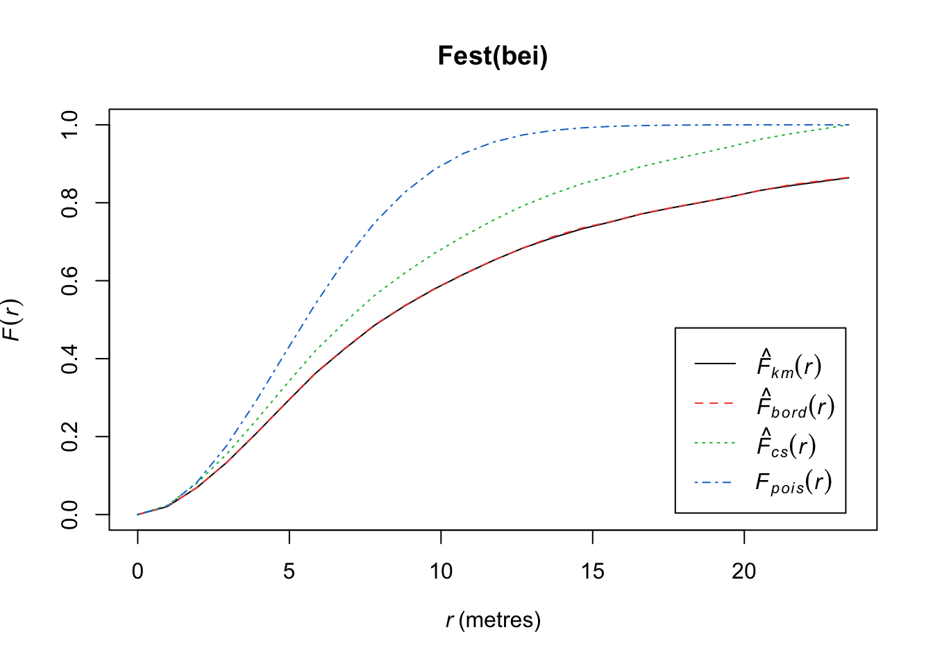
In this plot, we observe fewer short distances than expected if it were a completely random Poisson point process (\(F_{pois}\)) and thus many longer distances to observed points. Thus, more spots don’t have many points (larger distances to observed points), meaning points are more clustered than expected from a uniform distribution across the space.
Working instead with the nearest-neighbor distances from points themselves (\(t_i = \min_{j\not= i} d_{ij}\)), we define
\[G(r) = P(t_i \leq r)\] for an arbitrary observed point \(s_i\). We can estimate it using our observed $ t_i$’s.
\[\hat{G}(r) = \frac{1}{n}\sum^n_{i=1}I(t_i \leq r)\]
As before, we may or may not make an edge correction.
For a homogeneous Poisson process on \(R^2\),
\[G(r) = 1 - e^{-\lambda \pi r^2}\]
Compare the \(\hat{G}(r)\) to the \(G(r)\) under a homogenous Poisson process.
plot(Gest(bei)) 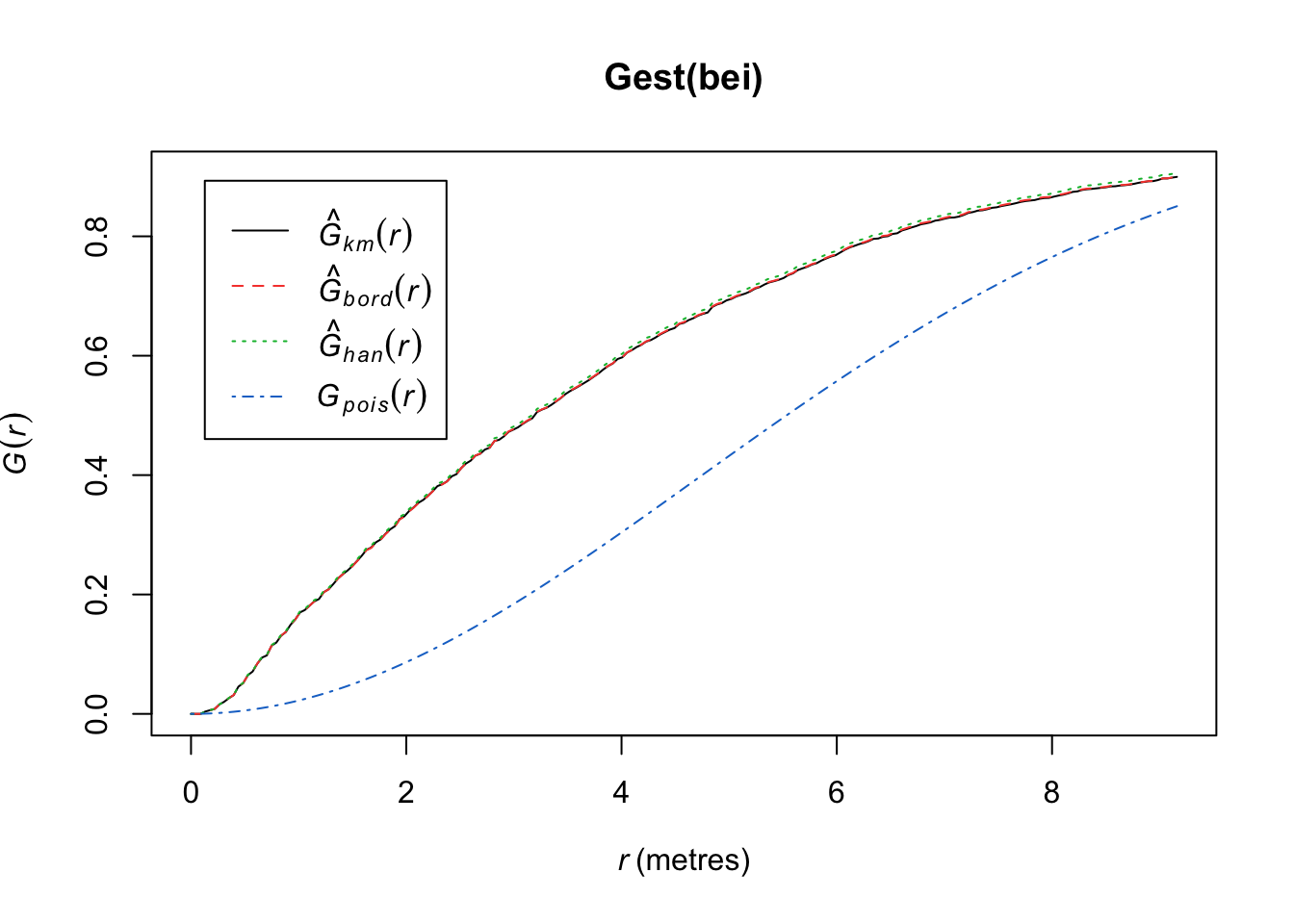
Here we observe that we see more short nearest-neighbor distances than expected if it were a completely random Poisson point process. Thus, the points are more clustered than expected from a uniform distribution across the space.
Another approach is to consider Ripley’s K function, which summarizes the distance between points. It divides the mean of the total number of points at different distance lags from each point by the area event density. In other words, it is concerned with the number of events falling within a circle of radius \(r\) of an event.
\[K(r) = \frac{1}{\lambda}E(\text{ points within distance r of an arbitrary point})\]
Under CSR (uniform intensity), we’d expect \(K(r) = \pi r^2\) because that is the area of the circle. Points that cluster more than you’d expect corresponds to \(K(r) > \pi r^2\) and spatial repulsion corresponds to \(K(r) < \pi r^2\).
Below, we have an estimate of the K function (black solid) along with the predicted K function if \(H_0\) were true (red dashed). For this set of trees, the points are more clustered than you’d expect for a homogenous Poisson process.
plot(Kest(bei))number of data points exceeds 3000 - computing border correction estimate only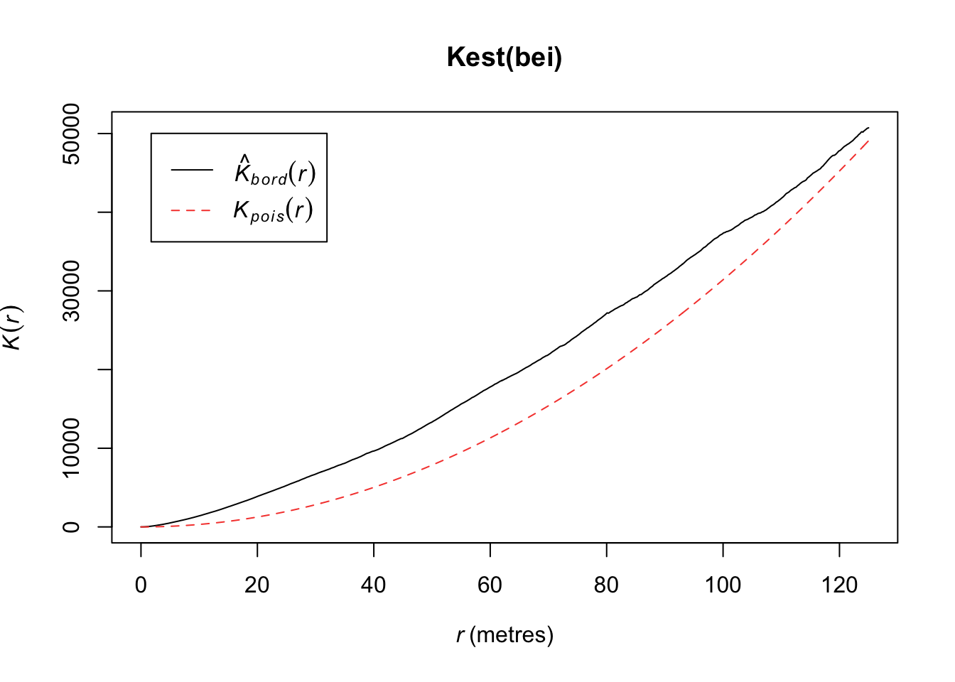
It is hard to see differences between the estimated \(K\) and expected functions. An alternative is to transform the values so that the expected values are horizontal. The transformation is calculated as follows:
\[L(r) = \sqrt{K(r)/\pi} - d\]
plot(Kest(bei),sqrt(./pi) - r ~ r)number of data points exceeds 3000 - computing border correction estimate only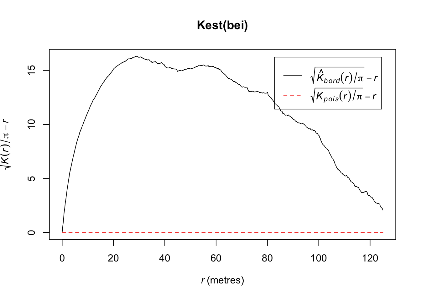
The second-order intensity function is
\[\lambda_2(s_1,s_2) = \lim_{|ds_1|,|ds_2| \rightarrow 0} \frac{E[N(ds_1)N(ds_2)]}{|ds_1||ds_2|}\]
where \(s_1 \not= s_2\). If \(\lambda(s)\) is constant and
\[\lambda_2(s_1,s_2) = \lambda_2(s_1 - s_2) =\lambda_2(s_2 - s_1)\] then we call \(N\) second-order stationary.
We can define \(g\) as the pair correlation function (PCF),
\[g(s_1,s_2) = \frac{\lambda_2(s_1,s_2)}{\lambda(s_1)\lambda(s_2)}\]
In R, if we assume stationarity and isotropy (direction of distance is not important), we can estimate \(g(r)\) where \(r = ||s_1-s_2||\). If a process has an isotropic pair correlation function, then our K function can be defined as
\[K(r) = 2\pi \int^r_0 ug(u)du, r>0\]
plot(pcf(bei))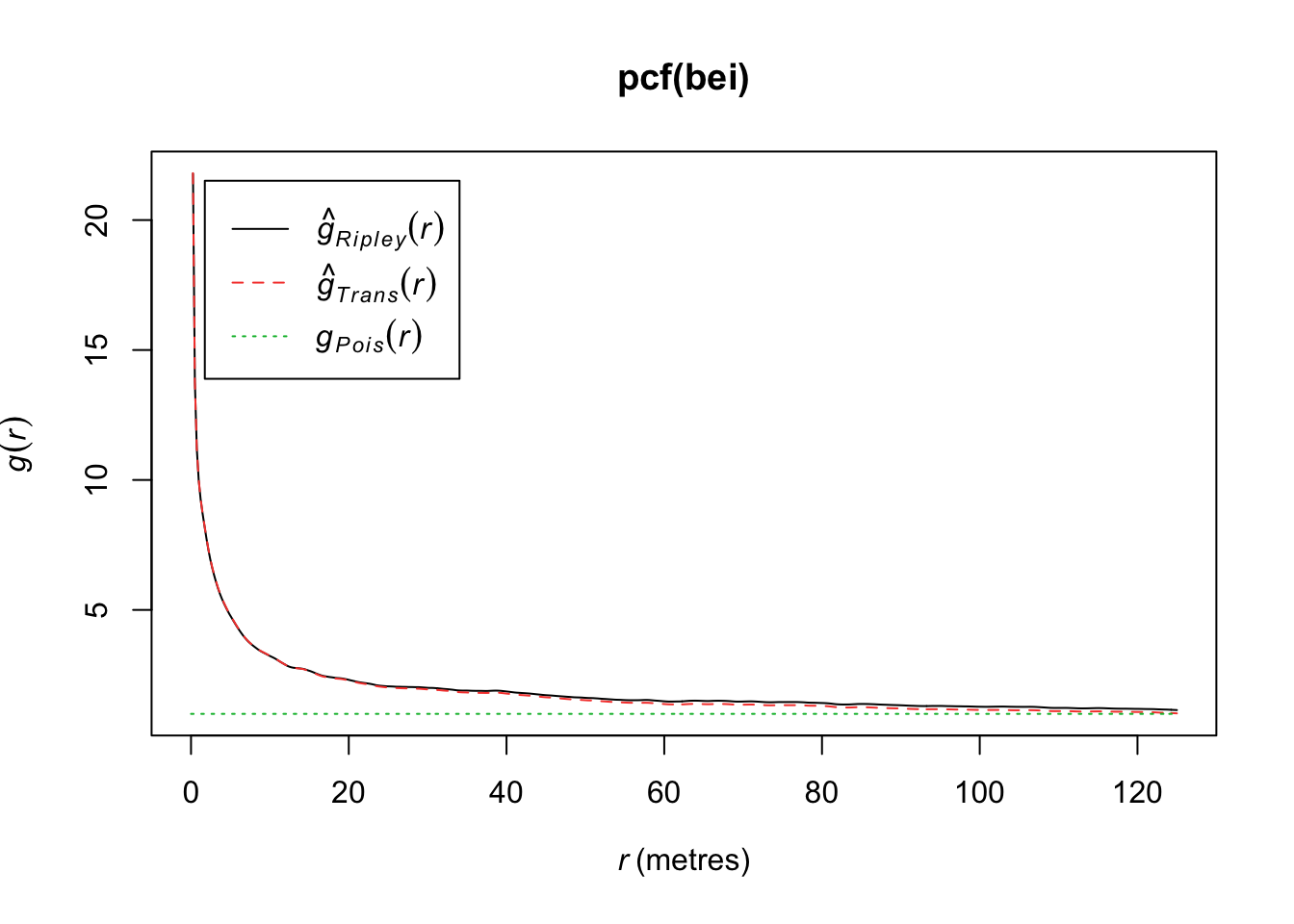
If \(g(r) = 1\), then we have a CSR process. If \(g(r)> 1\), it implies a cluster process and if \(g(r)<1\), it implies an inhibition process. In particular, if \(g(r) = 0\) for \(r_i<r\), it implies a hard core process (no point pairs within this distance).
We want to test \(H_0\): CSR (constant intensity) to understand whether points are closer or further away from each other than we’d expect with a Poisson process.
We can compare the estimated function to the theoretical for any of these 3 (4) functions, but that doesn’t tell us how far our estimate might be from the truth under random variability. So we can simulate under our null hypothesis (CSR), say \(B\) times, and for each time, we estimate the function. Then we create a single global test:
\[D_i = \max_r |\hat{H}_i(r) - H(r)|,\quad i=1,...,B\]
where \(H(r)\) is the theoretical value under CSR. Then we define \(D_{crit}\) as the \(k\)th largest among the \(D_i\). The “global” envelopes are then.
\[L(r) = H(r) - D_{crit}\] \[U(r) = H(r) + D_{crit}\]
Then the test that rejects \(\hat{H}_1\) (estimate from our observations) ever wanders outside \((L(r), U(r))\) has size \(\alpha = 1 - k/B\).
#See Example Code Below: Runs Slowly
plot(envelope(bei, Fest, global=TRUE))
Generating 99 simulations of CSR ...
1, 2, 3, 4, 5, 6, 7, 8, 9, 10, 11, 12, 13, 14, 15, 16, 17, 18, 19, 20,
21, 22, 23, 24, 25, 26, 27, 28, 29, 30, 31, 32, 33, 34, 35, 36, 37, 38, 39, 40,
41, 42, 43, 44, 45, 46, 47, 48, 49, 50, 51, 52, 53, 54, 55, 56, 57, 58, 59, 60,
61, 62, 63, 64, 65, 66, 67, 68, 69, 70, 71, 72, 73, 74, 75, 76, 77, 78, 79, 80,
81, 82, 83, 84, 85, 86, 87, 88, 89, 90, 91, 92, 93, 94, 95, 96, 97, 98,
99.
Done.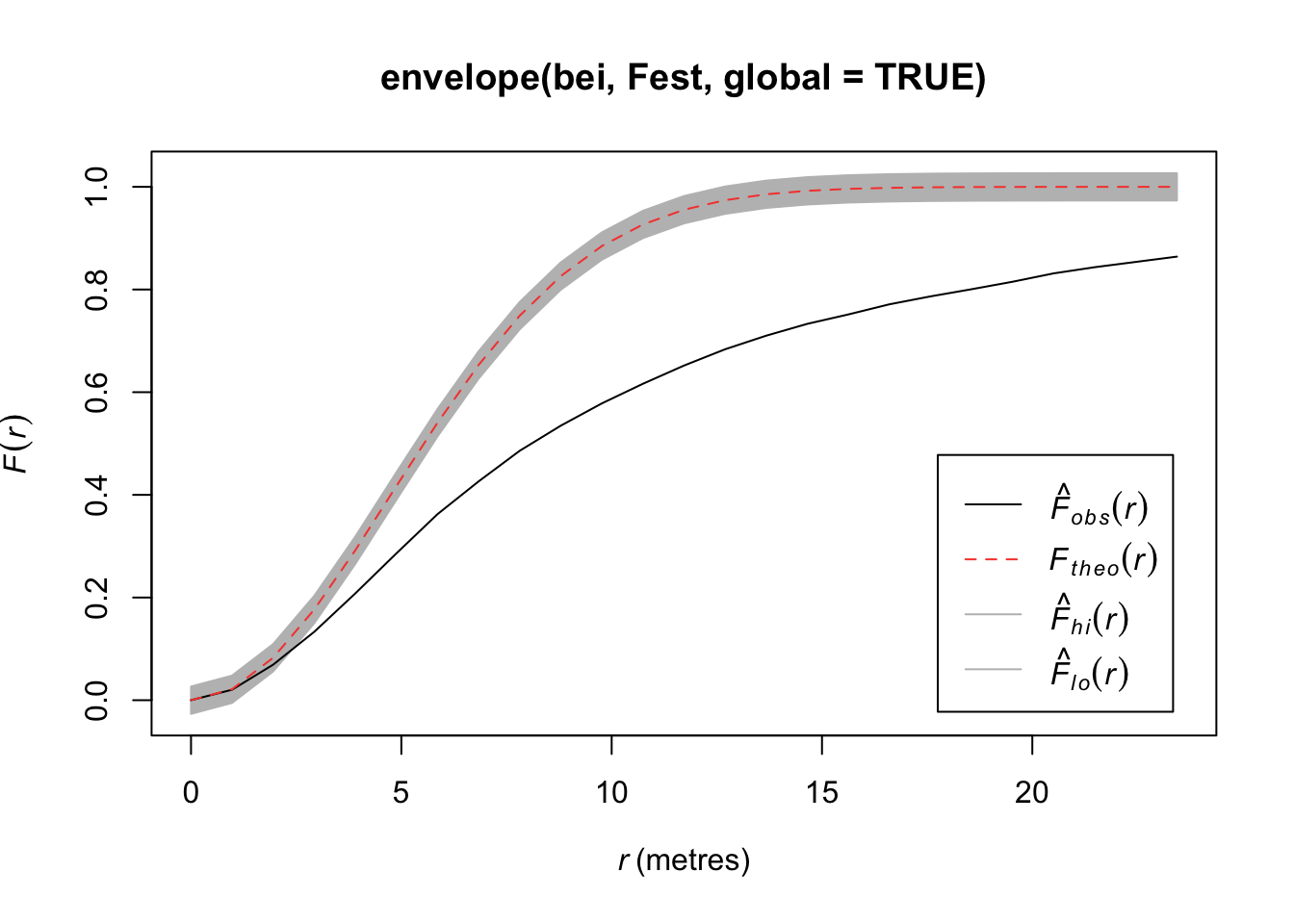
#plot(envelope(bei, Gest, global=TRUE))
#plot(envelope(bei, Kest, global=TRUE))
#plot(envelope(bei, Lest, global=TRUE))
#plot(envelope(bei, pcf, global=TRUE))A Poisson cluster process is defined by
Parent events form Poisson process with intensity \(\lambda\).
Each parent produces a random number \(M\) of children, iid for each parent according to a discrete distribution \(p_m\).
The positions of the children relative to parents are iid according to a bivariate pdf.
By convention, the point pattern consists of only the children, not the parents.
Homogeneous Poisson parent process with intensity \(\lambda\).
Poisson distributed number of children, mean = \(\mu\)
Children uniformly distributed on disc of radius, \(r\), centered at the parent location
Let’s simulate some data from this process.
win <- owin(c(0, 100), c(0, 100))
clust1 <- rMatClust(50/10000, r = 4, mu = 5, win = win)
plot(clust1)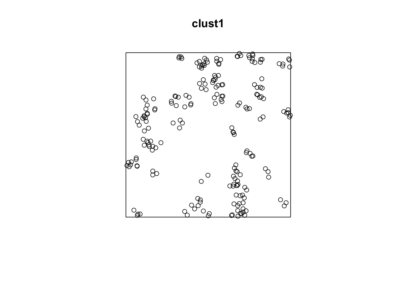
quadrat.test(clust1)
    Chi-squared test of CSR using quadrat counts

data:  clust1
X2 = 124.36, df = 24, p-value = 3.228e-15
alternative hypothesis: two.sided

Quadrats: 5 by 5 grid of tilesplot(envelope(clust1, Fest, global=TRUE))Generating 99 simulations of CSR ...
1, 2, 3, 4, 5, 6, 7, 8, 9, 10, 11, 12, 13, 14, 15, 16, 17, 18, 19, 20,
21, 22, 23, 24, 25, 26, 27, 28, 29, 30, 31, 32, 33, 34, 35, 36, 37, 38, 39, 40,
41, 42, 43, 44, 45, 46, 47, 48, 49, 50, 51, 52, 53, 54, 55, 56, 57, 58, 59, 60,
61, 62, 63, 64, 65, 66, 67, 68, 69, 70, 71, 72, 73, 74, 75, 76, 77, 78, 79, 80,
81, 82, 83, 84, 85, 86, 87, 88, 89, 90, 91, 92, 93, 94, 95, 96, 97, 98,
99.
Done.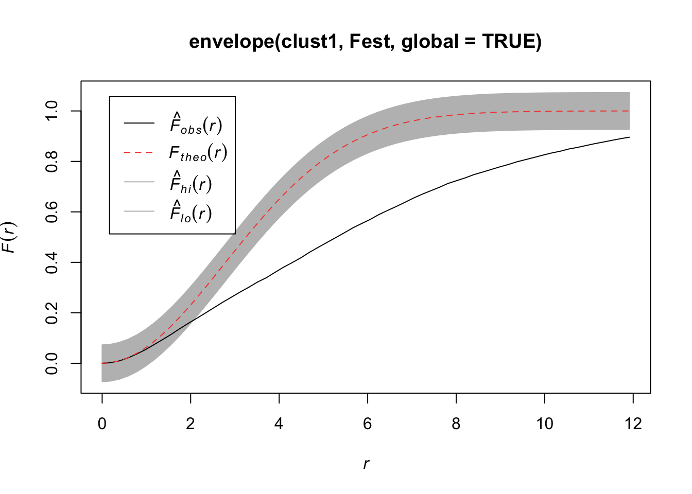
#plot(envelope(clust1, Gest, global=TRUE))
#plot(envelope(clust1, Kest, global=TRUE))
#plot(envelope(clust1, Lest, global=TRUE))
If we increase the radius of space for the children, we won’t notice that it is clustered.
clust2 <- rMatClust(50/10000, r = 40, mu = 5, win = win)
plot(clust2)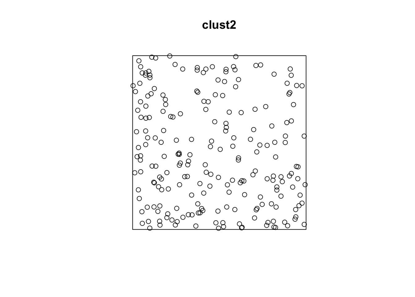
quadrat.test(clust2)
    Chi-squared test of CSR using quadrat counts

data:  clust2
X2 = 20.213, df = 24, p-value = 0.6308
alternative hypothesis: two.sided

Quadrats: 5 by 5 grid of tilesplot(envelope(clust2, Fest, global=TRUE))Generating 99 simulations of CSR ...
1, 2, 3, 4, 5, 6, 7, 8, 9, 10, 11, 12, 13, 14, 15, 16, 17, 18, 19, 20,
21, 22, 23, 24, 25, 26, 27, 28, 29, 30, 31, 32, 33, 34, 35, 36, 37, 38, 39, 40,
41, 42, 43, 44, 45, 46, 47, 48, 49, 50, 51, 52, 53, 54, 55, 56, 57, 58, 59, 60,
61, 62, 63, 64, 65, 66, 67, 68, 69, 70, 71, 72, 73, 74, 75, 76, 77, 78, 79, 80,
81, 82, 83, 84, 85, 86, 87, 88, 89, 90, 91, 92, 93, 94, 95, 96, 97, 98,
99.
Done.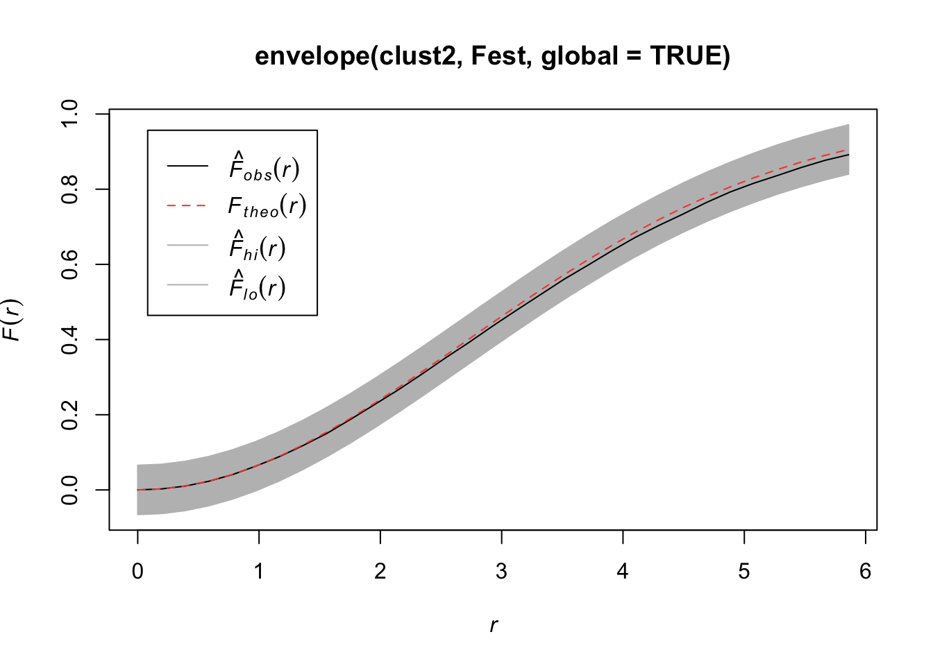
#plot(envelope(clust2, Gest, global=TRUE))
#plot(envelope(clust2, Kest, global=TRUE))
#plot(envelope(clust2, Lest, global=TRUE))Homogeneous Poisson parent process
Poisson distributed number of children
Locations of children according to an isotropic bivariate normal distribution with variance \(\sigma^2\)
clust3 <- rThomas(50/10000, scale = 2, mu = 5, win = win)
plot(clust3)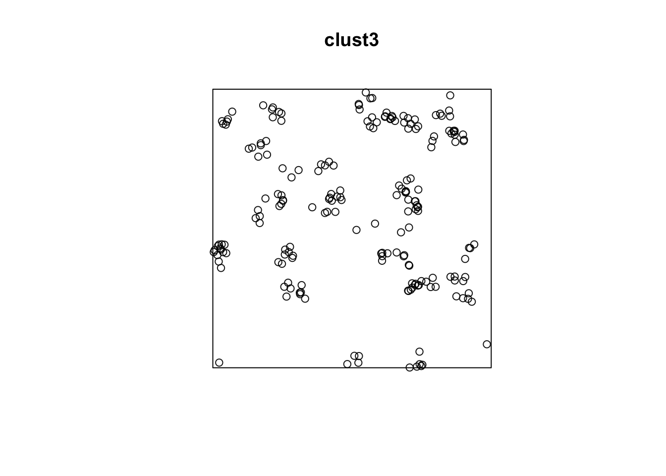
quadrat.test(clust3)
    Chi-squared test of CSR using quadrat counts

data:  clust3
X2 = 75.12, df = 24, p-value = 7.147e-07
alternative hypothesis: two.sided

Quadrats: 5 by 5 grid of tilesplot(envelope(clust3, Fest, global=TRUE))Generating 99 simulations of CSR ...
1, 2, 3, 4, 5, 6, 7, 8, 9, 10, 11, 12, 13, 14, 15, 16, 17, 18, 19, 20,
21, 22, 23, 24, 25, 26, 27, 28, 29, 30, 31, 32, 33, 34, 35, 36, 37, 38, 39, 40,
41, 42, 43, 44, 45, 46, 47, 48, 49, 50, 51, 52, 53, 54, 55, 56, 57, 58, 59, 60,
61, 62, 63, 64, 65, 66, 67, 68, 69, 70, 71, 72, 73, 74, 75, 76, 77, 78, 79, 80,
81, 82, 83, 84, 85, 86, 87, 88, 89, 90, 91, 92, 93, 94, 95, 96, 97, 98,
99.
Done.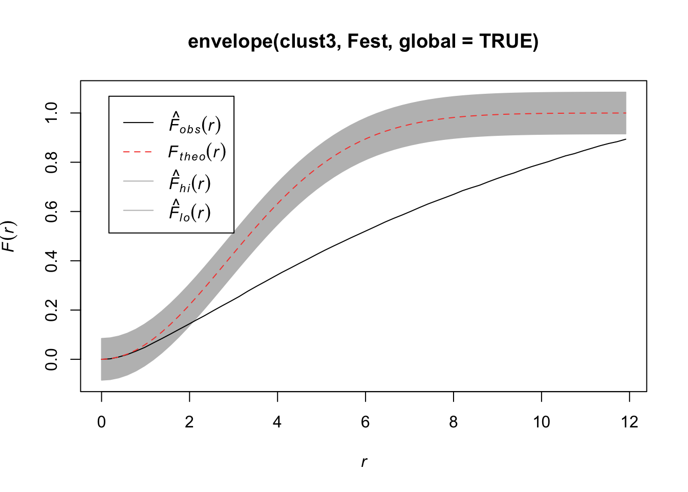
plot(envelope(clust3, Gest, global=TRUE))Generating 99 simulations of CSR ...
1, 2, 3, 4, 5, 6, 7, 8, 9, 10, 11, 12, 13, 14, 15, 16, 17, 18, 19, 20,
21, 22, 23, 24, 25, 26, 27, 28, 29, 30, 31, 32, 33, 34, 35, 36, 37, 38, 39, 40,
41, 42, 43, 44, 45, 46, 47, 48, 49, 50, 51, 52, 53, 54, 55, 56, 57, 58, 59, 60,
61, 62, 63, 64, 65, 66, 67, 68, 69, 70, 71, 72, 73, 74, 75, 76, 77, 78, 79, 80,
81, 82, 83, 84, 85, 86, 87, 88, 89, 90, 91, 92, 93, 94, 95, 96, 97, 98,
99.
Done.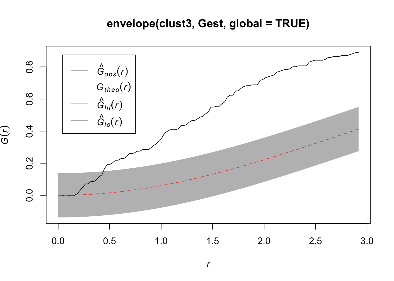
plot(envelope(clust3, Kest, global=TRUE))Generating 99 simulations of CSR ...
1, 2, 3, 4, 5, 6, 7, 8, 9, 10, 11, 12, 13, 14, 15, 16, 17, 18, 19, 20,
21, 22, 23, 24, 25, 26, 27, 28, 29, 30, 31, 32, 33, 34, 35, 36, 37, 38, 39, 40,
41, 42, 43, 44, 45, 46, 47, 48, 49, 50, 51, 52, 53, 54, 55, 56, 57, 58, 59, 60,
61, 62, 63, 64, 65, 66, 67, 68, 69, 70, 71, 72, 73, 74, 75, 76, 77, 78, 79, 80,
81, 82, 83, 84, 85, 86, 87, 88, 89, 90, 91, 92, 93, 94, 95, 96, 97, 98,
99.
Done.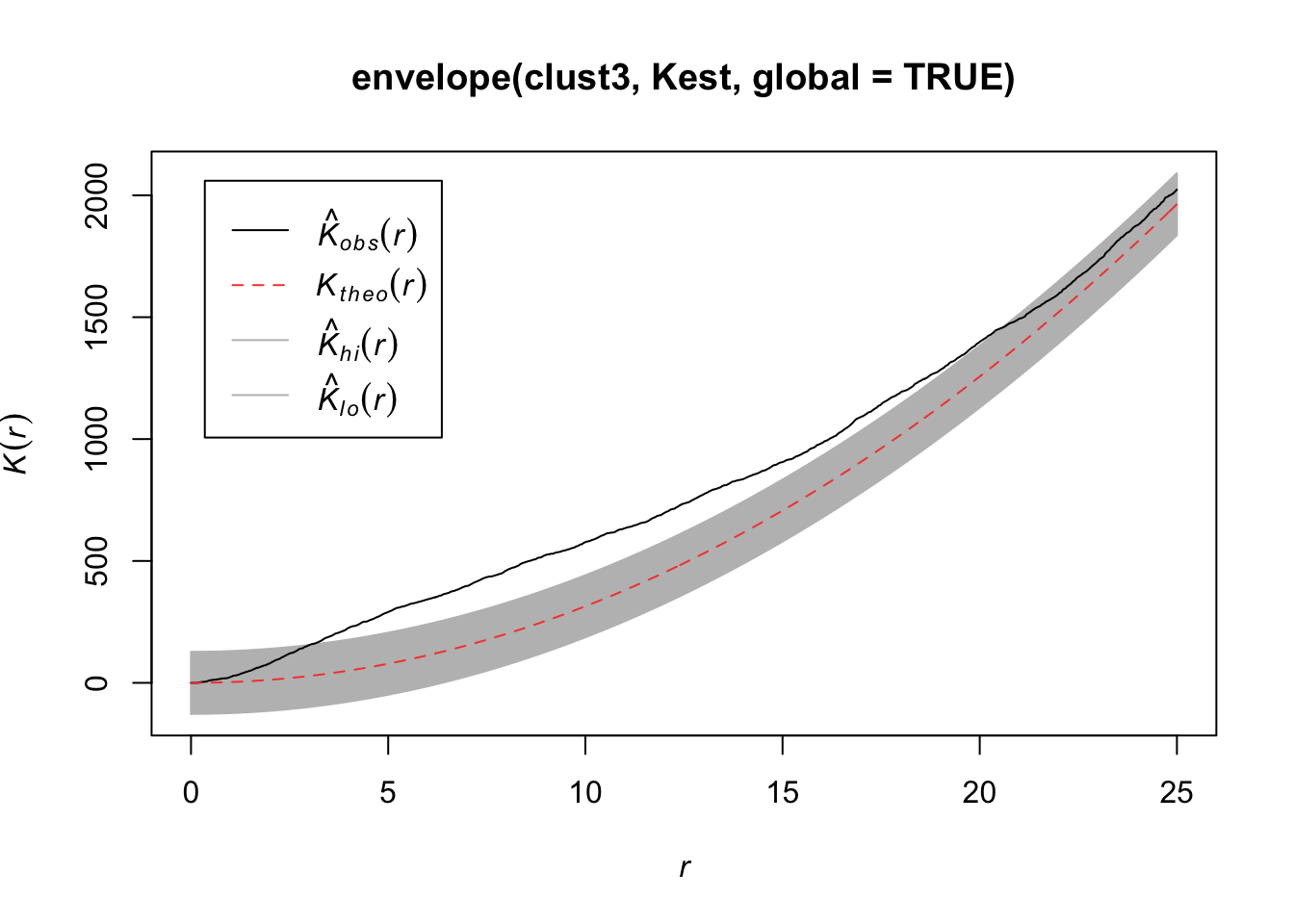
plot(envelope(clust3, Lest, global=TRUE))Generating 99 simulations of CSR ...
1, 2, 3, 4, 5, 6, 7, 8, 9, 10, 11, 12, 13, 14, 15, 16, 17, 18, 19, 20,
21, 22, 23, 24, 25, 26, 27, 28, 29, 30, 31, 32, 33, 34, 35, 36, 37, 38, 39, 40,
41, 42, 43, 44, 45, 46, 47, 48, 49, 50, 51, 52, 53, 54, 55, 56, 57, 58, 59, 60,
61, 62, 63, 64, 65, 66, 67, 68, 69, 70, 71, 72, 73, 74, 75, 76, 77, 78, 79, 80,
81, 82, 83, 84, 85, 86, 87, 88, 89, 90, 91, 92, 93, 94, 95, 96, 97, 98,
99.
Done.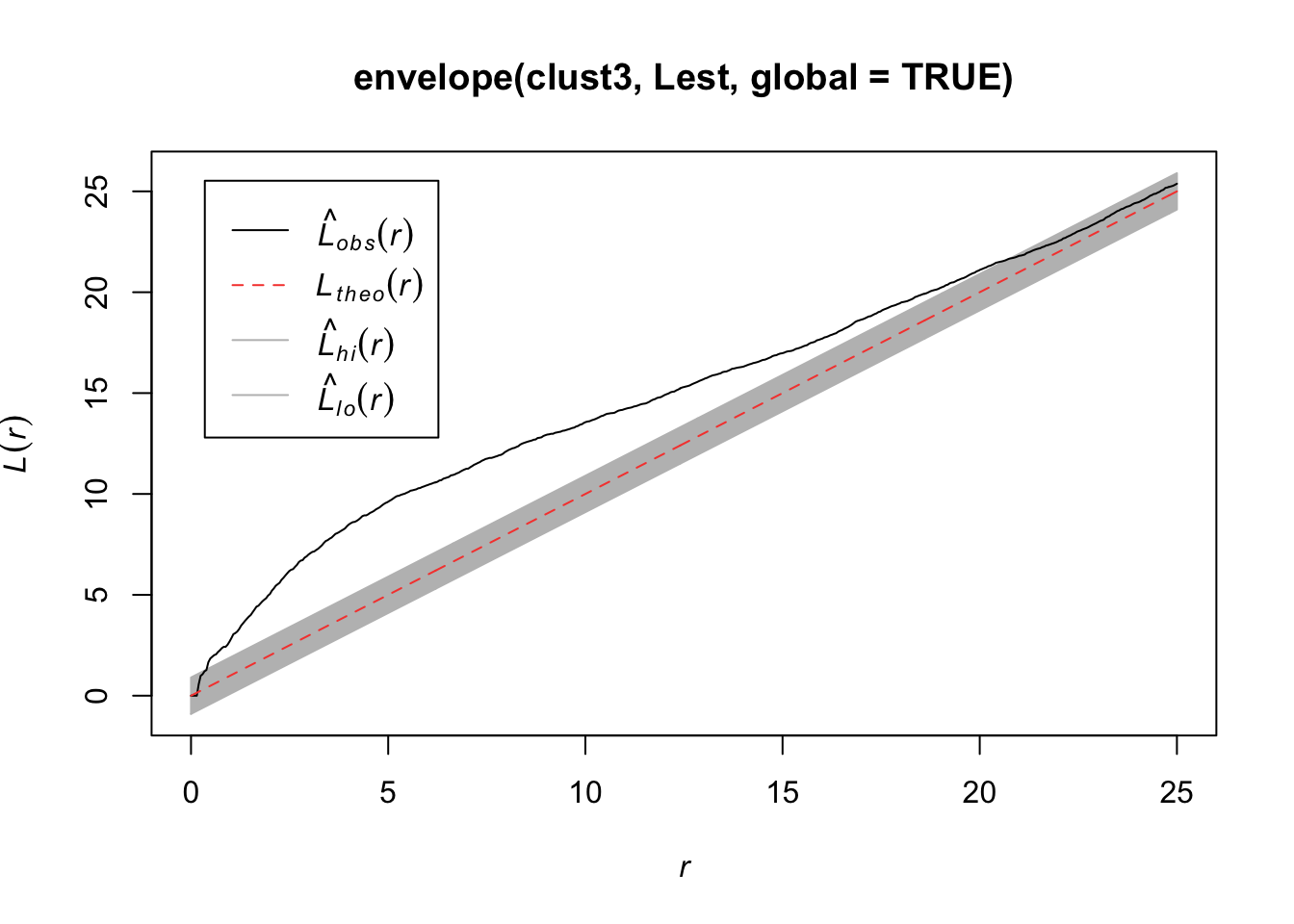
If you believe the data are clustered, you can fit a model that accounts for any trends in \(\lambda(s)\) and clustering in points in the generation process. Two potential models you can fit are the Thomas and the Matern model.
plot(redwood)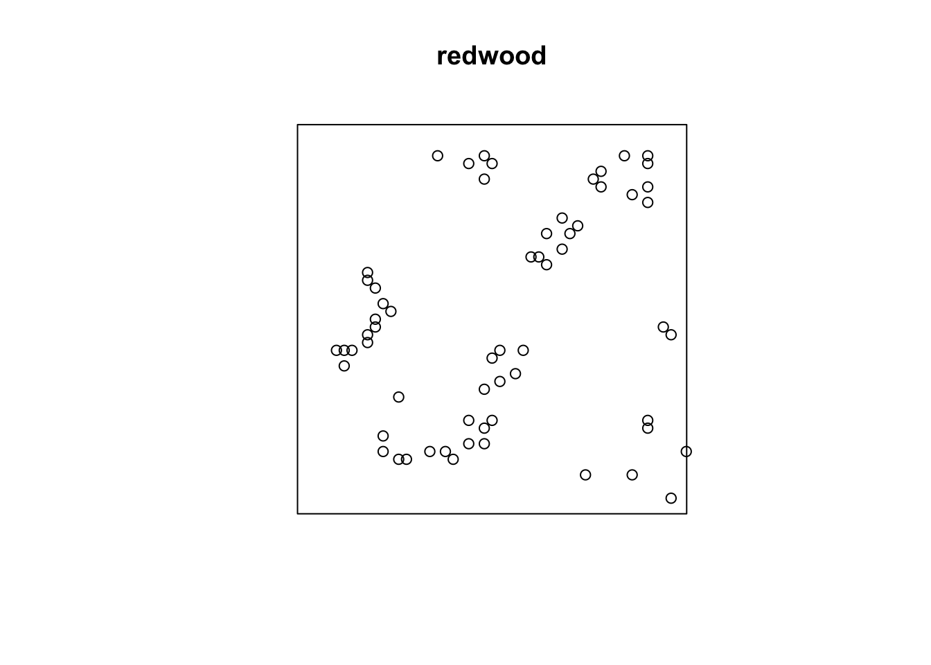
summary(kppm(redwood, ~1, "Thomas"))Stationary cluster point process model
Fitted to point pattern dataset 'redwood'
Fitted by minimum contrast
Summary statistic: K-function
Minimum contrast fit (object of class "minconfit")
Model: Thomas process
Fitted by matching theoretical K function to redwood
Internal parameters fitted by minimum contrast ($par):
kappa sigma2
23.548568483 0.002213841
Fitted cluster parameters:
kappa scale
23.54856848 0.04705148
Mean cluster size: 2.632856 points
Converged successfully after 105 function evaluations
Starting values of parameters:
kappa sigma2
62.000000000 0.006173033
Domain of integration: [ 0 , 0.25 ]
Exponents: p= 2, q= 0.25
----------- TREND -----
Point process model
Fitted to data: X
Fitting method: maximum likelihood (Berman-Turner approximation)
Model was fitted using glm()
Algorithm converged
Call:
ppm.ppp(Q = X, trend = trend, rename.intercept = FALSE, covariates = covariates,
covfunargs = covfunargs, use.gam = use.gam, forcefit = TRUE,
improve.type = ppm.improve.type, improve.args = ppm.improve.args,
nd = nd, eps = eps)
Edge correction: "border"
[border correction distance r = 0 ]
--------------------------------------------------------------------------------
Quadrature scheme (Berman-Turner) = data + dummy + weights
Data pattern:
Planar point pattern: 62 points
Average intensity 62 points per square unit
Window: rectangle = [0, 1] x [-1, 0] units
(1 x 1 units)
Window area = 1 square unit
Dummy quadrature points:
32 x 32 grid of dummy points, plus 4 corner points
dummy spacing: 0.03125 units
Original dummy parameters: =
Planar point pattern: 1028 points
Average intensity 1030 points per square unit
Window: rectangle = [0, 1] x [-1, 0] units
(1 x 1 units)
Window area = 1 square unit
Quadrature weights:
(counting weights based on 32 x 32 array of rectangular tiles)
All weights:
range: [0.000326, 0.000977] total: 1
Weights on data points:
range: [0.000326, 0.000488] total: 0.0277
Weights on dummy points:
range: [0.000326, 0.000977] total: 0.972
--------------------------------------------------------------------------------
FITTED :
Stationary Poisson process
---- Intensity: ----
Uniform intensity:
[1] 62
Estimate S.E. CI95.lo CI95.hi Ztest Zval
(Intercept) 4.127134 0.1270001 3.878219 4.37605 *** 32.49709
----------- gory details -----
Fitted regular parameters (theta):
(Intercept)
4.127134
Fitted exp(theta):
(Intercept)
62
----------- CLUSTER -----------
Model: Thomas process
Fitted cluster parameters:
kappa scale
23.54856848 0.04705148
Mean cluster size: 2.632856 points
Final standard error and CI
(allowing for correlation of cluster process):
Estimate S.E. CI95.lo CI95.hi Ztest Zval
(Intercept) 4.127134 0.2329338 3.670593 4.583676 *** 17.71806
----------- cluster strength indices ----------
Sibling probability 0.6041858
Count overdispersion index (on original window): 3.408838
Cluster strength: 1.526438
Spatial persistence index (over window): 0
Bound on distance from Poisson process (over window): 1
= min (1, 115.0878, 6030.864, 5306724, 76.60044)
Bound on distance from MIXED Poisson process (over window): 1
Intensity of parents of nonempty clusters: 21.85607
Mean number of offspring in a nonempty cluster: 2.836741
Intensity of parents of clusters of more than one offspring point: 17.39995
Ratio of parents to parents-plus-offspring: 0.2752655 (where 1 = Poisson
process)
Probability that a typical point belongs to a nontrivial cluster: 0.9281271AIC(kppm(redwood, ~1, "Thomas", method='palm'))[1] -2477.982summary(kppm(redwood, ~x, "Thomas"))Inhomogeneous cluster point process model
Fitted to point pattern dataset 'redwood'
Fitted by minimum contrast
Summary statistic: inhomogeneous K-function
Minimum contrast fit (object of class "minconfit")
Model: Thomas process
Fitted by matching theoretical K function to redwood
Internal parameters fitted by minimum contrast ($par):
kappa sigma2
22.917939455 0.002148329
Fitted cluster parameters:
kappa scale
22.91793945 0.04635007
Mean cluster size: [pixel image]
Converged successfully after 85 function evaluations
Starting values of parameters:
kappa sigma2
62.000000000 0.006173033
Domain of integration: [ 0 , 0.25 ]
Exponents: p= 2, q= 0.25
----------- TREND -----
Point process model
Fitted to data: X
Fitting method: maximum likelihood (Berman-Turner approximation)
Model was fitted using glm()
Algorithm converged
Call:
ppm.ppp(Q = X, trend = trend, rename.intercept = FALSE, covariates = covariates,
covfunargs = covfunargs, use.gam = use.gam, forcefit = TRUE,
improve.type = ppm.improve.type, improve.args = ppm.improve.args,
nd = nd, eps = eps)
Edge correction: "border"
[border correction distance r = 0 ]
--------------------------------------------------------------------------------
Quadrature scheme (Berman-Turner) = data + dummy + weights
Data pattern:
Planar point pattern: 62 points
Average intensity 62 points per square unit
Window: rectangle = [0, 1] x [-1, 0] units
(1 x 1 units)
Window area = 1 square unit
Dummy quadrature points:
32 x 32 grid of dummy points, plus 4 corner points
dummy spacing: 0.03125 units
Original dummy parameters: =
Planar point pattern: 1028 points
Average intensity 1030 points per square unit
Window: rectangle = [0, 1] x [-1, 0] units
(1 x 1 units)
Window area = 1 square unit
Quadrature weights:
(counting weights based on 32 x 32 array of rectangular tiles)
All weights:
range: [0.000326, 0.000977] total: 1
Weights on data points:
range: [0.000326, 0.000488] total: 0.0277
Weights on dummy points:
range: [0.000326, 0.000977] total: 0.972
--------------------------------------------------------------------------------
FITTED :
Nonstationary Poisson process
---- Intensity: ----
Log intensity: ~x
Fitted trend coefficients:
(Intercept) x
3.9745791 0.2976994
Estimate S.E. CI95.lo CI95.hi Ztest Zval
(Intercept) 3.9745791 0.2639734 3.4572007 4.491958 *** 15.0567391
x 0.2976994 0.4409396 -0.5665264 1.161925 0.6751478
----------- gory details -----
Fitted regular parameters (theta):
(Intercept) x
3.9745791 0.2976994
Fitted exp(theta):
(Intercept) x
53.227709 1.346757
----------- CLUSTER -----------
Model: Thomas process
Fitted cluster parameters:
kappa scale
22.91793945 0.04635007
Mean cluster size: [pixel image]
Final standard error and CI
(allowing for correlation of cluster process):
Estimate S.E. CI95.lo CI95.hi Ztest Zval
(Intercept) 3.9745791 0.4641811 3.064801 4.884357 *** 8.5625609
x 0.2976994 0.7850129 -1.240898 1.836296 0.3792287
----------- cluster strength indices ----------
Mean sibling probability 0.6177764
Count overdispersion index (on original window): 3.494409
Cluster strength: 1.616269
Spatial persistence index (over window): 0
Bound on distance from Poisson process (over window): 1
= min (1, 118.5459, 6380.467, 5790004, 78.82096)AIC(kppm(redwood, ~x, "Thomas", method='palm'))[1] -2465.114summary(kppm(redwood, ~1, "MatClust"))Stationary cluster point process model
Fitted to point pattern dataset 'redwood'
Fitted by minimum contrast
Summary statistic: K-function
Minimum contrast fit (object of class "minconfit")
Model: Matern cluster process
Fitted by matching theoretical K function to redwood
Internal parameters fitted by minimum contrast ($par):
kappa R
24.55865127 0.08653577
Fitted cluster parameters:
kappa scale
24.55865127 0.08653577
Mean cluster size: 2.524569 points
Converged successfully after 57 function evaluations
Starting values of parameters:
kappa R
62.00000000 0.07856865
Domain of integration: [ 0 , 0.25 ]
Exponents: p= 2, q= 0.25
----------- TREND -----
Point process model
Fitted to data: X
Fitting method: maximum likelihood (Berman-Turner approximation)
Model was fitted using glm()
Algorithm converged
Call:
ppm.ppp(Q = X, trend = trend, rename.intercept = FALSE, covariates = covariates,
covfunargs = covfunargs, use.gam = use.gam, forcefit = TRUE,
improve.type = ppm.improve.type, improve.args = ppm.improve.args,
nd = nd, eps = eps)
Edge correction: "border"
[border correction distance r = 0 ]
--------------------------------------------------------------------------------
Quadrature scheme (Berman-Turner) = data + dummy + weights
Data pattern:
Planar point pattern: 62 points
Average intensity 62 points per square unit
Window: rectangle = [0, 1] x [-1, 0] units
(1 x 1 units)
Window area = 1 square unit
Dummy quadrature points:
32 x 32 grid of dummy points, plus 4 corner points
dummy spacing: 0.03125 units
Original dummy parameters: =
Planar point pattern: 1028 points
Average intensity 1030 points per square unit
Window: rectangle = [0, 1] x [-1, 0] units
(1 x 1 units)
Window area = 1 square unit
Quadrature weights:
(counting weights based on 32 x 32 array of rectangular tiles)
All weights:
range: [0.000326, 0.000977] total: 1
Weights on data points:
range: [0.000326, 0.000488] total: 0.0277
Weights on dummy points:
range: [0.000326, 0.000977] total: 0.972
--------------------------------------------------------------------------------
FITTED :
Stationary Poisson process
---- Intensity: ----
Uniform intensity:
[1] 62
Estimate S.E. CI95.lo CI95.hi Ztest Zval
(Intercept) 4.127134 0.1270001 3.878219 4.37605 *** 32.49709
----------- gory details -----
Fitted regular parameters (theta):
(Intercept)
4.127134
Fitted exp(theta):
(Intercept)
62
----------- CLUSTER -----------
Model: Matern cluster process
Fitted cluster parameters:
kappa scale
24.55865127 0.08653577
Mean cluster size: 2.524569 points
Final standard error and CI
(allowing for correlation of cluster process):
Estimate S.E. CI95.lo CI95.hi Ztest Zval
(Intercept) 4.127134 0.2303018 3.675751 4.578518 *** 17.92054
----------- cluster strength indices ----------
Sibling probability 0.6338109
Count overdispersion index (on original window): 3.32639
Cluster strength: 1.73083
Spatial persistence index (over window): 0
Bound on distance from Poisson process (over window): 1
= min (1, 114.0685, 6809.832, 895130.7, 81.56782)
Bound on distance from MIXED Poisson process (over window): 1
Intensity of parents of nonempty clusters: 22.59168
Mean number of offspring in a nonempty cluster: 2.744373
Intensity of parents of clusters of more than one offspring point: 17.62592
Ratio of parents to parents-plus-offspring: 0.2837227 (where 1 = Poisson
process)
Probability that a typical point belongs to a nontrivial cluster: 0.9199071AIC(kppm(redwood, ~1, "MatClust",method='palm'))[1] -2476.282summary(kppm(redwood, ~x, "MatClust"))Inhomogeneous cluster point process model
Fitted to point pattern dataset 'redwood'
Fitted by minimum contrast
Summary statistic: inhomogeneous K-function
Minimum contrast fit (object of class "minconfit")
Model: Matern cluster process
Fitted by matching theoretical K function to redwood
Internal parameters fitted by minimum contrast ($par):
kappa R
23.89160402 0.08523814
Fitted cluster parameters:
kappa scale
23.89160402 0.08523814
Mean cluster size: [pixel image]
Converged successfully after 55 function evaluations
Starting values of parameters:
kappa R
62.00000000 0.07856865
Domain of integration: [ 0 , 0.25 ]
Exponents: p= 2, q= 0.25
----------- TREND -----
Point process model
Fitted to data: X
Fitting method: maximum likelihood (Berman-Turner approximation)
Model was fitted using glm()
Algorithm converged
Call:
ppm.ppp(Q = X, trend = trend, rename.intercept = FALSE, covariates = covariates,
covfunargs = covfunargs, use.gam = use.gam, forcefit = TRUE,
improve.type = ppm.improve.type, improve.args = ppm.improve.args,
nd = nd, eps = eps)
Edge correction: "border"
[border correction distance r = 0 ]
--------------------------------------------------------------------------------
Quadrature scheme (Berman-Turner) = data + dummy + weights
Data pattern:
Planar point pattern: 62 points
Average intensity 62 points per square unit
Window: rectangle = [0, 1] x [-1, 0] units
(1 x 1 units)
Window area = 1 square unit
Dummy quadrature points:
32 x 32 grid of dummy points, plus 4 corner points
dummy spacing: 0.03125 units
Original dummy parameters: =
Planar point pattern: 1028 points
Average intensity 1030 points per square unit
Window: rectangle = [0, 1] x [-1, 0] units
(1 x 1 units)
Window area = 1 square unit
Quadrature weights:
(counting weights based on 32 x 32 array of rectangular tiles)
All weights:
range: [0.000326, 0.000977] total: 1
Weights on data points:
range: [0.000326, 0.000488] total: 0.0277
Weights on dummy points:
range: [0.000326, 0.000977] total: 0.972
--------------------------------------------------------------------------------
FITTED :
Nonstationary Poisson process
---- Intensity: ----
Log intensity: ~x
Fitted trend coefficients:
(Intercept) x
3.9745791 0.2976994
Estimate S.E. CI95.lo CI95.hi Ztest Zval
(Intercept) 3.9745791 0.2639734 3.4572007 4.491958 *** 15.0567391
x 0.2976994 0.4409396 -0.5665264 1.161925 0.6751478
----------- gory details -----
Fitted regular parameters (theta):
(Intercept) x
3.9745791 0.2976994
Fitted exp(theta):
(Intercept) x
53.227709 1.346757
----------- CLUSTER -----------
Model: Matern cluster process
Fitted cluster parameters:
kappa scale
23.89160402 0.08523814
Mean cluster size: [pixel image]
Final standard error and CI
(allowing for correlation of cluster process):
Estimate S.E. CI95.lo CI95.hi Ztest Zval
(Intercept) 3.9745791 0.4599425 3.073108 4.87605 *** 8.6414699
x 0.2976994 0.7783921 -1.227921 1.82332 0.3824544
----------- cluster strength indices ----------
Mean sibling probability 0.647109
Count overdispersion index (on original window): 3.409944
Cluster strength: 1.833736
Spatial persistence index (over window): 0
Bound on distance from Poisson process (over window): 1
= min (1, 117.8056, 7209.547, 977197.8, 83.95629)AIC(kppm(redwood, ~x, "MatClust",method='palm'))[1] -2463.417We can then interpret the estimates for that process to tell us about the clustering.
INTERPRETATIONS
If points “repel” each other, we need to account for that also.
Each new point is generated uniformly in the window (space of interest) and independently of preceding points. If the new point lies closer than r units from an existing point, it is rejected, generating another random point. The process terminates when no further points can be added.
plot(rSSI(r = 0.05, n = 200))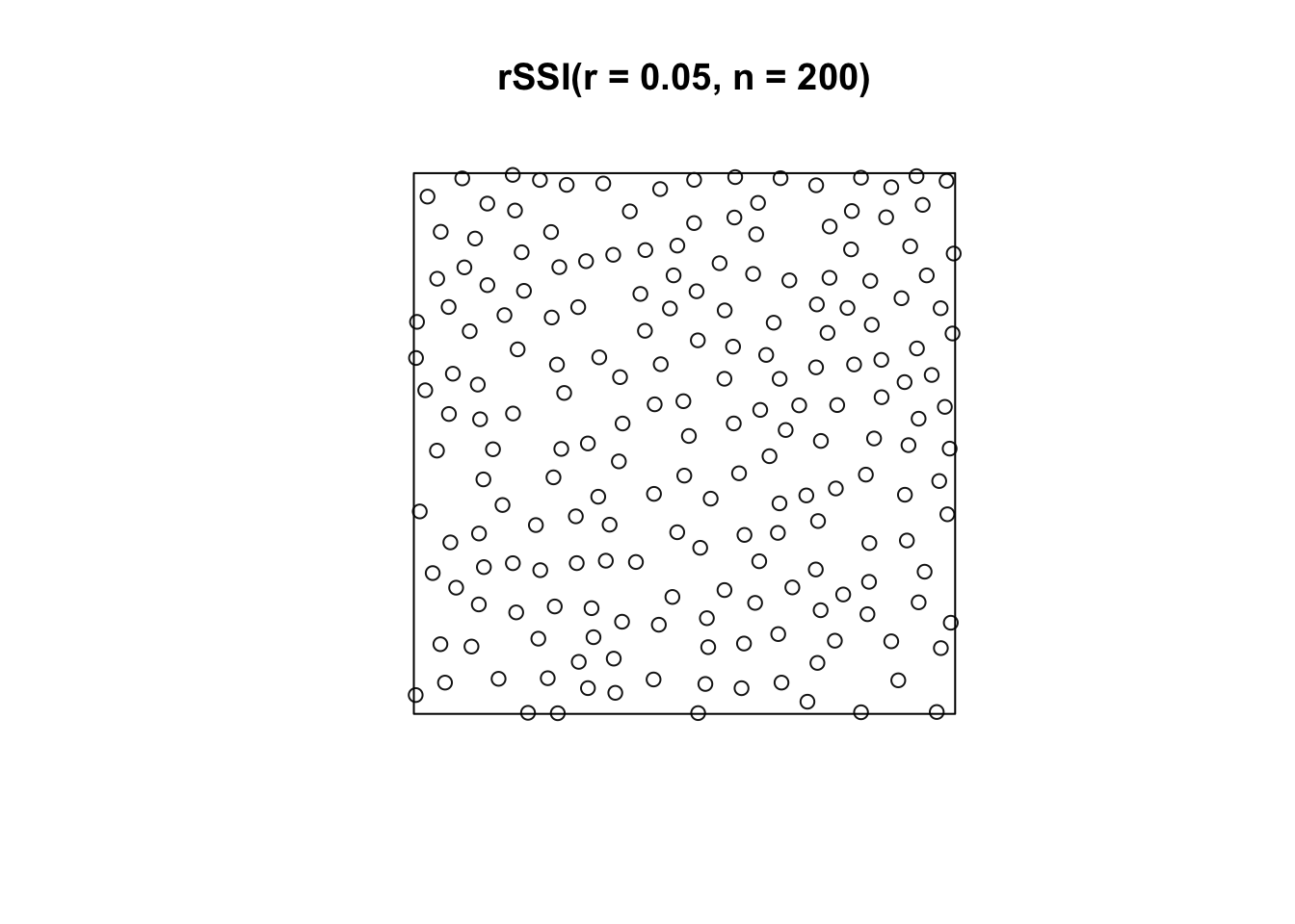
Matern’s Model I first generates a homogeneous Poisson process Y (intensity = \(\rho\)). Any pairs of points that lie closer than a distance \(r\) from each other are deleted. Thus, pairs of close neighbors annihilate each other.
The probability an arbitrary point survives is \(e^{-\pi\rho r^2}\) so the intensity of the final point pattern is \(\lambda = \rho e^{-\pi\rho r^2}\).
Markov Point Processes: a large class of models that allow for interaction between points (attraction or repulsion)
Hard Core Gibbs Point Processes: a subclass of Markov Point Processes that allow for interaction between points; no interaction is a Poisson point process
Strauss Processes: a subclass of Markov Point Processes that allow for the repulsion between pairs of points
Cox Processes: a doubly stochastic Poisson process in which the intensity is a random process and conditional on the intensity, the events are an inhomogeneous Poisson process.
For more information on how to fit spatial point processes in R, see http://www3.uji.es/~mateu/badturn.pdf.
A spatial stochastic process is a spatially indexed collection of random variables,
\[\{Y(s): s\in D \subset \mathbb{R}^d \}\]
where \(d\) will typically be 2 or 3.
A realization from a stochastic process is sometimes called a sample path. We typically observe a vector,
\[\mathbf{Y} \equiv Y(s_1),...,Y(s_n)\]
A Gaussian process (G.P.) has finite-dimensional distributions that are all multivariate normal, and we define it using a mean and covariance function,
\[\mu(s) = E(Y(s))\] \[C(s_1,s_2) = Cov(Y(s_1),Y(s_2))\]
As with time series and longitudinal data, we must consider the covariance of our data. Most covariance models that we will consider in this course require that our data come from a stationary, isotropic process such that the mean is constant across space, variance is constant across space, and the covariance is only a function of the distance between locations (disregarding the direction) such that
\[ E(Y(s)) = E(Y(s+h)) = \mu\] \[Cov(Y(s),Y(s+h)) = Cov(Y(0),Y(h)) = C(||h||)\]
A covariance model that is often used in spatial data is called the Matern class of covariance functions,
\[C(t) = \frac{\sigma^2}{2^{\nu-1}\Gamma(\nu)}(t\rho)^\nu \mathcal{K}_\nu(d/\rho)\]
where \(\mathcal{K}_\nu\) is a modified Bessel function of order \(\nu\). \(\nu\) is a smoothness parameter and if we let \(\nu = 1/2\), we get the exponential covariance.
Beyond the standard definition of stationarity, there is another form of stationary (intrinsic stationarity), which is when
\[Var(Y(s+h) - Y(s))\text{ depends only on h}\]
When this is true, we call
\[\gamma(h) = \frac{1}{2}Var(Y(s+h) - Y(s))\]
the semivariogram and \(2\gamma(h)\) the variogram.
If a covariance function is stationary, it will be intrinsic stationary and
\[\gamma(h) = C(0) - C(h) = C(0) (1-\rho(h))\] where \(C(0)\) is the variance (referred to as the sill).
First, to estimate the semivariogram, fit a trend so that you have a stationary process in your residuals.
\[\hat{\gamma}(h_u) = \frac{1}{2\cdot |\{s_i-s_j \in H_u\}|}\sum_{\{s_i-s_j\in H_u\}}(e(s_i) - e(s_j))^2\]
library(gstat)
Attaching package: 'gstat'The following object is masked from 'package:spatstat.explore':
idwcoordinates(meuse) = ~x+y
estimatedVar <- variogram(log(zinc) ~ 1, data = meuse)
plot(estimatedVar)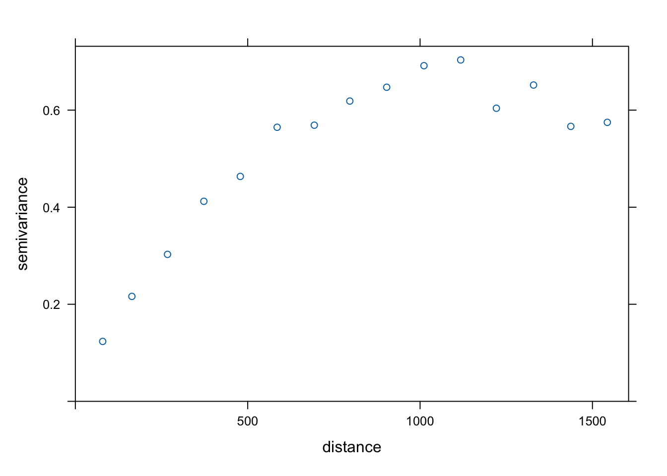
Var.fit1 <- fit.variogram(estimatedVar, model = vgm(1, "Sph", 900, 1))
plot(estimatedVar,Var.fit1)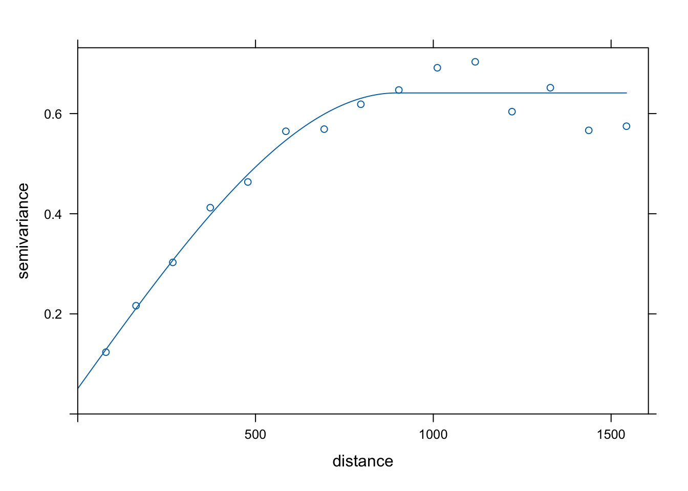
Var.fit2 <- fit.variogram(estimatedVar, model = vgm(1, "Exp", 900, 1))
plot(estimatedVar,Var.fit2)
Var.fit3 <- fit.variogram(estimatedVar, model = vgm(1, "Gau", 900, 1))
plot(estimatedVar,Var.fit3)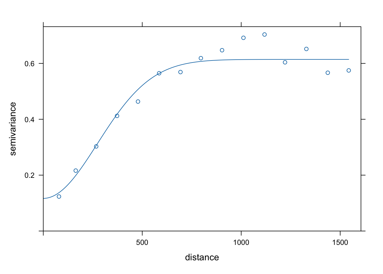
Var.fit4 <- fit.variogram(estimatedVar, model = vgm(1, "Mat", 900, 1))
plot(estimatedVar,Var.fit4)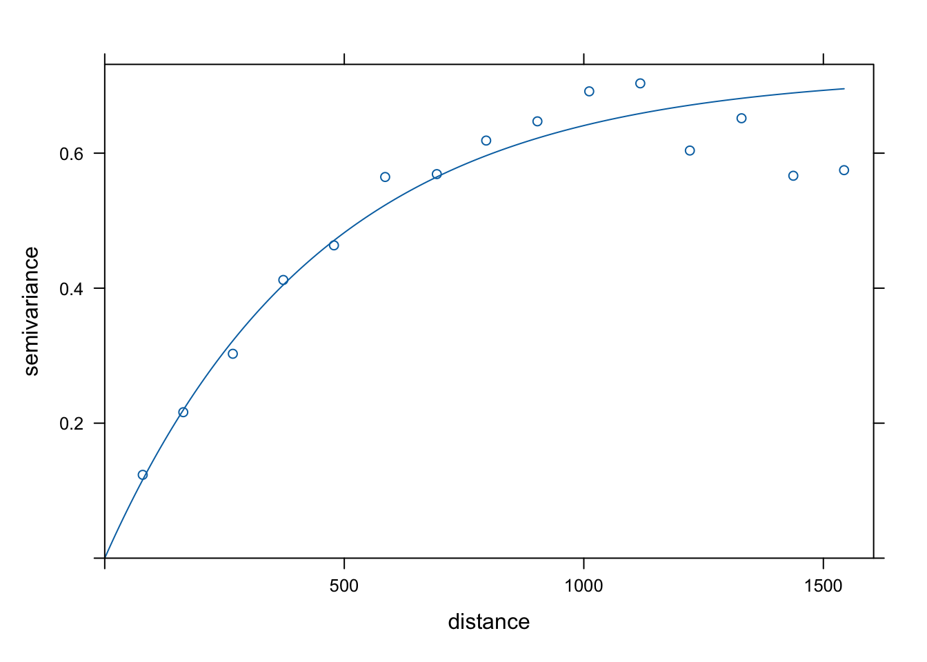
g = gstat::gstat(formula = log(zinc) ~ 1, model = Var.fit4, data = meuse)Section is under construction.
data(meuse)
data(meuse.grid)
coordinates(meuse) = ~x+y
coordinates(meuse.grid) = ~x+y


zinc.idw <- idw(zinc~1, meuse, meuse.grid)
[inverse distance weighted interpolation]spplot(zinc.idw["var1.pred"], main = "zinc inverse distance weighted interpolations")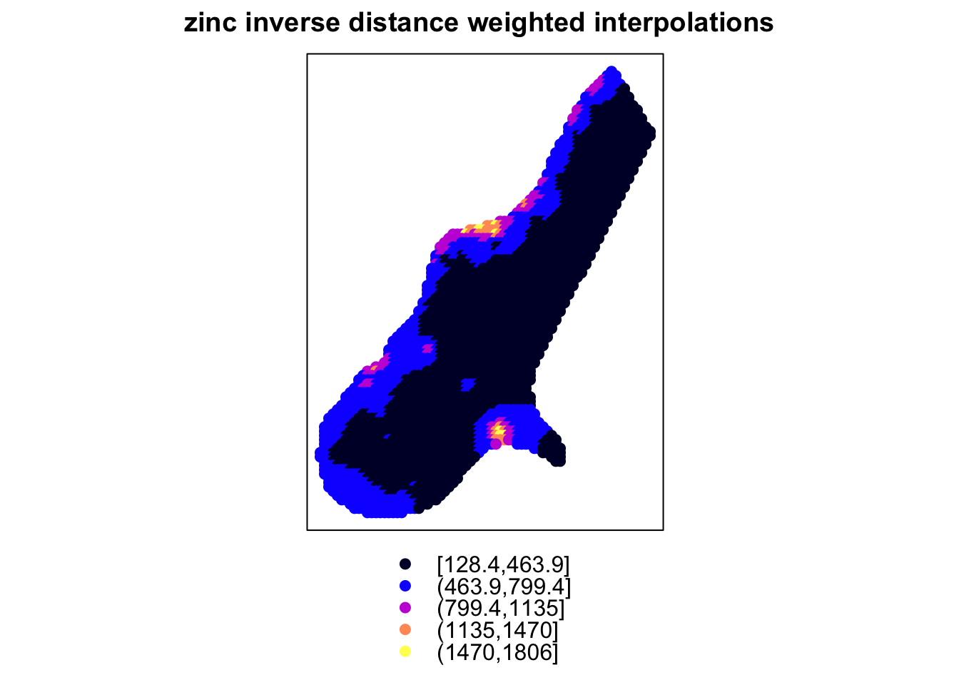
zinc.ord <- predict(g, meuse.grid)[using ordinary kriging]spplot(zinc.ord["var1.pred"], main = "zinc ordinary kriging interpolations")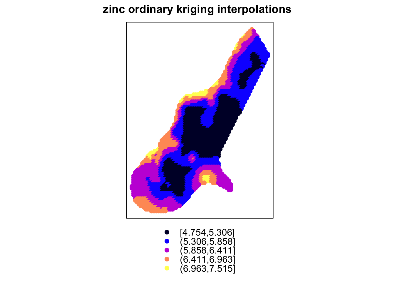
g = gstat::gstat(formula = log(zinc) ~ sqrt(dist), model = Var.fit4, data = meuse)
zinc.uni <- predict(g, meuse.grid)
[using universal kriging]spplot(zinc.uni["var1.pred"], main = "zinc universal kriging interpolations")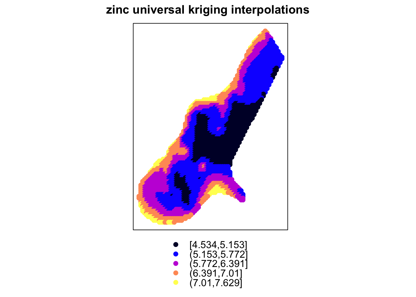
Areal data can often be thought of as a “coarser-resolution” version of other data types, such as
average/aggregation of point reference data (a geostatistical field)
a count of points within a boundary from a point process.
For areal data, we will explore relationships between aggregate summaries of observations within boundaries while specifying spatial dependence regarding notions of neighborhoods and spatial proximity. The boundary of areas can be considered polygons determined by a closed sequence of ordered coordinates connected by straight line segments.
Let’s look at an example to understand what we mean by polygons. Say we are interested in the county-level data in North Carolina. We can read in a series of shapefiles and specify a CRS (ellipsoid, datum, and projection) to project longitude and latitude onto a 2d surface.
library(spdep)Loading required package: spDataTo access larger datasets in this package, install the spDataLarge
package with: `install.packages('spDataLarge',
repos='https://nowosad.github.io/drat/', type='source')`
Attaching package: 'spData'The following object is masked _by_ '.GlobalEnv':
worldlibrary(sf)
nc <- st_read(system.file("shape/nc.shp", package="sf"), quiet=TRUE)
st_crs(nc) <- "+proj=longlat +datum=NAD27"
row.names(nc) <- as.character(nc$FIPSNO)This data set includes some county-level information about births. Let’s look at the first 6 rows. This data set is not just a typical data frame but has geometric information. In particular, the geometry field is a list of multi polygons, a series of coordinates that can be connected to create polygons. They might be multi polygons in case one county may consist of two or more closed polygons (separated by a body of water, such as an island).
head(nc)Simple feature collection with 6 features and 14 fields
Geometry type: MULTIPOLYGON
Dimension: XY
Bounding box: xmin: -81.74107 ymin: 36.07282 xmax: -75.77316 ymax: 36.58965
Geodetic CRS: +proj=longlat +datum=NAD27
AREA PERIMETER CNTY_ CNTY_ID NAME FIPS FIPSNO CRESS_ID BIR74
37009 0.114 1.442 1825 1825 Ashe 37009 37009 5 1091
37005 0.061 1.231 1827 1827 Alleghany 37005 37005 3 487
37171 0.143 1.630 1828 1828 Surry 37171 37171 86 3188
37053 0.070 2.968 1831 1831 Currituck 37053 37053 27 508
37131 0.153 2.206 1832 1832 Northampton 37131 37131 66 1421
37091 0.097 1.670 1833 1833 Hertford 37091 37091 46 1452
SID74 NWBIR74 BIR79 SID79 NWBIR79 geometry
37009 1 10 1364 0 19 MULTIPOLYGON (((-81.47276 3...
37005 0 10 542 3 12 MULTIPOLYGON (((-81.23989 3...
37171 5 208 3616 6 260 MULTIPOLYGON (((-80.45634 3...
37053 1 123 830 2 145 MULTIPOLYGON (((-76.00897 3...
37131 9 1066 1606 3 1197 MULTIPOLYGON (((-77.21767 3...
37091 7 954 1838 5 1237 MULTIPOLYGON (((-76.74506 3...st_geometry(nc)Geometry set for 100 features
Geometry type: MULTIPOLYGON
Dimension: XY
Bounding box: xmin: -84.32385 ymin: 33.88199 xmax: -75.45698 ymax: 36.58965
Geodetic CRS: +proj=longlat +datum=NAD27
First 5 geometries:MULTIPOLYGON (((-81.47276 36.23436, -81.54084 3...MULTIPOLYGON (((-81.23989 36.36536, -81.24069 3...MULTIPOLYGON (((-80.45634 36.24256, -80.47639 3...MULTIPOLYGON (((-76.00897 36.3196, -76.01735 36...MULTIPOLYGON (((-77.21767 36.24098, -77.23461 3...If we plot these polygons and fill them with their own color, we can see each boundary, including some counties that include islands (multiple polygons).
ggplot(nc) +
  geom_sf(aes(fill = factor(CNTY_ID))) +
  guides(fill = FALSE) + theme_classic()
Warning: The `<scale>` argument of `guides()` cannot be `FALSE`. Use "none" instead as
of ggplot2 3.3.4.
If we’d like to visualize an outcome spatially, we can change the fill to correspond to the value of another variable and shade the color on a spectrum. Below are cases of Sudden Infant Death (SID) in 1974 at a county level in North Carolina.
ggplot(nc) +
  geom_sf(aes(fill = SID74)) +
  scale_fill_gradient(high= 'red', low ='lightgrey') +
  theme_classic()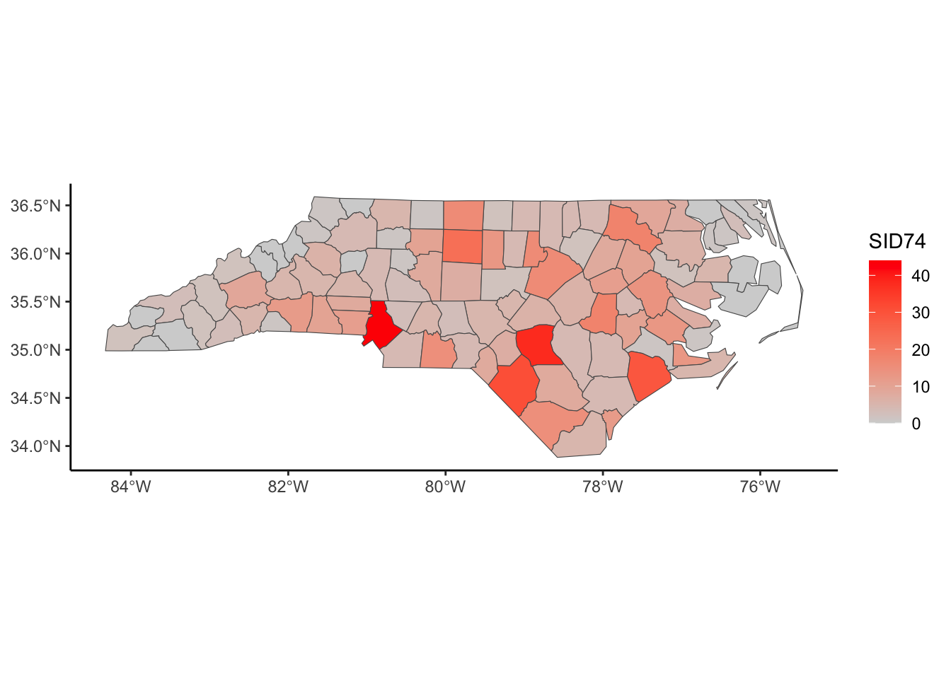
Here are the cases of SID relative to the birth rate in 1974 at a county level in North Carolina. This considers that more metropolitan areas will have higher birth rates and, thus, higher SID rates.
ggplot(nc) +
  geom_sf(aes(fill = SID74/BIR74)) +
  scale_fill_gradient(high= 'red', low ='lightgrey') +
  theme_classic()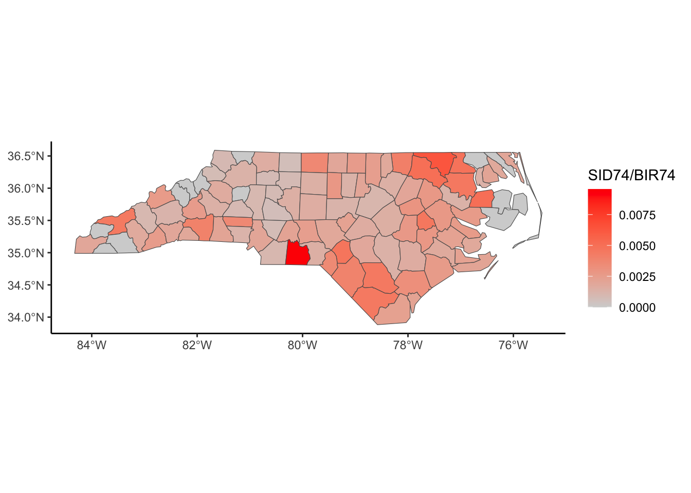
Now, we might wonder why some counties have a higher incidence of SID. Do we have other county-level information that can help us explain those differences? Are there geographical similarities and differences that might explain why two counties closer together might have similar rates?
To answer these questions, we must first consider what it means for two polygons or areas to be “close.” We’ll use the language of two areas being close if they are neighbors. But, we need to define a neighborhood structure on our geometry of polygons.
For data on a regular lattice, it’s fairly straightforward to think about what a neighborhood means. You’ll often see terminology referring to Chess moves.
There are many ways to define the neighborhood structure if we have irregular lattices.
As you see in the visualizations, these different ways of defining a neighborhood lead to nice and not-so-nice properties.
Of course, you can also define the neighborhoods manually to incorporate your knowledge of the data context. The approaches defined above are great ways to start thinking about neighboring polygons or areas and the correlation structure in the data.
# Centroid of Polygons
centroids <- st_centroid(st_geometry(nc), of_largest_polygon=TRUE)


#Neighbor information for nc data
Queen <- poly2nb(nc, queen = TRUE)
Rook <-  poly2nb(nc, queen = FALSE)

KNN <- knn2nb(knearneigh(centroids, k = 3)) #k: number of neighbors
KNNDist <- dnearneigh(centroids ,d1 = 0,d2 = 40) #d1: min distance, d2: max distanc
Warning in dnearneigh(centroids, d1 = 0, d2 = 40): neighbour object has 7
sub-graphs# Network lines from Neighbors
nb_Q_net <- nb2lines(nb = Queen, coords = centroids, as_sf = TRUE)
nb_R_net <- nb2lines(nb = Rook, coords = centroids, as_sf = TRUE)
nb_KNN_net <- nb2lines(nb = KNN, coords = centroids, as_sf = TRUE)
nb_KNNDist_net <- nb2lines(nb = KNNDist, coords = centroids, as_sf = TRUE)
# Plots of Neighbor Networks
nc %>%
ggplot() +
geom_sf() +
geom_sf(data = centroids) +
geom_sf(data = nb_Q_net) +
theme_classic()
nc %>%
ggplot() +
  geom_sf() +
  geom_sf(data = centroids) +
  geom_sf(data = nb_R_net) +
  theme_classic()
nc %>%
ggplot() +
  geom_sf() +
  geom_sf(data = centroids) +
  geom_sf(data = nb_KNN_net) +
  theme_classic()
nc %>%
ggplot() +
  geom_sf() +
  geom_sf(data = centroids) +
  geom_sf(data = nb_KNNDist_net) +
  theme_classic()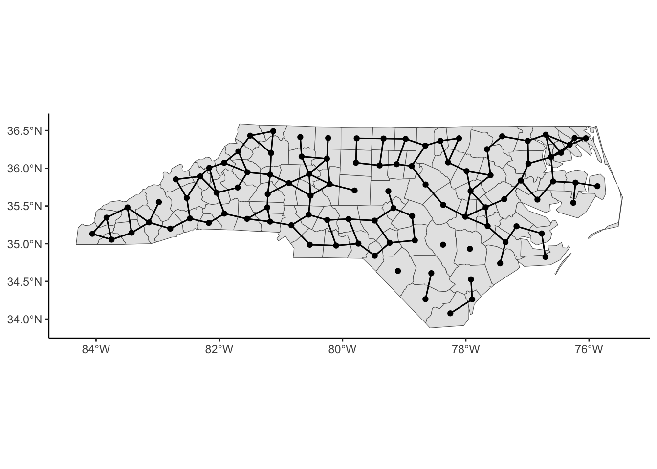
Typically, we codify this neighborhood structure with a spatial proximity or weighting matrix, \(W\). This \(n\times n\) matrix has values, \(w_{ij}\), between 0 and 1 that reflect whether or not the \(i\) area is a neighbor of the \(j\) area (0: not neighbor) and the strength of the influence of \(i\) on \(j\) (>0 if there is an influence or 1 if neighbor). These are called spatial weights in ArcGIS. We could restrict ourselves to binary values of \(w_{ij}\) such that 1 indicates a neighbor and 0 indicates not a neighbor.
Note: These relationships are often symmetric but not always. For example, an urban county may influence a nearby rural one more than vice versa. To incorporate this data context, we’d have to update this W matrix manually.
Considering the approaches above, Queen and Rook should give a symmetric \(W\), but Nearest Neighbors may not give a symmetric \(W\) based on the algorithm of defining neighbors.
# Neighbor Information to Spatial Proximity or Weighting Matrix
## style = 'B' forces W to be a binary matrix
## style = 'W' standardizes the rows (taking into account how many neighbors an area has)
## zero.policy = TRUE allows for polygons with no neighbors

W <- nb2mat(Queen, style='B', zero.policy = TRUE)

W[1:10,1:10]
37009 37005 37171 37053 37131 37091 37029 37073 37185 37169
37009 0 1 0 0 0 0 0 0 0 0
37005 1 0 1 0 0 0 0 0 0 0
37171 0 1 0 0 0 0 0 0 0 1
37053 0 0 0 0 0 0 1 0 0 0
37131 0 0 0 0 0 1 0 0 1 0
37091 0 0 0 0 1 0 0 1 0 0
37029 0 0 0 1 0 0 0 1 0 0
37073 0 0 0 0 0 1 1 0 0 0
37185 0 0 0 0 1 0 0 0 0 0
37169 0 0 1 0 0 0 0 0 0 0Now that we’ve defined a neighborhood structure using \(W\), we can estimate a neighborhood-based correlation called Moran’s I. This is a measure of spatial autocorrelation using the information in \(W\). We define Moran’s I as
\[I = \frac{n\sum_i\sum_j w_{ij} (Y_i - \bar{Y})(Y_j - \bar{Y})}{\sum_{i,j} w_{ij} \sum_i(Y_i - \bar{Y})^2}\]
Under \(H_0\): \(Y_i\) are independent and identically distributed, then \(\frac{I+1/(n-1)}{\sqrt{Var(I)}} \rightarrow N(0,1)\)
spdep::moran.test(nc$SID79, nb2listw(Queen, style='B'), randomisation=FALSE, alternative = 'two.sided') # Using normality
    Moran I test under normality

data:  nc$SID79
weights: nb2listw(Queen, style = "B")

Moran I statistic standard deviate = 1.9892, p-value = 0.04668
alternative hypothesis: two.sided
sample estimates:
Moran I statistic       Expectation          Variance
0.113074290 -0.010101010 0.003834515 spdep::moran.test(nc$SID79, nb2listw(Queen, style='B'), alternative = 'two.sided') # Using randomization
    Moran I test under randomisation

data:  nc$SID79
weights: nb2listw(Queen, style = "B")

Moran I statistic standard deviate = 2.065, p-value = 0.03892
alternative hypothesis: two.sided
sample estimates:
Moran I statistic       Expectation          Variance
      0.113074290      -0.010101010       0.003557876
You can calculate a local version of Moran’s I. For each region \(i\),
\[I_i = \frac{n(Y_i - \bar{Y})\sum_j w_{ij}(Y_j - \bar{Y})}{\sum_{j}(Y_j - \bar{Y})^2}\] such that the global version is proportional to the sum of the local Moran’s I values:
\[I = \frac{1}{\sum_{i\not=j w_{ij}}}\sum_{i}I_i\]
local_i <- spdep::localmoran(nc$SID79, nb2listw(Queen, style='B'), alternative = 'two.sided') # Using normality

nc %>% bind_cols(local_i) %>%
  ggplot() +
  geom_sf(aes(fill = Ii)) +
  scale_fill_gradient2(mid = 'white', high= 'red', low ='blue') +
  labs(title='Local Moran\'s I for SID79') +
  theme_classic()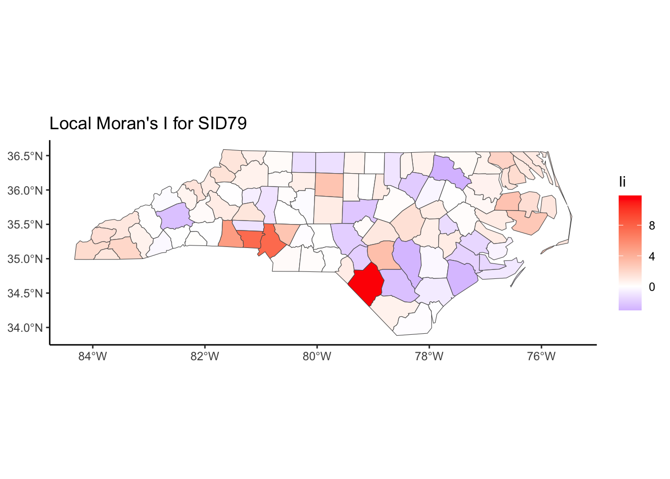
nc %>% bind_cols(local_i) %>%
  mutate(pvalue = cut(`Pr(z != E(Ii))`,breaks=c(-Inf,0.05,Inf), labels = c('P-value < 0.05','P-value > 0.05'))) %>%
  ggplot() +
  geom_sf(aes(fill = pvalue)) +
  labs(title='Local Test of Moran\'s I for SID79') +
  theme_classic()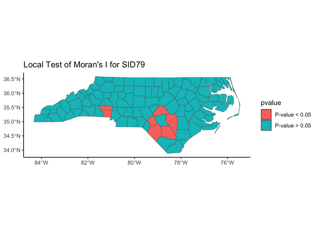
To account for spatial trends and spatial autocorrelation, we follow a series of steps:
\[Y_i = x_i^T\beta + \epsilon_i\] where \(i\) indexes spatial region
Test the residuals after detrending with Moran’s I
If there is spatial autocorrelation as measured by Moran’s I, fit an autoregressive model.
For example, if we want to predict the SID county rate in North Carolina as a function of the birth rate, we could fit a linear model first, then map the residuals and estimate the spatial autocorrelation of the residuals.
nc %>%
  ggplot(aes(y = SID74, x = BIR74)) +
  geom_point() + geom_smooth(se=FALSE) + theme_classic()
`geom_smooth()` using method = 'loess' and formula = 'y ~ x'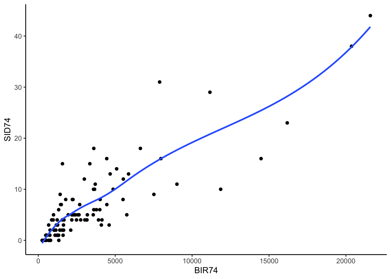
nc_lm <- lm(formula = log(SID74+1) ~ BIR74, data = nc)
nc$lm_resid <- resid(nc_lm)

nc %>%
  ggplot()+
  geom_sf(aes(fill = lm_resid)) +
  scale_fill_gradient2(mid = 'white', high= 'red', low ='blue') +
  theme_classic()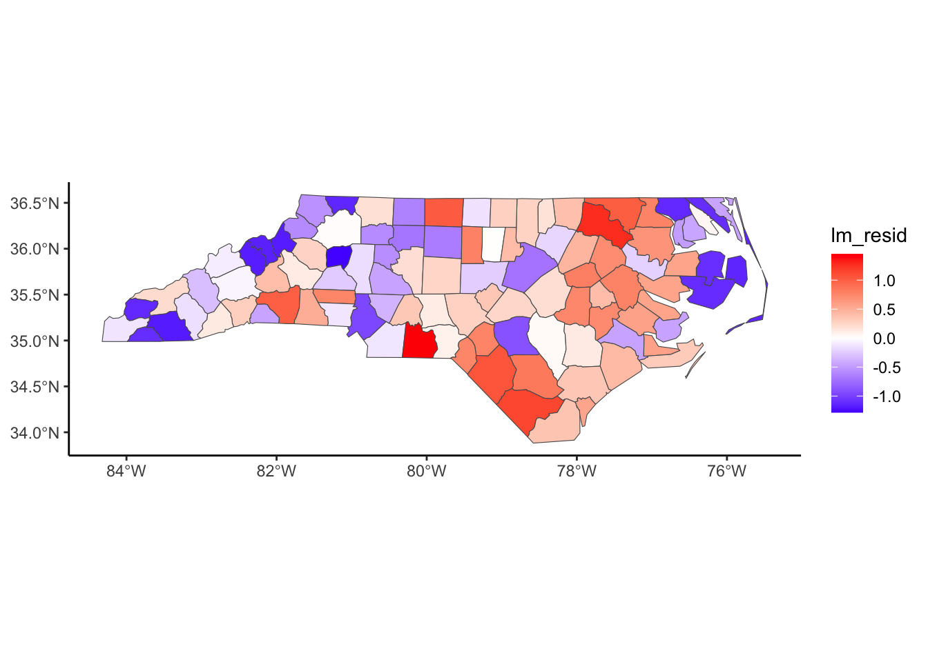
#Examine Extreme Residuals (higher or lower than what we'd expect)
nc %>%
  filter(abs(scale(lm_resid)) > 2)
Warning: Using one column matrices in `filter()` was deprecated in dplyr 1.1.0.
ℹ Please use one dimensional logical vectors instead.Simple feature collection with 1 feature and 15 fields
Geometry type: MULTIPOLYGON
Dimension: XY
Bounding box: xmin: -80.32528 ymin: 34.80792 xmax: -79.85371 ymax: 35.20452
Geodetic CRS: +proj=longlat +datum=NAD27
AREA PERIMETER CNTY_ CNTY_ID NAME FIPS FIPSNO CRESS_ID BIR74 SID74
37007 0.138 1.621 2096 2096 Anson 37007 37007 4 1570 15
NWBIR74 BIR79 SID79 NWBIR79 geometry lm_resid
37007 952 1875 4 1161 MULTIPOLYGON (((-79.91995 3... 1.448938spdep::moran.test(nc$lm_resid, nb2listw(Queen, style='B'), alternative = 'two.sided') # Using randomization test
    Moran I test under randomisation

data:  nc$lm_resid
weights: nb2listw(Queen, style = "B")

Moran I statistic standard deviate = 4.0515, p-value = 5.089e-05
alternative hypothesis: two.sided
sample estimates:
Moran I statistic       Expectation          Variance
0.241674505 -0.010101010 0.003861889 Simultaneous Autoregressive Model (SAR)
Spatial Lag Model
We build autoregressive models for the data based on the proximity matrix \(W\),
\[\mathbf{Y} = \lambda \mathbf{W Y} + \mathbf{X}\boldsymbol \beta + \boldsymbol \epsilon,\quad\quad \boldsymbol\epsilon \sim N(0,\sigma^2I)\]
and typically, we assume \(Y\) are Gaussian if the outcome is continuous and use maximum likelihood estimation to estimate the parameters of this model.
Spatial Error Model
We build autoregressive models for the data based on the proximity matrix \(W\),
\[\mathbf{Y} = \mathbf{X}\boldsymbol \beta + \boldsymbol \epsilon,\quad\quad \text{ where } \boldsymbol \epsilon = \lambda \mathbf{W}\boldsymbol \epsilon + \boldsymbol u,\quad \boldsymbol u \sim N(0,\sigma^2I)\]
and typically, we assume \(Y\) are Gaussian if the outcome is continuous and use maximum likelihood estimation to estimate the parameters of this model.
This can be rewritten as
\[\mathbf{Y} \sim N(\mathbf{X}\boldsymbol\beta, \sigma^2[(I-\lambda \mathbf{W})^{T}(I-\lambda \mathbf{W})]^{-1})\]
where the weighting matrix \(\mathbf{W}\) should be weighted so that the rows sum to 1 (style = 'W").
library(spatialreg)Loading required package: Matrix
Attaching package: 'Matrix'The following objects are masked from 'package:tidyr':
expand, pack, unpack
Attaching package: 'spatialreg'The following objects are masked from 'package:spdep':
get.ClusterOption, get.coresOption, get.mcOption,
get.VerboseOption, get.ZeroPolicyOption, set.ClusterOption,
set.coresOption, set.mcOption, set.VerboseOption,
set.ZeroPolicyOption# Convert Neighborhood Information to List (with weighting so that rows sum to 1)
listW <- nb2listw(Queen, style = 'W')
# Fit SAR Model (spatial lag)
nc_sar_lag <- lagsarlm(formula = log(SID74+1) ~ BIR74, data = nc, listw = listW, type="lag")
summary(nc_sar_lag)
Call:lagsarlm(formula = log(SID74 + 1) ~ BIR74, data = nc, listw = listW,
    type = "lag")

Residuals:
      Min        1Q    Median        3Q       Max
-1.346259 -0.509069  0.078573  0.479147  1.446400

Type: lag
Coefficients: (asymptotic standard errors)
              Estimate Std. Error z value  Pr(>|z|)
(Intercept) 4.3761e-01 1.5781e-01  2.7730  0.005555
BIR74       1.5404e-04 1.5998e-05  9.6288 < 2.2e-16

Rho: 0.40441, LR test value: 19.101, p-value: 1.24e-05
Asymptotic standard error: 0.092236
    z-value: 4.3845, p-value: 1.1626e-05
Wald statistic: 19.224, p-value: 1.1626e-05

Log likelihood: -91.52298 for lag model
ML residual variance (sigma squared): 0.35109, (sigma: 0.59253)
Number of observations: 100
Number of parameters estimated: 4
AIC: 191.05, (AIC for lm: 208.15)
LM test for residual autocorrelation
test value: 0.488, p-value: 0.48482nc$sar_lag_resid <- resid(nc_sar_lag)
nc$sar_lag_pred <- exp(fitted(nc_sar_lag))This method assumes the response is known - see manual pagenc %>%
ggplot()+
geom_sf(aes(fill = sar_lag_pred)) +
labs(title='Predictions from SAR lag Model',fill = 'SID Rate') +
scale_fill_gradient(low = 'lightgrey', high='red')+
theme_classic()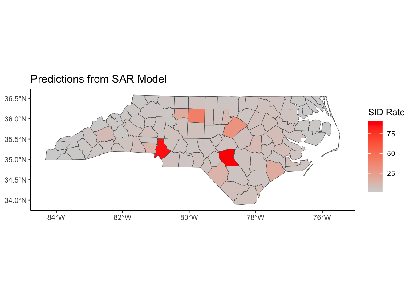
nc %>%
  ggplot()+
  geom_sf(aes(fill = sar_lag_resid)) +
  labs(title='Residuals from SAR lag Model',fill = 'Residuals') +
  scale_fill_gradient2(mid = 'white', high= 'red', low ='blue')+
  theme_classic()
# Fit SAR Model (spatial error)
nc_sar_error = spautolm(formula = log(SID74+1) ~ BIR74, data = nc, listw = listW, family = "SAR")

summary(nc_sar_error)
Call: spautolm(formula = log(SID74 + 1) ~ BIR74, data = nc, listw = listW,
    family = "SAR")

Residuals:
      Min        1Q    Median        3Q       Max
-1.298005 -0.429960  0.077978  0.492145  1.386400

Coefficients:
              Estimate Std. Error z value  Pr(>|z|)
(Intercept) 1.0882e+00 1.2639e-01  8.6097 < 2.2e-16
BIR74       1.5451e-04 1.6083e-05  9.6069 < 2.2e-16

Lambda: 0.48703 LR test value: 16.581 p-value: 4.661e-05
Numerical Hessian standard error of lambda: 0.10493

Log likelihood: -92.78273
ML residual variance (sigma squared): 0.3529, (sigma: 0.59406)
Number of observations: 100
Number of parameters estimated: 4
AIC: 193.57nc$sar_error_resid <- resid(nc_sar_error)
nc$sar_error_pred <- exp(fitted(nc_sar_error))
nc %>%
ggplot()+
geom_sf(aes(fill = sar_error_pred)) +
labs(title='Predictions from SAR error Model',fill = 'SID Rate') +
scale_fill_gradient(low = 'lightgrey', high='red')+
theme_classic()
nc %>%
  ggplot()+
  geom_sf(aes(fill = sar_error_resid)) +
  labs(title='Residuals from SAR error Model',fill = 'Residuals') +
  scale_fill_gradient2(mid = 'white', high= 'red', low ='blue')+
  theme_classic()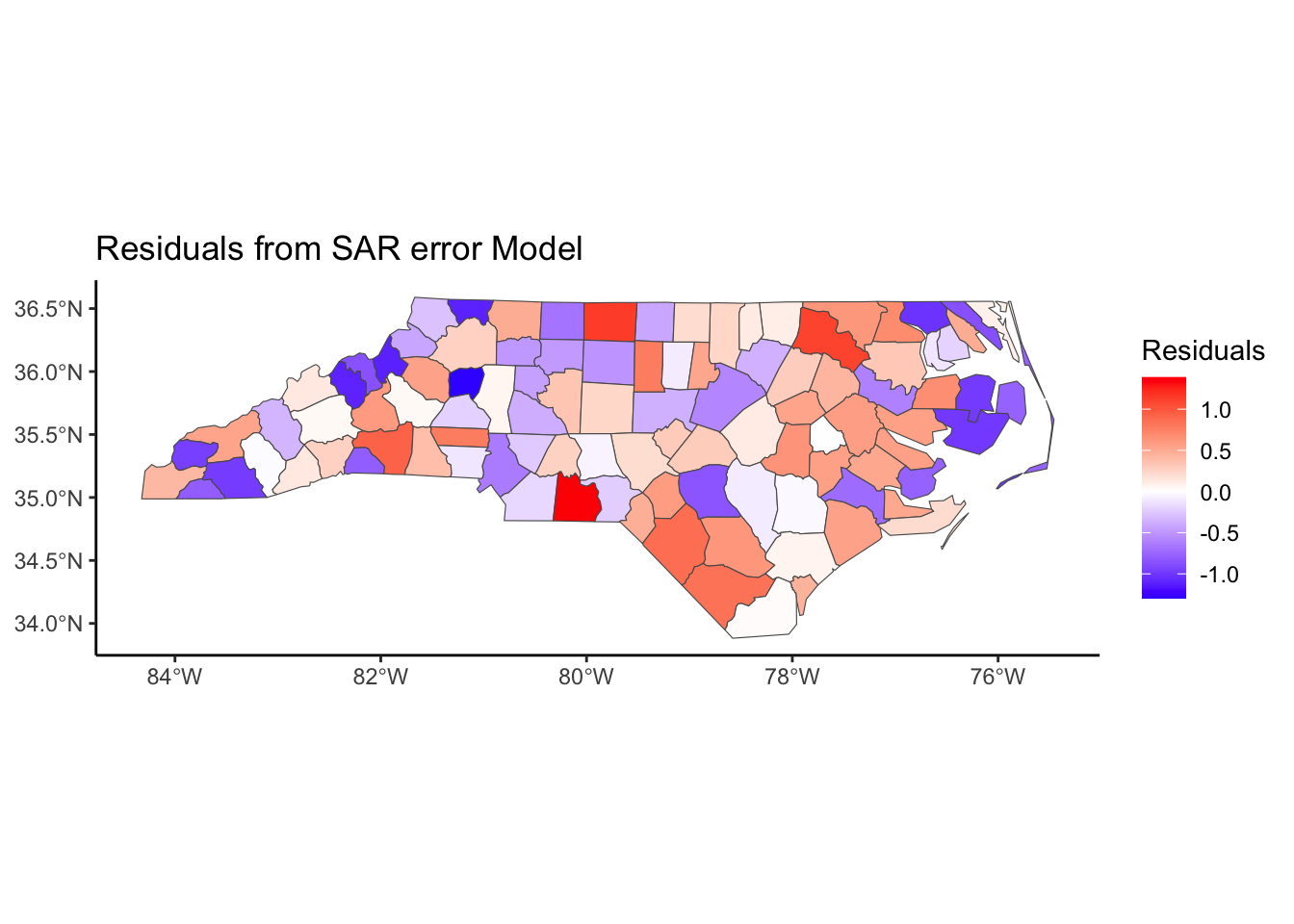
#RMSE
sqrt(mean(nc$sar_lag_resid^2))
[1] 0.5925265sqrt(mean(nc$sar_error_resid^2))[1] 0.5940562#Extreme Residuals (higher or lower than what we'd expect)
nc %>%
filter(abs(scale(sar_lag_resid)) > 3)Simple feature collection with 0 features and 19 fields
Bounding box: xmin: NA ymin: NA xmax: NA ymax: NA
Geodetic CRS: +proj=longlat +datum=NAD27
[1] AREA PERIMETER CNTY_ CNTY_ID
[5] NAME FIPS FIPSNO CRESS_ID
[9] BIR74 SID74 NWBIR74 BIR79
[13] SID79 NWBIR79 geometry lm_resid
[17] sar_lag_resid sar_lag_pred sar_error_resid sar_error_pred
<0 rows> (or 0-length row.names)nc %>%
filter(abs(scale(sar_error_resid)) > 3)Simple feature collection with 0 features and 19 fields
Bounding box: xmin: NA ymin: NA xmax: NA ymax: NA
Geodetic CRS: +proj=longlat +datum=NAD27
[1] AREA PERIMETER CNTY_ CNTY_ID
[5] NAME FIPS FIPSNO CRESS_ID
[9] BIR74 SID74 NWBIR74 BIR79
[13] SID79 NWBIR79 geometry lm_resid
[17] sar_lag_resid sar_lag_pred sar_error_resid sar_error_pred
<0 rows> (or 0-length row.names)# Double check the residuals after the SAR model are independent
spdep::moran.test(nc$sar_lag_resid, nb2listw(Queen, style='W'), alternative = 'two.sided') # Using randomization
    Moran I test under randomisation

data:  nc$sar_lag_resid
weights: nb2listw(Queen, style = "W")

Moran I statistic standard deviate = -0.30652, p-value = 0.7592
alternative hypothesis: two.sided
sample estimates:
Moran I statistic       Expectation          Variance
-0.030164320 -0.010101010 0.004284369 spdep::moran.test(nc$sar_error_resid, nb2listw(Queen, style='W'), alternative = 'two.sided') # Using randomization
    Moran I test under randomisation

data:  nc$sar_error_resid
weights: nb2listw(Queen, style = "W")

Moran I statistic standard deviate = -0.40597, p-value = 0.6848
alternative hypothesis: two.sided
sample estimates:
Moran I statistic       Expectation          Variance
     -0.036666245      -0.010101010       0.004281978
Conditional Autoregressive Model (CAR)
An alternative but similar model says that
\[E(Y_i | Y_j, j\not= i) = x_i^T\beta + \sum^n_{j=1}c_{ij}(Y_j - x^T_j\beta)\]
\[Var(Y_i | Y_j, j\not= i) = \tau^2_i = \tau^2/w_{i.}\]
where \(w_{i.} = \sum^n_{j=1}w_{ij}\), \(c_{ij}\) is nonzero only if \(Y_j\in N_i\), where \(N_i\) is the neighborhood of \(Y_i\). \(c_{ij}\) is typically \(\lambda w_{ij}/w_{i.}\).
This can be rewritten as
\[\mathbf{Y} \sim N(\mathbf{X}\boldsymbol\beta, \sigma^2(I-\lambda \mathbf{W})^{-1})\]
listW = nb2listw(Queen, style = 'W')
nc_car = spautolm(formula = log(SID74+1) ~ BIR74, data = nc, listw = listW, family = "CAR")
Warning in spautolm(formula = log(SID74 + 1) ~ BIR74, data = nc, listw = listW,
: Non-symmetric spatial weights in CAR modelsummary(nc_car)
Call: spautolm(formula = log(SID74 + 1) ~ BIR74, data = nc, listw = listW,
    family = "CAR")

Residuals:
     Min       1Q   Median       3Q      Max
-1.23287 -0.39827  0.10560  0.43790  1.40183

Coefficients:
              Estimate Std. Error z value  Pr(>|z|)
(Intercept) 8.9713e-01 1.3265e-01  6.7634 1.348e-11
BIR74       1.6749e-04 1.6149e-05 10.3716 < 2.2e-16

Lambda: 0.77612 LR test value: 16.605 p-value: 4.6027e-05
Numerical Hessian standard error of lambda: 0.34138

Log likelihood: -92.77079
ML residual variance (sigma squared): 0.34097, (sigma: 0.58393)
Number of observations: 100
Number of parameters estimated: 4
AIC: 193.54nc$car_resid <- resid(nc_car)
nc$car_pred <- exp(fitted(nc_car))
nc %>%
ggplot()+
geom_sf(aes(fill = car_pred)) +
labs(title='Predictions from CAR Model',fill = 'SID Rate') +
scale_fill_gradient(low = 'lightgrey', high='red')+
theme_classic()
nc %>%
  ggplot()+
  geom_sf(aes(fill = car_resid)) +
  labs(title='Residuals from CAR Model',fill = 'Residuals') +
  scale_fill_gradient2(mid = 'white', high= 'red', low ='blue')+
  theme_classic()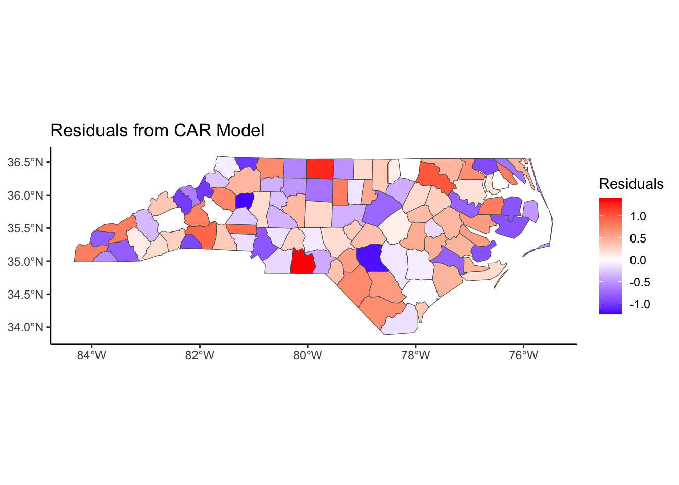
#RMSE
sqrt(mean(nc$car_resid^2))
[1] 0.5882464#Extreme Residuals (higher or lower than what we'd expect)
nc %>%
filter(abs(scale(car_resid)) > 3)Simple feature collection with 0 features and 21 fields
Bounding box: xmin: NA ymin: NA xmax: NA ymax: NA
Geodetic CRS: +proj=longlat +datum=NAD27
[1] AREA PERIMETER CNTY_ CNTY_ID
[5] NAME FIPS FIPSNO CRESS_ID
[9] BIR74 SID74 NWBIR74 BIR79
[13] SID79 NWBIR79 geometry lm_resid
[17] sar_lag_resid sar_lag_pred sar_error_resid sar_error_pred
[21] car_resid car_pred
<0 rows> (or 0-length row.names)# Double check the residuals after the SAR model are independent
spdep::moran.test(nc$car_resid, nb2listw(Queen, style='W'), alternative = 'two.sided') # Using randomization
    Moran I test under randomisation

data:  nc$car_resid
weights: nb2listw(Queen, style = "W")

Moran I statistic standard deviate = -3.2381, p-value = 0.001203
alternative hypothesis: two.sided
sample estimates:
Moran I statistic       Expectation          Variance
     -0.222000699      -0.010101010       0.004282266
Typically, the CAR model and its variations (iCAR, BYM, etc.) are fit in a Bayesian context. The details of the Bayesian estimation are beyond the scope of this course. See CARBayes package for more details.
Note: If you have count data within an area, transform it with a log() and model with a Gaussian model.
Reference about SAR and CAR Models and Covariance: https://doi.org/10.1016/j.spasta.2018.04.006
See the CARBayes package for more information.
While the SAR and CAR models are similar to autoregressive models for time series, we could also allow coefficients to differ across space, similar to a mixed effects model that we used for longitudinal data.
\[\mathbf{Y} = \mathbf{X}\boldsymbol \beta +\mathbf{b} + \boldsymbol \epsilon,\quad\quad \boldsymbol\epsilon \sim N(0,\sigma^2I)\]
where the random effects \(\mathbf{b}\sim N(0,G)\) and \(G\) can be assumed to be a covariance matrix based on spatial correlation such as the Matern correlation structure.
library(spaMM)Registered S3 methods overwritten by 'registry':
method from
print.registry_field proxy
print.registry_entry proxyspaMM (Rousset & Ferdy, 2014, version 4.6.1) is loaded.
Type 'help(spaMM)' for a short introduction,
'news(package='spaMM')' for news,
and 'citation('spaMM')' for proper citation.
Further infos, slides, etc. at https://gitlab.mbb.univ-montp2.fr/francois/spamm-ref.
Attaching package: 'spaMM'The following objects are masked from 'package:spatstat.model':
Poisson, pseudoR2, responsenc2 <- cbind(nc, st_coordinates(st_centroid(nc))) %>%
rename(x = X, y = Y) %>% # Rename coordinates to x and y for spaMM
as.data.frame()Warning: st_centroid assumes attributes are constant over geometriesspamm <- fitme(log(SID74+1) ~ BIR74 + Matern(1 | x+y), data = nc2, fixed = list(nu = 0.5))
summary(spamm)formula: log(SID74 + 1) ~ BIR74 + Matern(1 | x + y)
ML: Estimation of corrPars, lambda and phi by ML.
Estimation of fixed effects by ML.
Estimation of lambda and phi by 'outer' ML, maximizing logL.
family: gaussian( link = identity )
------------ Fixed effects (beta) ------------
Estimate Cond. SE t-value
(Intercept) 0.9579409 0.2921880 3.279
BIR74 0.0001473 0.0000156 9.446
--------------- Random effects ---------------
Family: gaussian( link = identity )
--- Correlation parameters:
1.nu 1.rho
0.5000000 0.6325215
--- Variance parameters ('lambda'):
lambda = var(u) for u ~ Gaussian;
x + y : 0.3342
# of obs: 100; # of groups: x + y, 100
-------------- Residual variance ------------
phi estimate was 0.214876
------------- Likelihood values -------------
logLik
logL (p_v(h)): -89.61781spamm.map <- cbind(nc, spamm_pred = predict(spamm)) %>%
mutate(spamm_resid = log(SID74+1) - spamm_pred)
spamm.map %>%
ggplot(aes(fill = exp(spamm_pred))) +
geom_sf() +
scale_fill_gradient(low = 'lightgrey', high='red')+
theme_classic()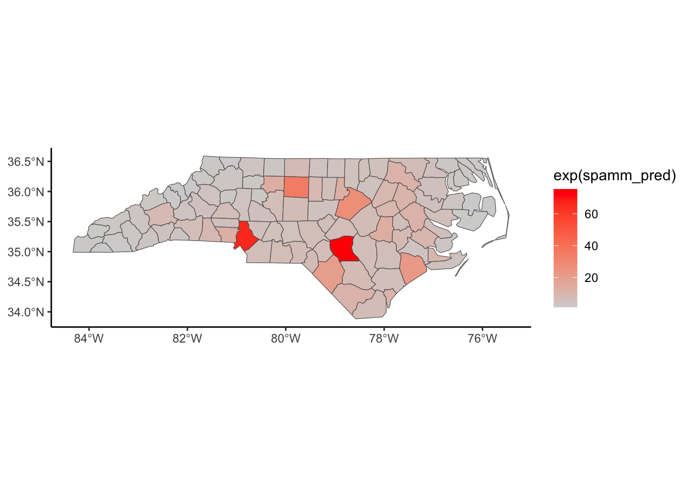
spamm.map %>%
  ggplot(aes(fill = spamm_resid)) +
  geom_sf() +
  scale_fill_gradient2(mid = 'white', high= 'red', low ='blue') +
  theme_classic()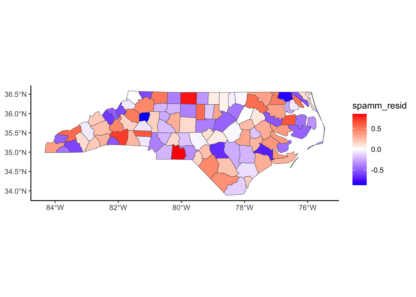
## RMSE
sqrt(mean(spamm.map$spamm_resid^2))
[1] 0.3854601# Extreme Residuals (higher or lower than what we'd expect)
spamm.map %>%
filter(abs(scale(spamm_resid)) > 3)Simple feature collection with 0 features and 23 fields
Bounding box: xmin: NA ymin: NA xmax: NA ymax: NA
Geodetic CRS: +proj=longlat +datum=NAD27
[1] AREA PERIMETER CNTY_ CNTY_ID
[5] NAME FIPS FIPSNO CRESS_ID
[9] BIR74 SID74 NWBIR74 BIR79
[13] SID79 NWBIR79 lm_resid sar_lag_resid
[17] sar_lag_pred sar_error_resid sar_error_pred car_resid
[21] car_pred spamm_pred geometry spamm_resid
<0 rows> (or 0-length row.names)# Double check the residuals after the model are independent
spdep::moran.test(spamm.map$spamm_resid, nb2listw(Queen, style='W'), alternative = 'two.sided') # Using randomization
    Moran I test under randomisation

data:  spamm.map$spamm_resid
weights: nb2listw(Queen, style = "W")

Moran I statistic standard deviate = -2.3794, p-value = 0.01734
alternative hypothesis: two.sided
sample estimates:
Moran I statistic       Expectation          Variance
-0.165848405 -0.010101010 0.004284663 Lastly, we present a non-parametric approach to spatial correlation called Geographically Weighted Regression (GWR). The general model is
\[Y_i = \beta_{i0} + \sum^p_{k=1}\beta_{ik}x_{ik} + \epsilon_i\]
where \(Y_i\) is the outcome at location \(i\), \(x_{ik}\) is the value of the \(k\)th explanatory variable at location \(i\), and \(\beta_{ik}\) is a local regression coefficient for the \(k\)th explanatory variable.
GWR allows the coefficients to vary continuously over a study region, and a set of coefficients can be estimated at any location. This is a non-parametric approach in that we do not specify the structure of how the coefficients vary, but rather use a “local regression” approach in 2 dimensions.
Each set of regression coefficients is estimated by weighted least squares (weighting points closer in space than those further away),
\[\hat{\boldsymbol\beta}_i = (\mathbf{X}^T\mathbf{W}_i\mathbf{X})^{-1}\mathbf{X}^T\mathbf{W}_i\mathbf{Y}\]
where \(\mathbf{W}_i\) is a diagonal matrix denoting the geographical weighting of each observed data for regression point \(i\). The weighting is calculated with a chosen kernel function based on proximities between the location \(i\) and the location of the other data points. One kernel function that could be used is the Gaussian kernel, such that
\[w_{ij} = \exp\left[\frac{-1}{2}\left(\frac{d_{ij}}{b}\right)^2 \right]\]
where \(d_{ij}\) is the distance between observation point \(j\) and regression point \(i\) and \(b\) is the kernel bandwidth. The optimal bandwidth can be chosen using cross-validation or a goodness-of-fit measure such as AIC or BIC.
library(spgwr)NOTE: This package does not constitute approval of GWR
as a method of spatial analysis; see example(gwr)GWRbandwidth <- gwr.sel(log(SID74+1) ~ BIR74, data = nc2, coords = as.matrix(nc2[,c('x','y')]), adapt = TRUE)Adaptive q: 0.381966 CV score: 40.10318
Adaptive q: 0.618034 CV score: 43.03422
Adaptive q: 0.236068 CV score: 36.54116
Adaptive q: 0.145898 CV score: 32.79307
Adaptive q: 0.09016994 CV score: 30.15781
Adaptive q: 0.05572809 CV score: 30.70451
Adaptive q: 0.08427944 CV score: 30.29308
Adaptive q: 0.1114562 CV score: 30.87369
Adaptive q: 0.09830056 CV score: 30.27686
Adaptive q: 0.0915056 CV score: 30.16935
Adaptive q: 0.08791997 CV score: 30.16358
Adaptive q: 0.08945536 CV score: 30.1547
Adaptive q: 0.08932905 CV score: 30.15461
Adaptive q: 0.08928836 CV score: 30.15461
Adaptive q: 0.08936974 CV score: 30.15462
Adaptive q: 0.08932905 CV score: 30.15461 gwr.model <- gwr(log(SID74+1) ~ BIR74, data = nc2,
adapt=GWRbandwidth,
coords = as.matrix(nc2[,c('x','y')]),
hatmatrix=TRUE,
se.fit=TRUE)
gwr.modelCall:
gwr(formula = log(SID74 + 1) ~ BIR74, data = nc2, coords = as.matrix(nc2[,
c("x", "y")]), adapt = GWRbandwidth, hatmatrix = TRUE, se.fit = TRUE)
Kernel function: gwr.Gauss
Adaptive quantile: 0.08932905 (about 8 of 100 data points)
Summary of GWR coefficient estimates at data points:
Min. 1st Qu. Median 3rd Qu. Max. Global
X.Intercept. 0.29756084 0.64874576 1.04875034 1.46053450 1.69422536 1.0530
BIR74 0.00010846 0.00012462 0.00016401 0.00024836 0.00064206 0.0002
Number of data points: 100
Effective number of parameters (residual: 2traceS - traceS'S): 15.4748
Effective degrees of freedom (residual: 2traceS - traceS'S): 84.5252
Sigma (residual: 2traceS - traceS'S): 0.53242
Effective number of parameters (model: traceS): 11.33877
Effective degrees of freedom (model: traceS): 88.66123
Sigma (model: traceS): 0.519853
Sigma (ML): 0.4894941
AICc (GWR p. 61, eq 2.33; p. 96, eq. 4.21): 169.387
AIC (GWR p. 96, eq. 4.22): 152.2499
Residual sum of squares: 23.96045
Quasi-global R2: 0.7270107 gwr.map <- cbind(nc, as.matrix(as.data.frame(gwr.model$SDF))) %>%
mutate(gwr_resid = log(SID74+1) - pred)
#map the coef, map the r2, map the residuals
gwr.map %>%
ggplot(aes(fill = X.Intercept.)) +
geom_sf() +
scale_fill_gradient(low = 'lightgrey', high='blue')+
theme_classic()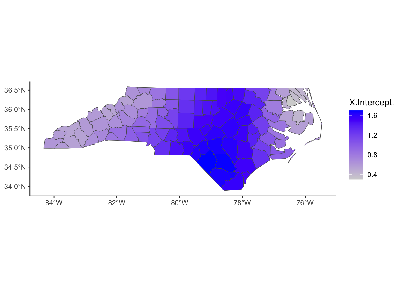
gwr.map %>%
  ggplot(aes(fill = BIR74.1)) +
  geom_sf() +
  scale_fill_gradient(low = 'lightgrey', high='green')+
  theme_classic()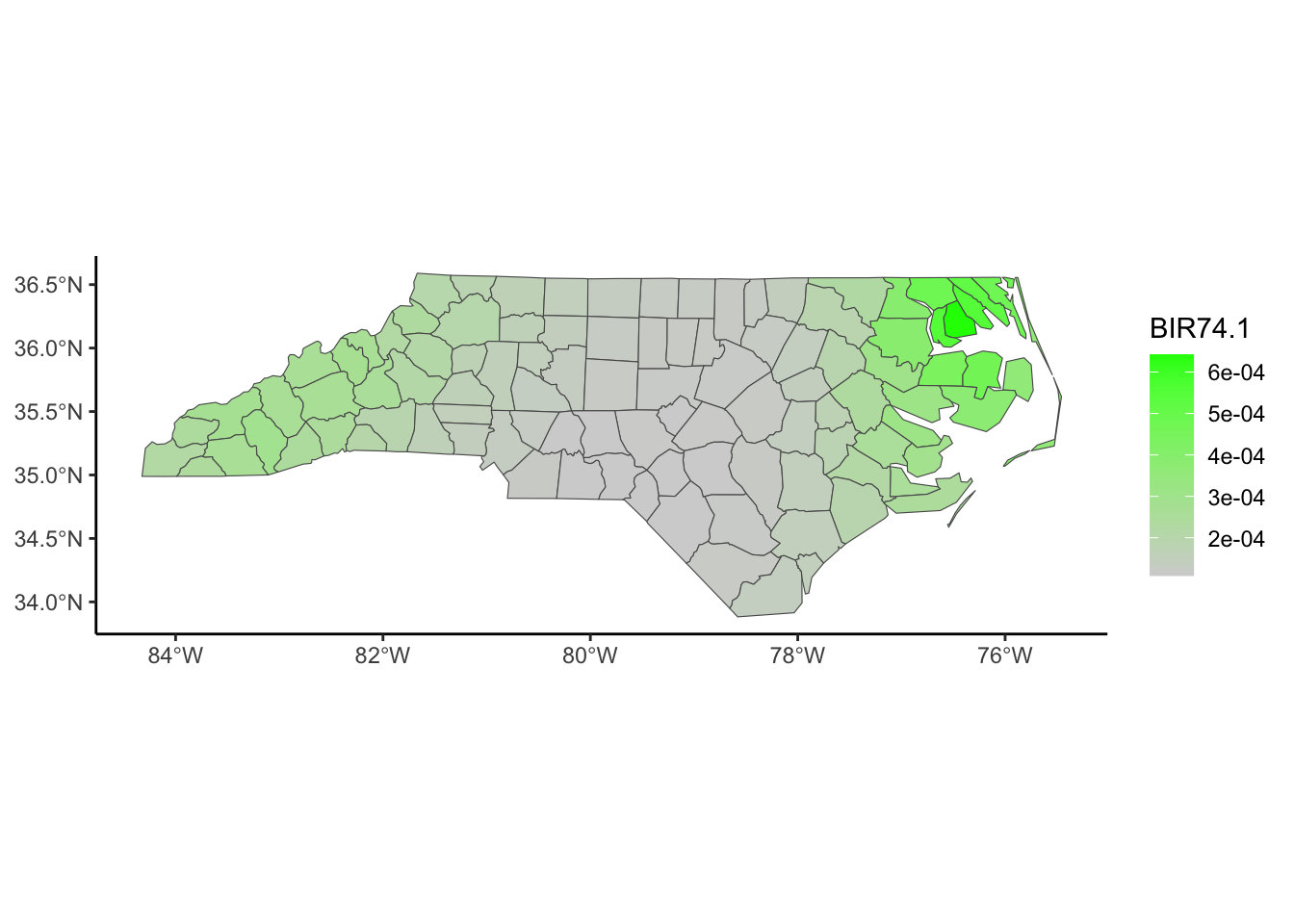
gwr.map %>%
  ggplot(aes(fill = exp(pred))) +
  scale_fill_gradient(low = 'lightgrey', high='red')+
  geom_sf() + theme_classic()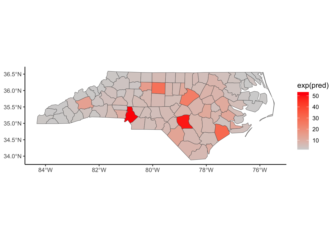
gwr.map %>%
  ggplot(aes(fill = gwr_resid)) +
  geom_sf() +
  scale_fill_gradient2(mid = 'white', high= 'red', low ='blue') +
  theme_classic()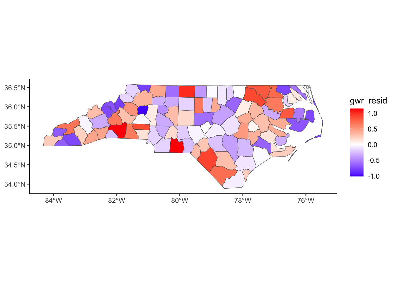
## RMSE
sqrt(mean(gwr.map$gwr_resid^2))
[1] 0.4894941gwr.map %>%
ggplot(aes(fill = localR2)) +
geom_sf() + theme_classic()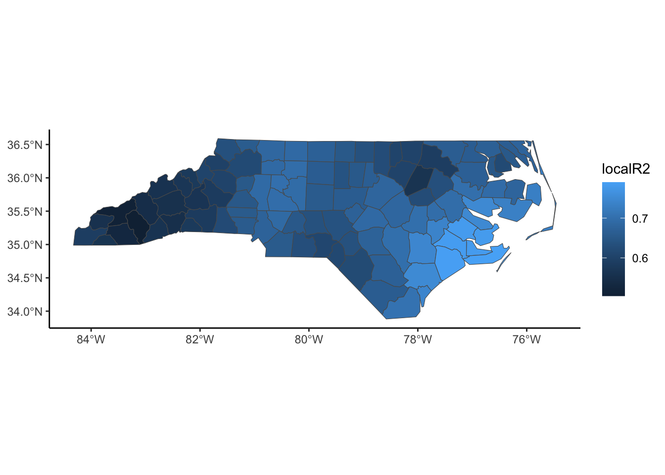
# Double check the residuals after the  model are independent
spdep::moran.test(gwr.map$gwr_resid, nb2listw(Queen, style='W'), alternative = 'two.sided') # Using randomization
    Moran I test under randomisation

data:  gwr.map$gwr_resid
weights: nb2listw(Queen, style = "W")

Moran I statistic standard deviate = 0.53231, p-value = 0.5945
alternative hypothesis: two.sided
sample estimates:
Moran I statistic       Expectation          Variance
0.024710153 -0.010101010 0.004276652 While it may be the easiest to define spatial distance using the Euclidean distance between centroids of the areal boundaries, that may not be the most meaningful.
Two locations that are “close” geographically might be quite different due to other environmental factors such as physical factors (e.g., rivers, road infrastructure, and associated conditions of accessibility), socio-economic factors (e.g., preferences for hospitals, schools, and stores), and administrative geographies.
If you study outcomes related to transportation, river/stream networks or some complex terrain conditions, typical distance metrics may fail to reflect true spatial proximity. Instead, others should be considered, such as road network distance, travel time, water-based distance (along a river or stream or coastline), or landscape-based (i.e. complex terrain) distance.