source('Active_Cleaning.R')

activeLong %>%
  ggplot(aes(x = Years, y = Reasoning)) +
  geom_point() +
  geom_line(aes(group = factor(AID))) +
  geom_smooth(method = 'loess',color = 'blue' , se = FALSE) +
  facet_wrap(~ INTGRP)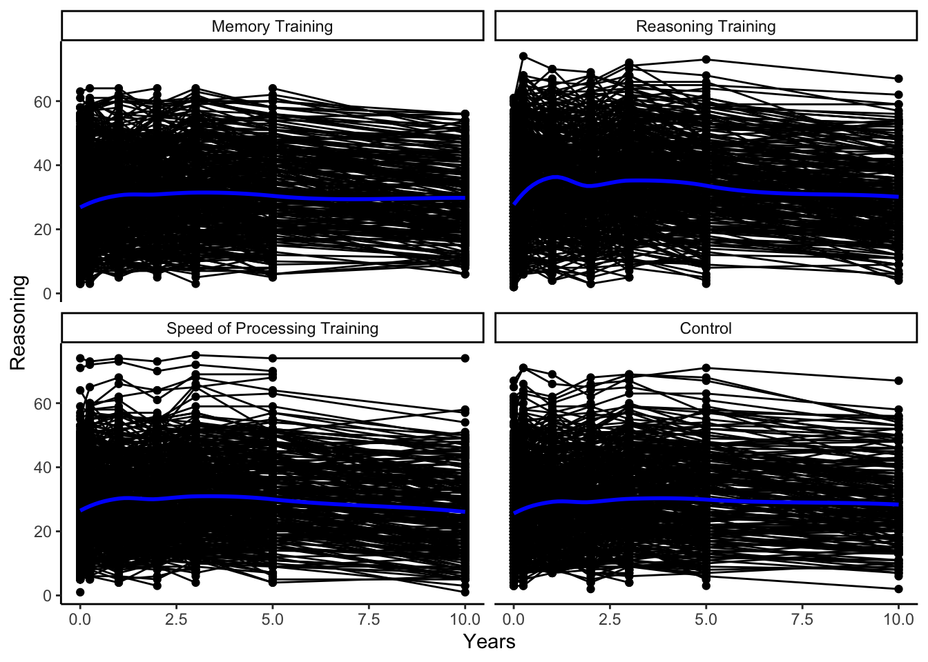
In this class, we focus on temporal data, in which we have repeated measurements over time on the same units, and spatial data, in which the measurement location plays a meaningful role in the analysis.
There are two types of temporal data we discuss in this class.
We call temporal data a time series if we have measurements on a smaller number of units or subjects taken at many (typically \(>20\)) regular and equally-spaced times.
We call temporal data longitudinal data if we have measurements on many units or subjects taken at approximately 2 to 20 observation times (potentially irregular, unequally-spaced times) that may differ between subjects. If we have repeated measurements on each subject in different conditions, rather than necessarily over some time, we call this data repeated measures data, but the methods will be the same for both longitudinal and repeated measures data.
Spatial data can be measured as
observations at a point in space, typically measured using a longitude and latitude coordinate system, or
areal units, which are aggregated summaries based on natural or societal boundaries such as county districts, census tracts, postal code areas, or any other arbitrary spatial partition.
The common thread between these types of data is that observations measured closer in time or space tend to be more similar (more positively correlated) than observations measured further away in time or space.
Here are some examples of these types of data.
source('Active_Cleaning.R')
activeLong %>%
ggplot(aes(x = Years, y = Reasoning)) +
geom_point() +
geom_line(aes(group = factor(AID))) +
geom_smooth(method = 'loess',color = 'blue' , se = FALSE) +
facet_wrap(~ INTGRP)
To motivate why this class is important, let’s consider applying linear regression (least squares) models that you learned in your introductory statistics course, Stat 155. We will call the method of least squares regression you used ordinary least squares (or OLS, for short).
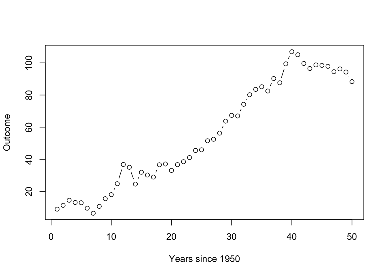
Suppose we have 50 observations over time where our outcome of interest is observed yearly, and it linearly increases over time, but there is random variation from year to year. If the random fluctuation is large and positive one year, it is more likely to be large and positive next year. In particular, let’s assume that our outcome \(y_t\) roughly doubles every year, such that
\[y_t = 2*x_t + \epsilon_t\]
where \(x_1 = 1, x_2 = 2,...,x_{50} = 50\) represents the year since 1950 and the random fluctuation, or the noise, \(\epsilon_t\) are positively correlated from time \(t\) to \(t+1\) and generated from an autoregressive process – we’ll talk about this process later.
Let’s see a plot of one possible realization (for one subject or unit) generated from this random process. The overall trend is a line with an intercept at 0 and a slope of 2, but we can see that the observations don’t just randomly bounce around that line but rather stick close to where the past value was.
If we were to ignore the correlation in the random fluctuation across time, we could fit a simple linear regression model,
\[y_t = \beta_0 + \beta_1 x_t + \epsilon_t,\quad \epsilon_t \stackrel{iid}{\sim} N(0,\sigma^2)\]
using OLS to estimate the general or overall relationship with year, we’ll call that big picture relationship the trend.
lm(y ~ x) %>% summary()
Call:
lm(formula = y ~ x)

Residuals:
     Min       1Q   Median       3Q      Max
-20.8574  -6.1287  -0.3483   6.6895  19.7229

Coefficients:
            Estimate Std. Error t value Pr(>|t|)
(Intercept) -0.69654    2.36584  -0.294     0.77
x            2.19734    0.08074  27.213   <2e-16 ***
---
Signif. codes:  0 '***' 0.001 '**' 0.01 '*' 0.05 '.' 0.1 ' ' 1

Residual standard error: 8.239 on 48 degrees of freedom
Multiple R-squared:  0.9391,    Adjusted R-squared:  0.9379
F-statistic: 740.6 on 1 and 48 DF,  p-value: < 2.2e-16
Even with linear regression, we do well estimating the slope (\(\hat{\beta_1} = 2.19\) when the true slope value in how we generated the data is \(\beta_1 = 2\)). But let’s consider the standard error of that slope, the estimated variability of that slope estimate. The lm() function gives a standard error of 0.08074.
WARNING: This is not a valid estimate of the variability in the slope with correlated data. Let’s generate more data to see why!
Let’s simulate this same process 500 times (get different random fluctuations) so we can get a sense of how much the estimated slope (which was a “good” estimate) might change.
We can look at all of the estimated slopes by looking at a histogram of the values in beta.
sim_cor_data_results %>%
  ggplot(aes(x = beta)) +
  geom_histogram() +
  geom_vline(xintercept = 2, color = 'red') #true value used to generate the data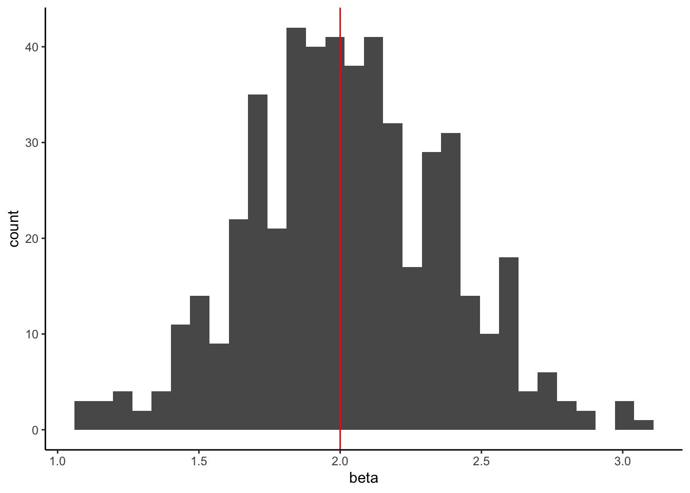
It is centered at the true slope of 2 (great!). This indicates that our estimate is unbiased (on average, OLS using the lm() function gets the true value of 2). The estimate is unbiased if the expected value of our estimated slope equals the true slope we used to generate the data,
\[E(\hat{\beta_1}) = \beta_1\]
Now, let’s look at the standard errors (SE) that OLS using lm() gave us.
sim_cor_data_results %>%
  ggplot(aes(x = se)) +
  geom_histogram() +
  geom_vline(xintercept = sd(beta), color = 'red') #true variability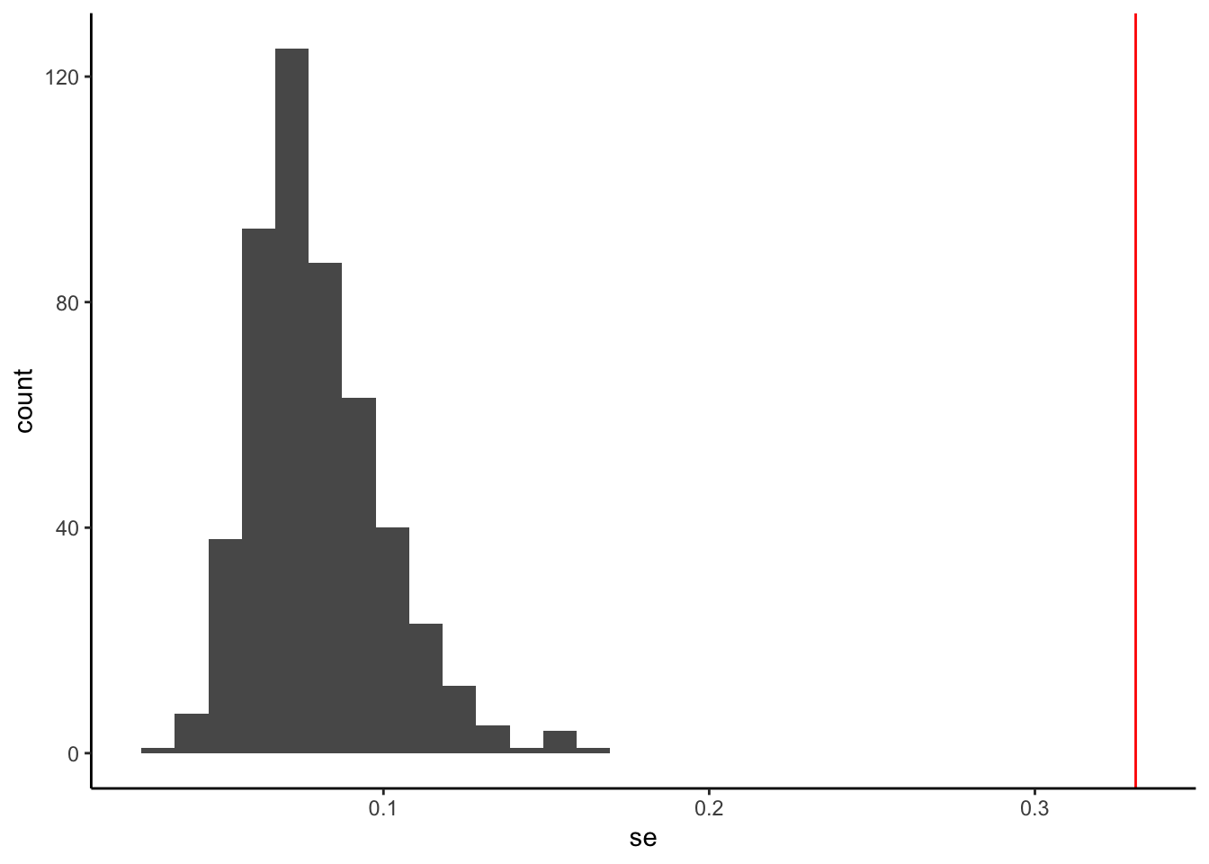
The true variability of the slopes is estimated by the standard deviation of beta from the simulations (around 0.33), but the values provided from lm() are all between 0.03 and 0.1.
lm(), which assumes the observations are independent, underestimates the true variation of the slope estimate.Why does this happen?
If the data were truly independent, then each random data point would give you unique, important information. If the data are correlated, the observations contain overlapping information (e.g., knowing today’s interest in cupcakes tells you something about tomorrow’s interest in cupcakes). Thus, your effective sample size for positively correlated data is going to be less than the sample size of independent observations. You could get the same amount of information about the phenomenon with fewer data points. You could space them apart further in time so they are almost independent.
The variability of our estimates depends on the information available. Typically, the sample size of independent observations captures the measure of information, but if we have correlated observations, the effective sample size (which is usually smaller than the actual sample size) gives a more accurate measure of the information available.
In this specific simulation of \(n = 50\) from an autoregressive order 1 process, the effective sample size is calculated as \(50/(1 + 2*0.9) = 17.9\), where \(0.9\) was the correlation used to generate the autoregressive noise. The 50 correlated observations contain about the same amount of information as about 18 independent observations.
If you are interested in the theory of calculating effective sample size, check out these two blog posts, Andy Jones Blog and the Stan handbook
What is the big takeaway?
When we use lm(), we are using the ordinary least squares (OLS) method of estimating a regression model. In this method, we assume that the observations are independent of each other.
If our data is actually correlated (not independent, the OLS slope estimates are good (unbiased), but the inference based on the standard errors (including the test statistics, the p-values, and confidence intervals) is wrong.
In this case, the true variability of the slope estimates is much higher than the OLS estimates given by lm() because the effective sample size is much smaller.
With any of the data examples above or the examples we talk about in class, observations taken closer in time or space are typically going to be more similar than observations taken further apart in space or time.
We may be able to explain why data points closer together are more similar using predictors or explanatory variables, but there may be unmeasured characteristics or inherent dependence that we can’t explain with our collected data.
To be more precise, we will assume that the observed outcome at time \(t\) (we will generalize this notation to spatial data) can be modeled as
\[y_t = \underbrace{f(x_t)}_\text{trend} + \underbrace{\epsilon_t}_\text{noise}\]
where the trend can be modeled as a deterministic function based on predictors, and there is leftover random noise. This noise might include both serial autocorrelation due to observations being observed close in time, plus random variability or measurement error from the data collection instrument.
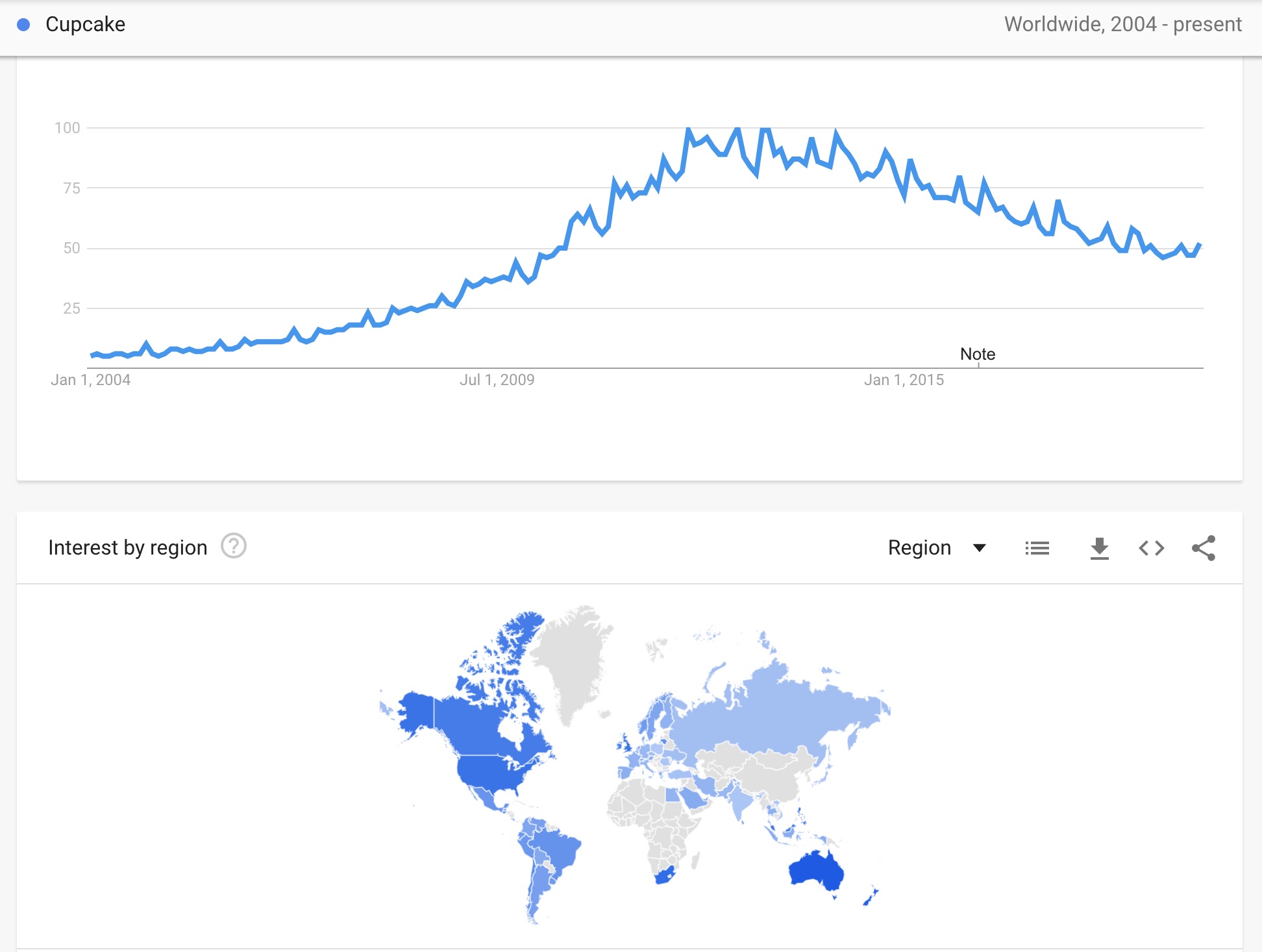
Time Series Example
Consider the Google search frequency for “cupcake” data example.
The number of people who are searching for the term “cupcake” should be a function of general interest in cupcakes. This interest could change throughout the year by season, or it may be reflected in the number of cupcake shops in business or the number of mentions of cupcakes on network television. We could use these measured predictors in modeling the overall trend in search frequency.
What else may explain differences in the interest in cupcakes over time? Even if we can collect and account for these other cultural characteristics, the number of searches for cupcakes will be similar from one day to the next because culture and general interest typically do not change overnight (unless an extreme event happens).
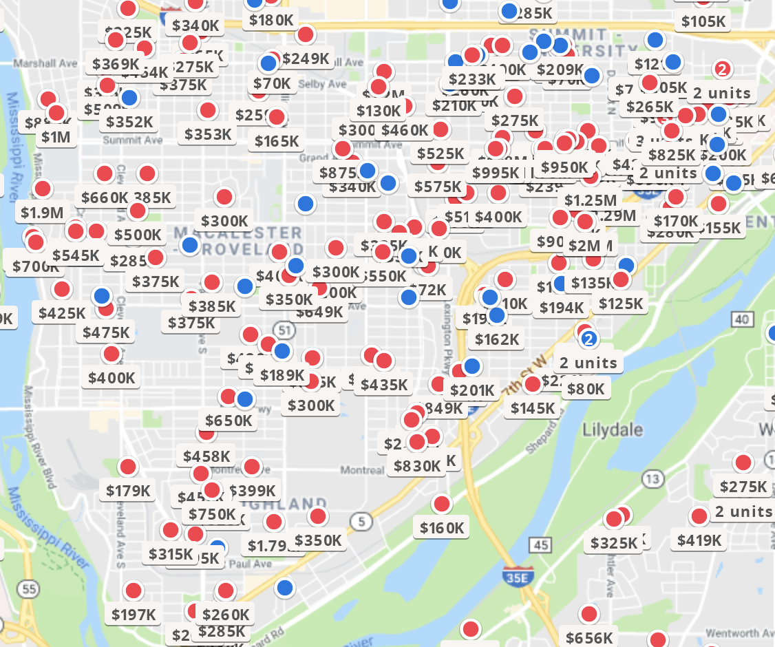
Spatial Example
Consider the home sale prices from Zillow. Price will be determined by a combination of the home characteristics (e.g., number of bedrooms, bathrooms, size, home quality) as well as neighborhood characteristics (e.g., walking distance to amenities, perception of school reputation). These characteristics could be used to model the general trends of sale prices. Even after controlling for these measurable qualities, homes that are next to each other or on the same block will have a similar price.
For each data type, we discuss these two components, the trend and the noise. In particular, we can’t assume the noise is independent, so we need to model the covariance and correlation of the noise, treating it as a series of random variables.
We’ll come back to questions 2 and 3 for each sub-field. Let’s spend some time thinking about the covariance and correlation in the context of a random process.
With all three of the correlated data types, we explicitly or implicitly model the covariance between observations, so we need to be quite familiar with the probability theory of covariance.
Let’s go on a journey together, learning the foundational approaches to dealing with correlated (temporal or spatial) data!
We’ll start with a review of important probability concepts and review/learn some basic matrix notation that simplifies our probability model notation by neatly organizing our model information. Then we’ll spend some time thinking about how we define or encode dependence between observations in models.
The course will be structured so that we spend a few weeks with each type of data structure. We’ll learn the characteristics and structure that define that type of correlated data and the standard models and approaches used to deal with the dependence over time or space. By the end of this course, you should have a foundational understanding of how to analyze correlated data and be able to learn more advanced methodologies within each of these data types.