---
title: "Evaluating Classification Models (Notes)"
subtitle: "Stat 253"
author: "Your Name"
format:
html:
toc: true
toc-depth: 2
embed-resources: true
---
```{r include = FALSE}
knitr::opts_chunk$set(
collapse = TRUE,
warning = FALSE,
message = FALSE,
fig.height = 2.75,
fig.width = 4.25,
fig.env='figure',
fig.pos = 'h',
fig.align = 'center')
```
# Learning Goals {-}
- Calculate (by hand from confusion matrices) and contextually interpret overall accuracy, sensitivity, and specificity
- Construct and interpret plots of predicted probabilities across classes
- Explain how a ROC curve is constructed and the rationale behind AUC as an evaluation metric
- Appropriately use and interpret the no-information rate to evaluate accuracy metrics
# Notes: Classification Evaluation {-}
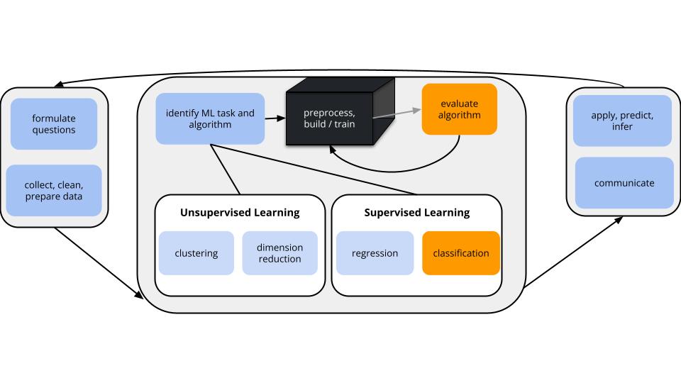
## Where are we? {.unnumbered .smaller}
{width=90%}
**CONTEXT**
- **world = supervised learning**
We want to model some output variable $y$ using a set of potential predictors ($x_1, x_2, ..., x_p$).
- **task = CLASSIFICATION**
$y$ is categorical and **binary**
- **(parametric) algorithm**
logistic regression
- **application = classification**
- Use our algorithm to calculate the probability that y = 1.
- Turn these into binary classifications using a classification rule. For some probability threshold c:
- If the probability that y = 1 is at least c, classify y as 1.
- Otherwise, classify y as 0.
- WE get to pick c. This should be guided by *context* (what are the consequences of misclassification?) and the *quality* of the resulting classifications.
**GOAL**
- *Evaluate* the quality of binary classifications of $y$ (here resulting logistic regression model).
## Pause {-}
Take a minute to think about (& write answers to) the following:
- What tool did we use to assess the quality of our predictions of $y$ in the regression context?
- Why might that tool *not* be useful to us in our new classification context?
Discuss at your table.
## Sensitivity & specificity {.unnumbered .smaller}
- **overall accuracy**
= probability of making a correct classification
- **sensitivity**
= true positive rate
= probability of correctly classifying $y=1$ as $y=1$
- **specificity**
= true negative rate
= probability of correctly classifying $y=0$ as $y=0$
- $1 - \text{specificity}$
= false positive rate
= probability of classifying $y=0$ as $y=1$
**In-sample estimation** (how well our model classifies the same data points we used to build it)
y = 0 y = 1
-------------- ------- -------
classify as 0 a b
classify as 1 c d
$$\begin{split}
\text{overall accuracy} & = \frac{a + d}{a + b + c + d}\\
\text{sensitivity} & = \frac{d}{b + d} \\
\text{specificity} & = \frac{a}{a + c} \\
\end{split}$$
**k-Fold Cross-Validation** (how well our model classifies NEW data points)
- Divide the data into k folds of approximately equal size.
- Repeat the following procedures for each fold j = 1, 2, ..., k:
- Remove fold j from the data set.
- Fit a model using the other k - 1 folds.
- Use this model to classify the outcomes for the data points in fold j.
- Calculate the overall accuracy, sensitivity, and specificity of these classifications.
- Average the metrics across the k folds. This gives our CV estimates of overall accuracy, sensitivity, and specificity.
## ROC curves {.unnumbered .smaller}
**ROC** = **R**eceiver **O**perating **C**haracteristic curves
Sensitivity and specificity depend upon the *specific* probability threshold c.
- If we lower c, hence make it *easier* to classify y as 1:
- sensitivity increases *but* specificity decreases
- If we increase c, hence make it *tougher* to classify y as 1:
- specificity increases *but* sensitivity decreases
To understand this trade-off, for a *range* of possible thresholds c between 0 and 1, ROC curves calculate and plot
- y-axis: sensitivity (true positive rate)
- x-axis: 1 - specificity (false positive rate)
- Since specificity is the probability of classifying y = 0 as 0, 1 - specificity is the probability of misclassifying y = 0 as 1.
Why we care:
- Along with context, ROC curves can help us identify an appropriate probability threshold c.
- ROC curves can help us compare the quality of different models.
- The **area under an ROC curve** (AUC) estimates the probability that our algorithm is *more* likely to classify y = 1 as 1 than to classify y = 0 as 1, hence distinguish between the 2 classes.
- Put another way: if we give our model 2 data points, one with y = 0 and the other with y = 1, AUC is the probability that we correctly identify which is which.
# Small Group Discussion {-}
Open the QMD template for today.
## Example 1 {.unnumbered .smaller}
Suppose we model `RainTomorrow` in Sydney using only the number of hours of bright `Sunshine` today.
Using a **probability threshold of 0.5**, this model produces the following **classification rule**:
- If `Sunshine` < 3.125, predict rain.
- Otherwise, predict no rain.
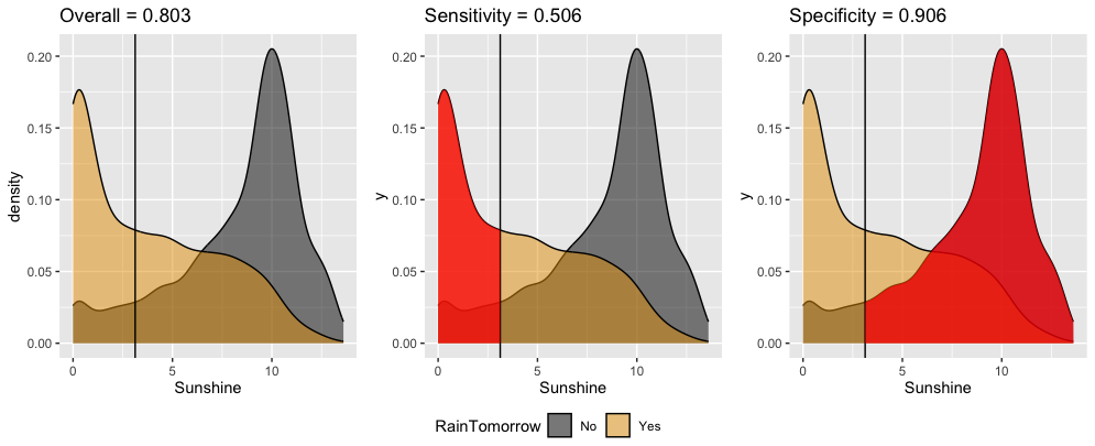
Interpret these **in-sample** *estimates* of the resulting classification quality.
a. Overall accuracy = 0.803
- We correctly predict the rain outcome (yes or no) 80.3% of the time.
- We correctly predict "no rain" on 80.3% of non-rainy days.
- We correctly predict "rain" on 80.3% of rainy days.
b. Sensitivity = 0.506
- We correctly predict the rain outcome (yes or no) 50.6% of the time.
- We correctly predict "no rain" on 50.6% of non-rainy days.
- We correctly predict "rain" on 50.6% of rainy days.
c. Specificity = 0.906
- We correctly predict the rain outcome (yes or no) 90.6% of the time.
- We correctly predict "no rain" on 90.6% of non-rainy days.
- We correctly predict "rain" on 90.6% of rainy days.
## Extra Practice {.unnumbered .smaller}
Confirm the 3 metrics above using the confusion matrix. Work is shown below (peek when you're ready).
```{verbatim}
Truth
Prediction No Yes
No 3108 588
Yes 324 602
```
```{r}
```
## Example 2: ROC curves {.unnumbered .smaller}
We can change up the probability threshold in our classification rule!
The ROC curve for our logistic regression model of `RainTomorrow` by `Sunshine` plots the sensitivity (true positive rate) vs 1 - specificity (false positive rate) corresponding to "every" possible threshold:
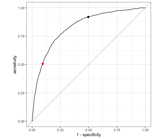
a. Which point represents the quality of our classification rule using a 0.5 probability threshold?
b. The other point corresponds to a different classification rule which uses a different threshold. Is that threshold smaller or bigger than 0.5?
c. Which classification rule do you prefer?
## Example 3: Area Under the ROC Curve (AUC) {.unnumbered .smaller}
The **area under an ROC curve** (AUC) estimates the probability that our algorithm is *more* likely to classify y = 1 (rain) as 1 (rain) than to classify y = 0 (no rain) as 1 (rain), hence distinguish between the 2 classes.
AUC is helpful for evaluating and comparing the overall quality of classification models.
Consider 3 different possible predictors (A, B, C) of rainy and non-rainy days:
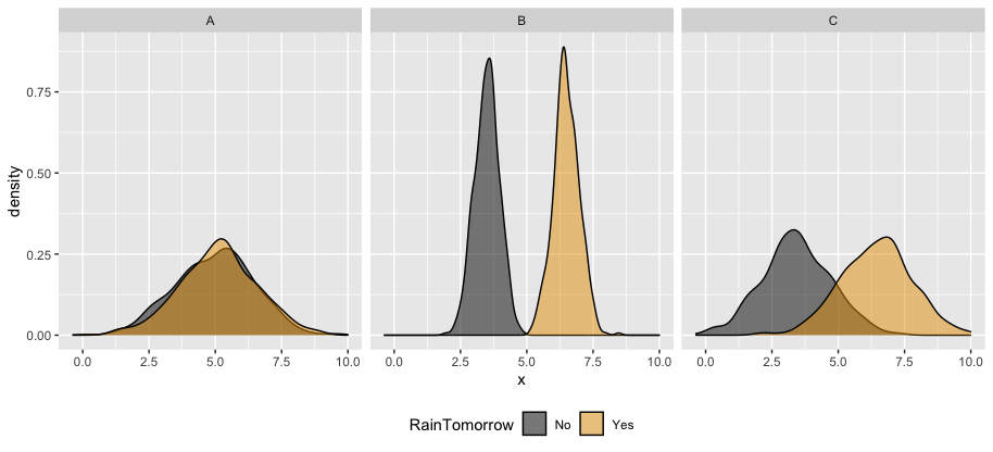
Which predictor is the "strongest" predictor of rain tomorrow?
The ROC curves corresponding to the models `RainTomorrow ~ A`, `RainTomorrow ~ B`, `RainTomorrow ~ C` are shown below.
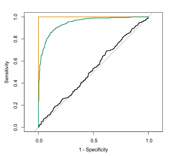
For each ROC curve, indicate the corresponding model and the approximate AUC. Do this in any order you want!
**black ROC curve**
- `RainTomorrow ~ ___`
- AUC is roughly ___
**green ROC curve**
- `RainTomorrow ~ ___`
- AUC is roughly ___.
**orange ROC curve**
- `RainTomorrow ~ ___`
- AUC is exactly ___.
## AUC Observation {.unnumbered .smaller}
In general:
- A *perfect* classification model has an AUC of 1.
- The *simplest* classification model that just randomly predicts y to be 1 or 0 (eg: by flipping a coin), has an AUC of 0.5. It is represented by the diagonal "no discrimination line" in an ROC plot.
- A model with an AUC below 0.5 is *worse* than just random. Flipping a coin would be better.
# Exercises {-}
Today's in-class exercises will be due as HW4.
Please find the exercises and template on Moodle.
I recommend working on Exercises 1, 5, and 6 in class.
Exercise 1 is necessary to the other exercises, and Exercises 5 and 6 involve new content: ROC curves, AUC, and LASSO for classification!
# Future Reference {-}
## R Code Notes {.unnumbered .smaller}
Let `my_model` be a logistic regression model of categorical response variable `y` using predictors `x1` and `x2` in our `sample_data`.
```{r}
#| eval: false
# Load packages
library(tidymodels)
# Resolves package conflicts by preferring tidymodels functions
tidymodels_prefer()
```
```{r}
#| eval: false
# Calculate the probability that y = 1 for each sample data point
# The probability is stored in the .pred_Yes column
in_sample_predictions <- my_model %>%
augment(new_data = sample_data)
```
```{r}
#| eval: false
# Plot the predicted probability that y = 1 by the actual y category
ggplot(in_sample_predictions, aes(y = .pred_Yes, x = y)) +
geom_boxplot()
```
```{r}
#| eval: false
# Calculate sensitivity & specificity for a range of probability thresholds
in_sample_predictions %>%
roc_curve(truth = y, .pred_Yes, event_level = "second")
# Plot the ROC curve
in_sample_predictions %>%
roc_curve(truth = y, .pred_Yes, event_level = "second") %>%
autoplot()
# Calculate the AUC
in_sample_predictions %>%
roc_auc(truth = y, .pred_Yes, event_level = "second")
```
For out-of-sample evaluation metrics, see the R Code Notes from last class.
# Done!
- Render your notes.
- Check the solutions in the course website (Solution drop downs).
- If you finish all that during class, start your homework!